Agentica
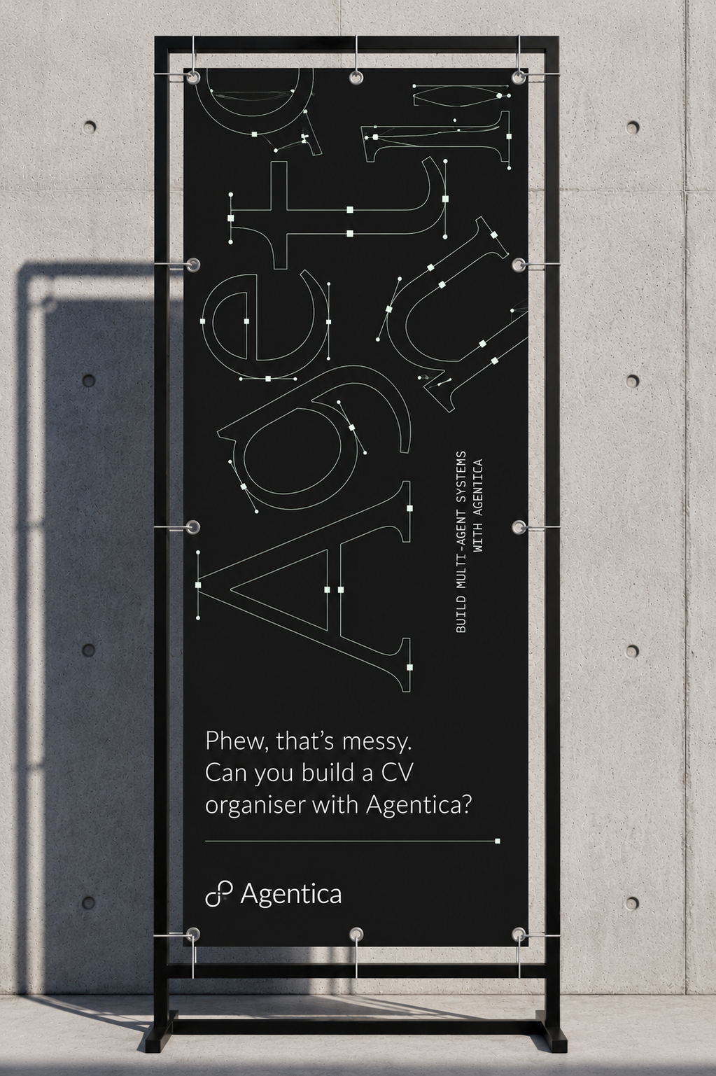
Symbolica's first product, taken from developer SDK to consumer AI application. As the first and only creative hire I designed the brand, both websites, the product UI and component system, the campaign creative and the motion work. Shipped directly in code, no agency.

An orchestration layer for agents, built for engineers, opened to everyone.
 Mark · The loop
 Developer lockup
 Mark · On paper
 →
→
Agentica is a product of Symbolica. It inherits the loop mark and the Arizona type, then sets its own monochrome, dark-first tone for developers.
Black, white, and one signal.
The system is monochrome. Periwinkle is borrowed from Symbolica and used only as a live signal: the status dot on “Beta · Available now,” never as fill. A light mode mirrors the same neutrals for select consumer surfaces.
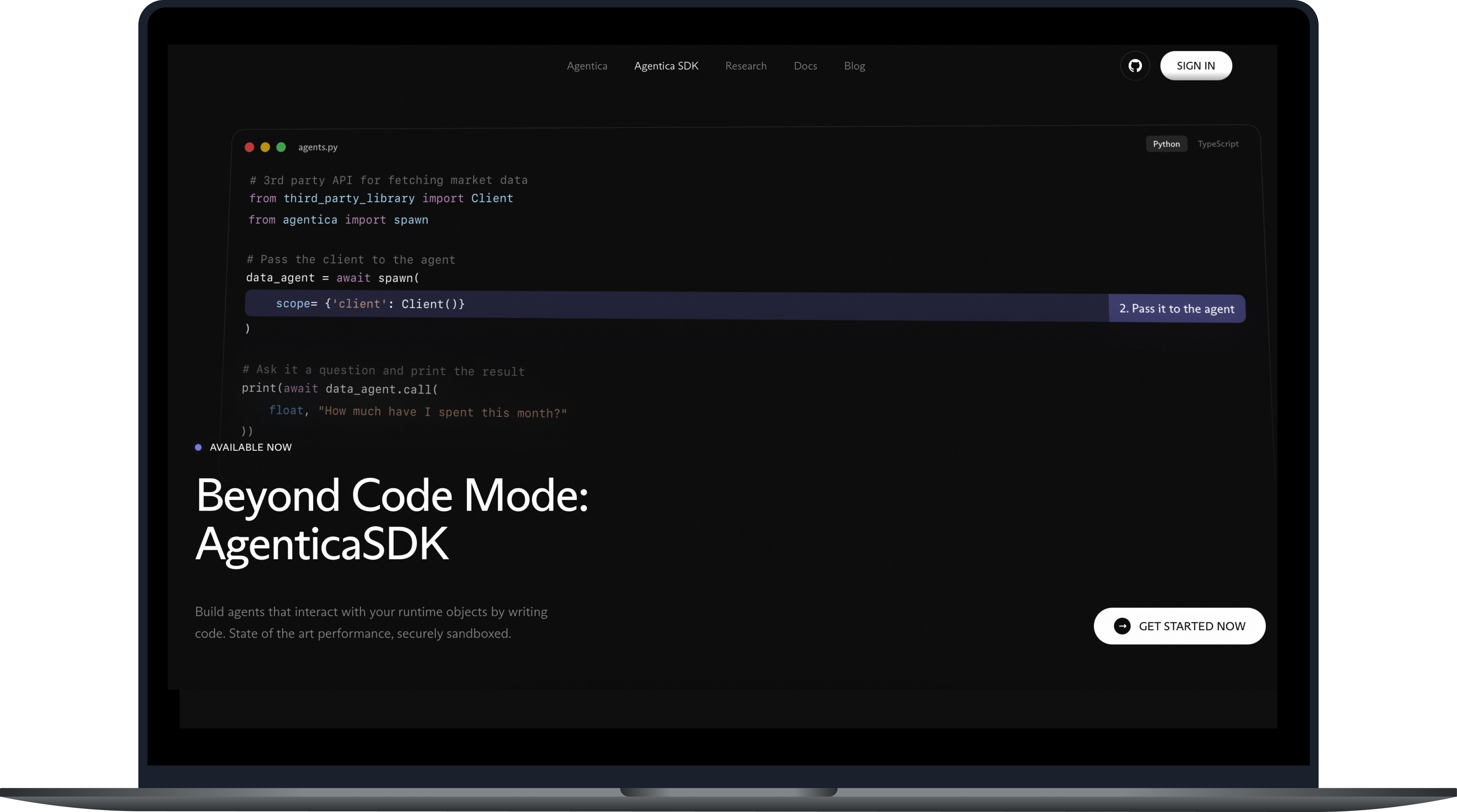
Spawn agents that interact with your runtime objects by writing code. State-of-the-art performance, securely sandboxed, or just ask in plain language.
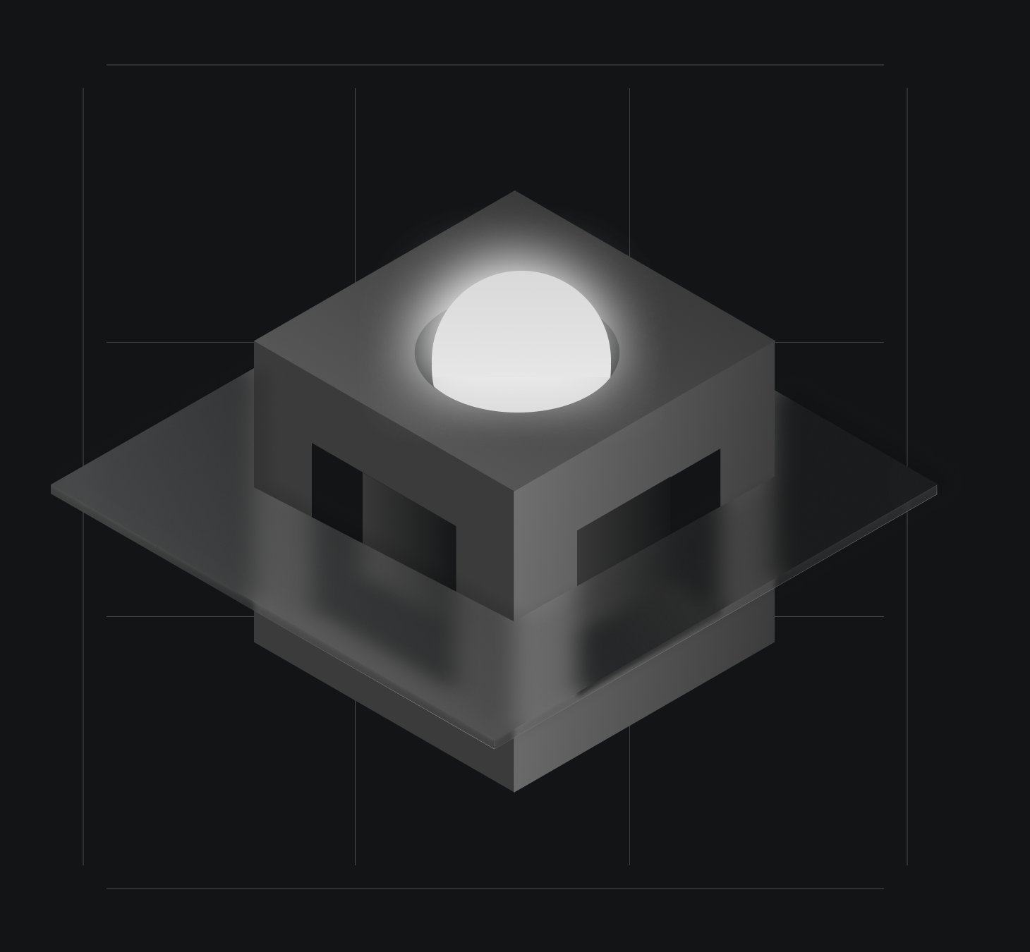
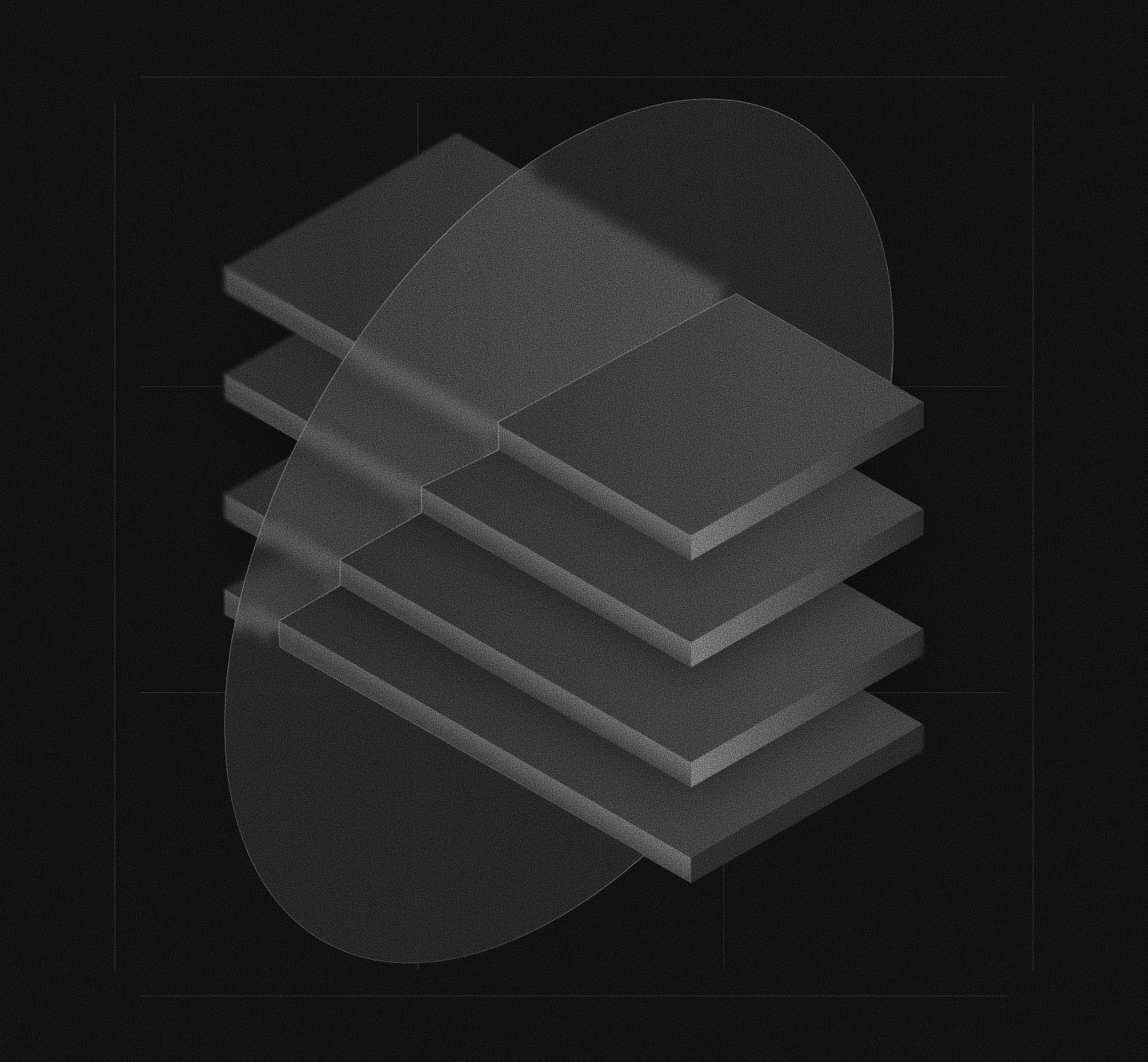
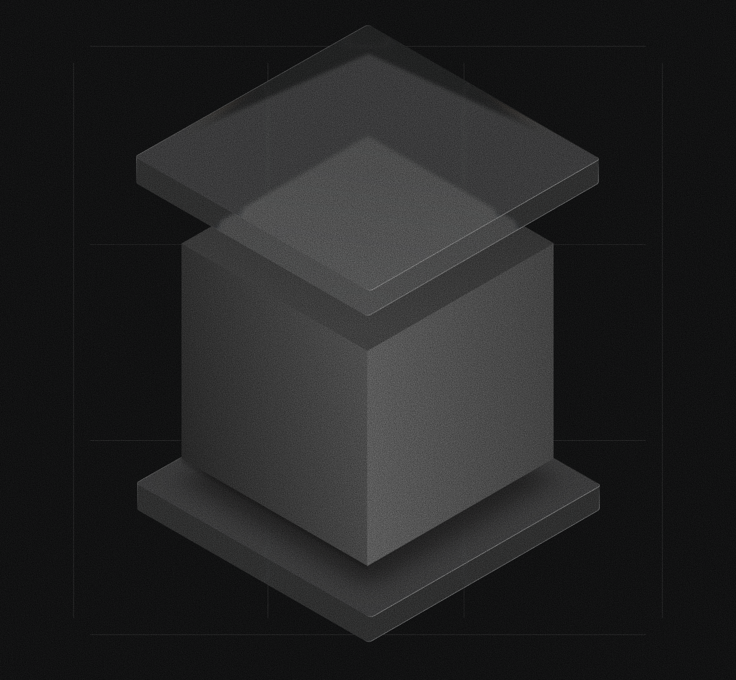
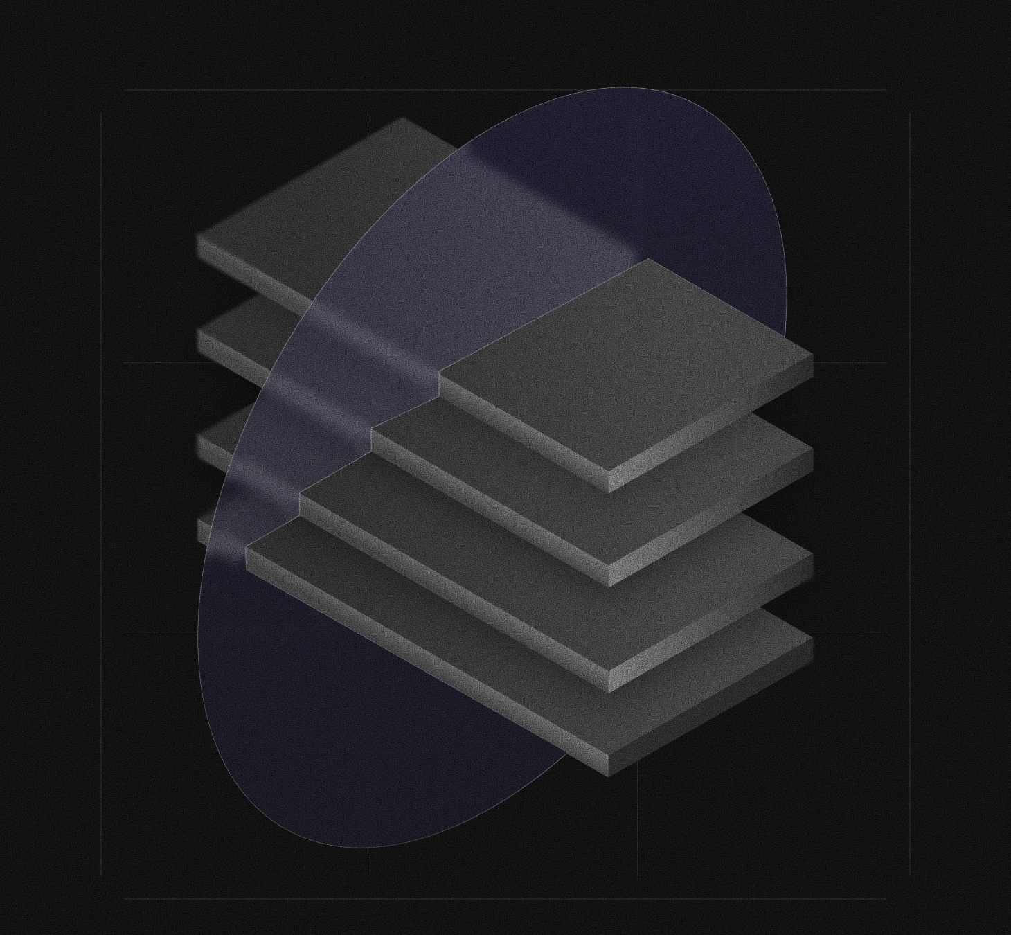
Objects in space.
Grainy, monochrome isometric forms: stacked planes, cubes, loops and lattices that stand in for agents, runtimes and the structures they build. Rendered on black, lit from a single source.
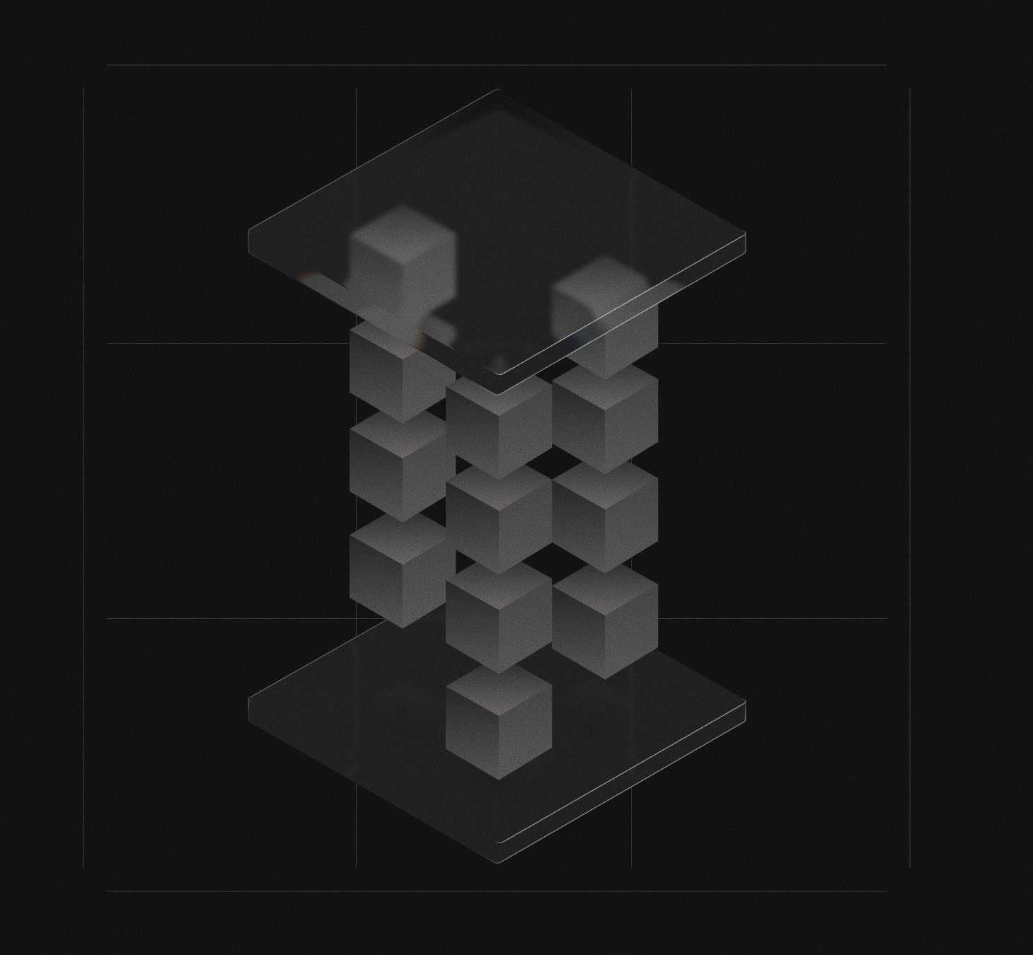
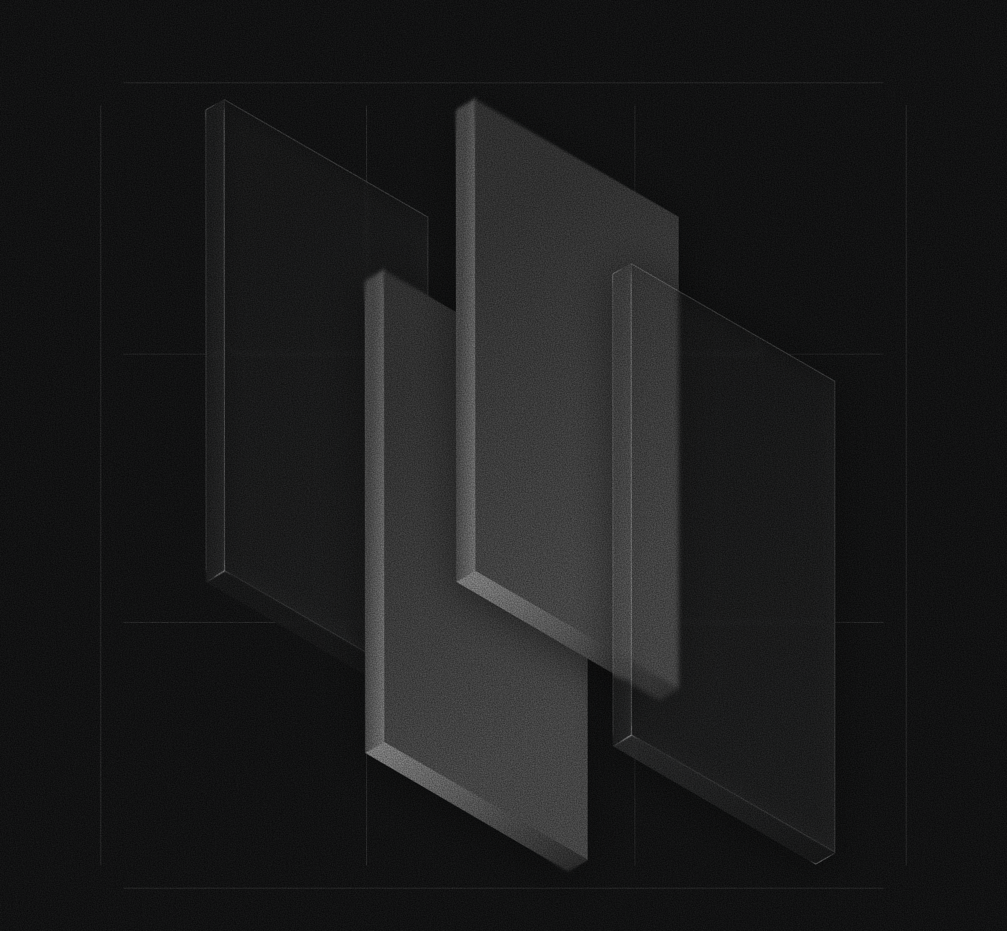
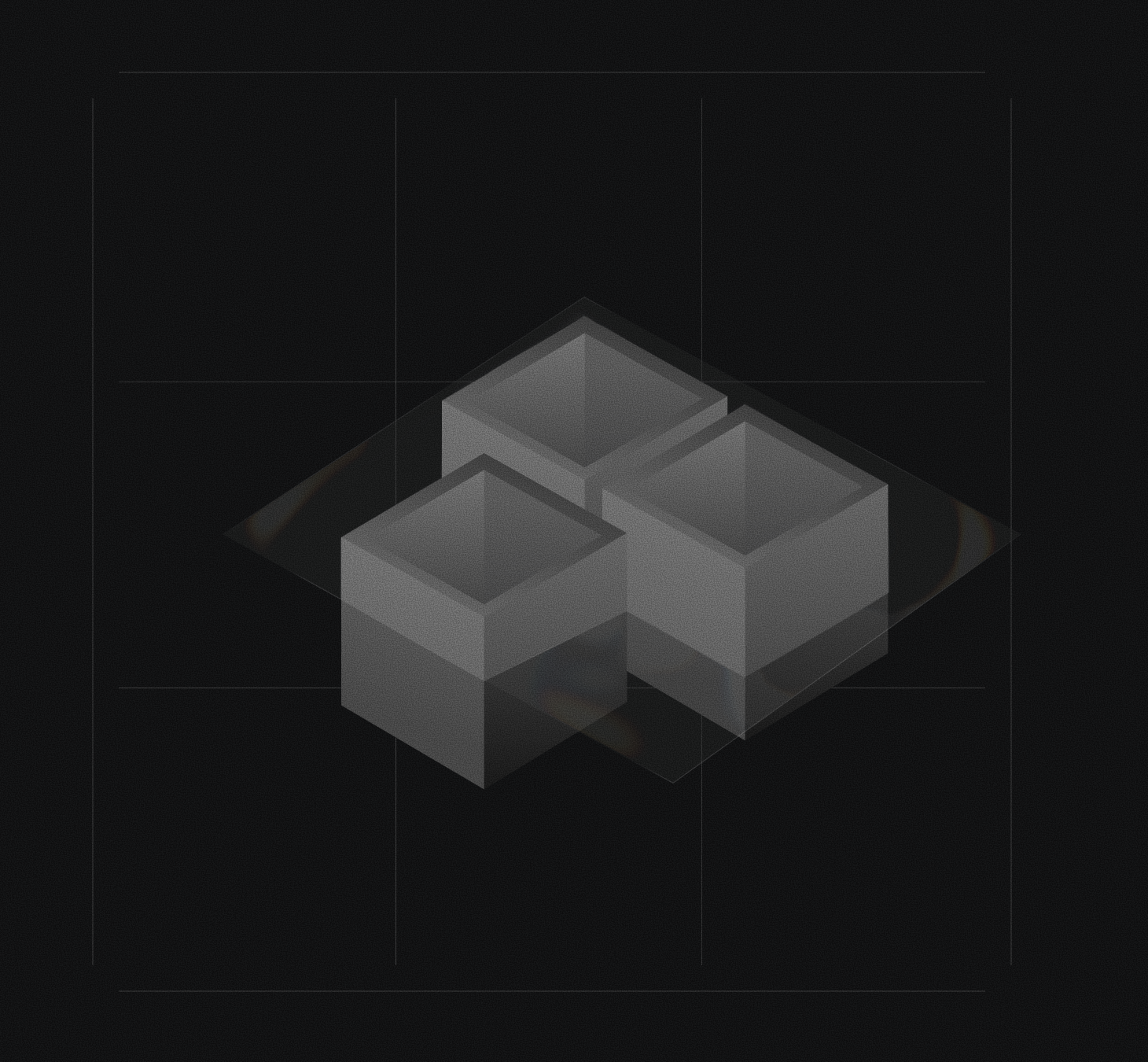
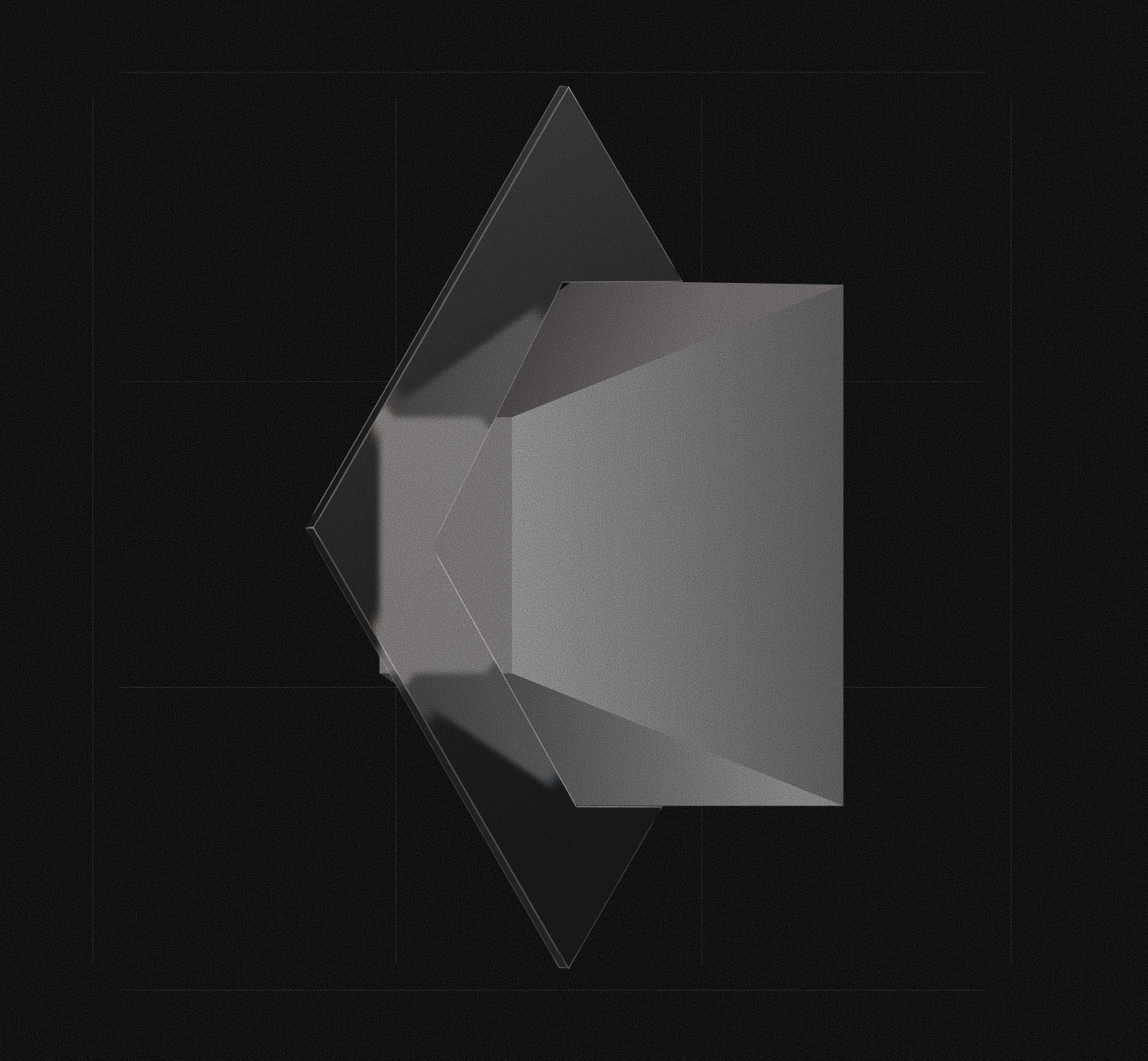
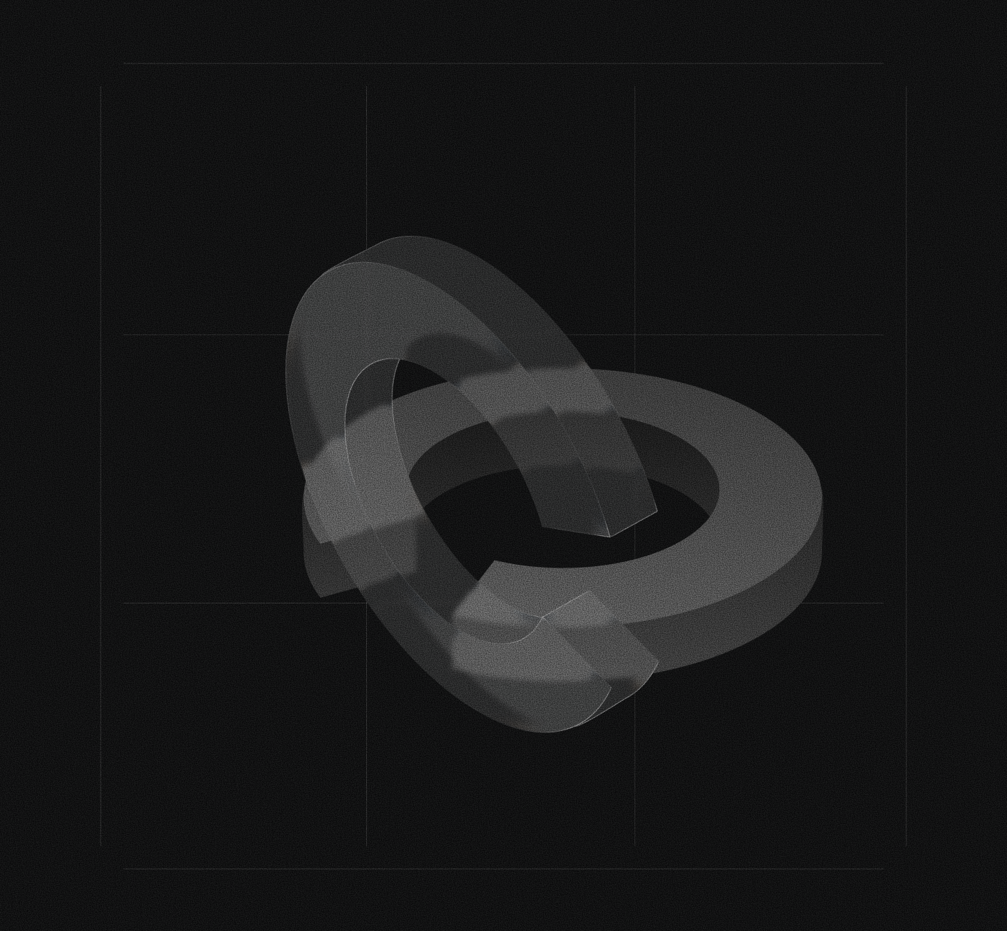
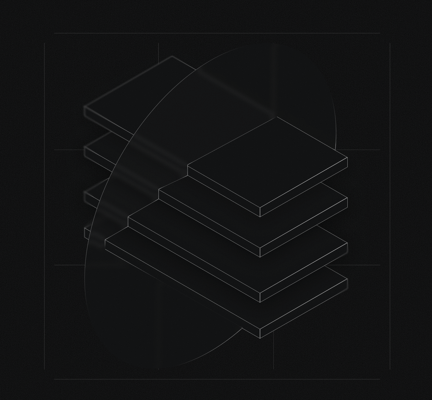
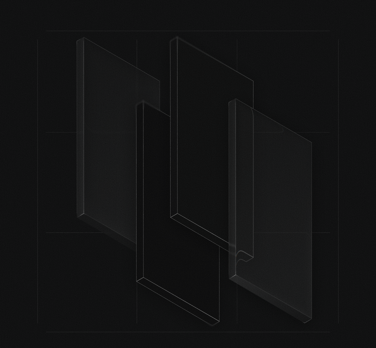
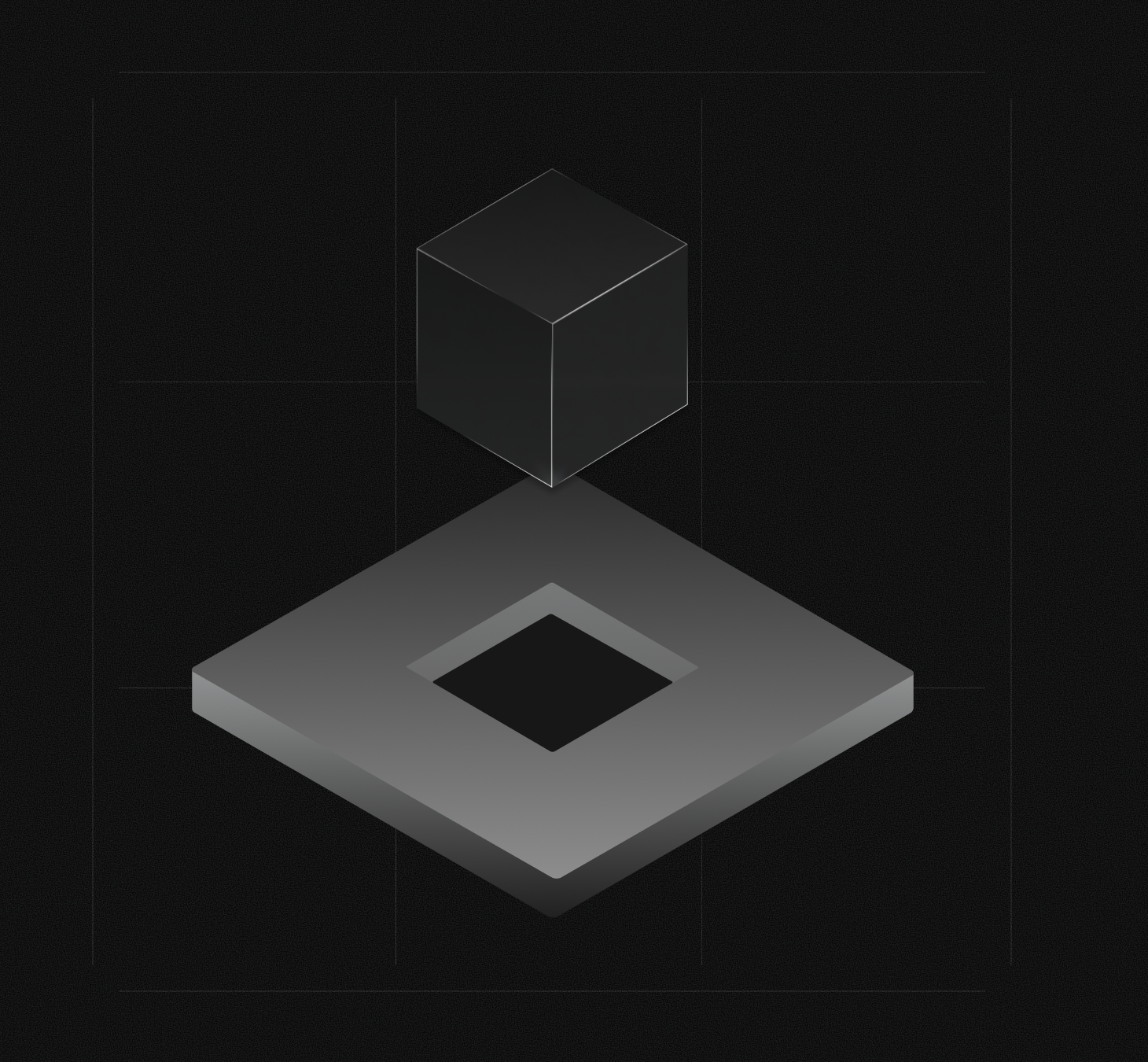
One brand, two surfaces.
The SDK speaks to engineers in code; the consumer product speaks to everyone in plain language. Same mark, same type, same dark monochrome. Different doors in.
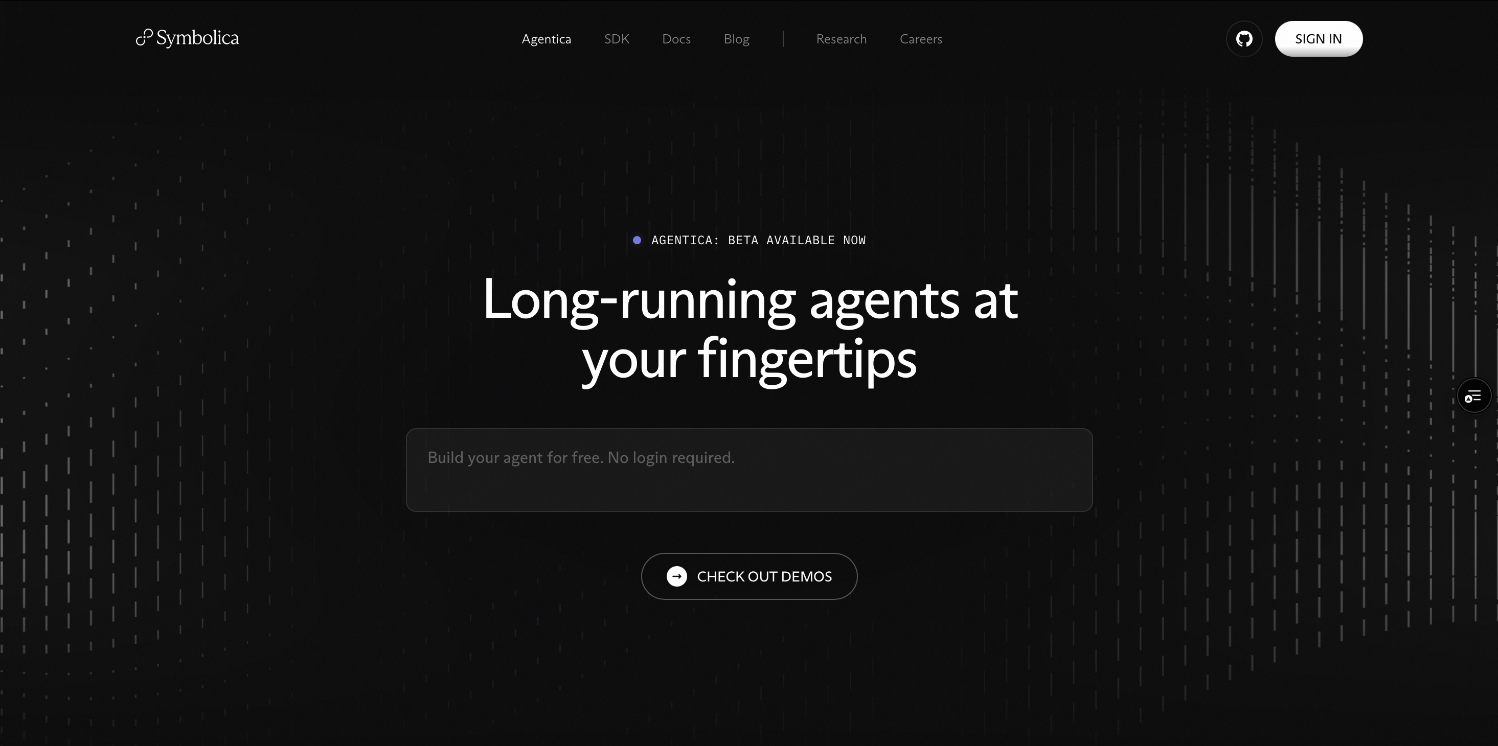
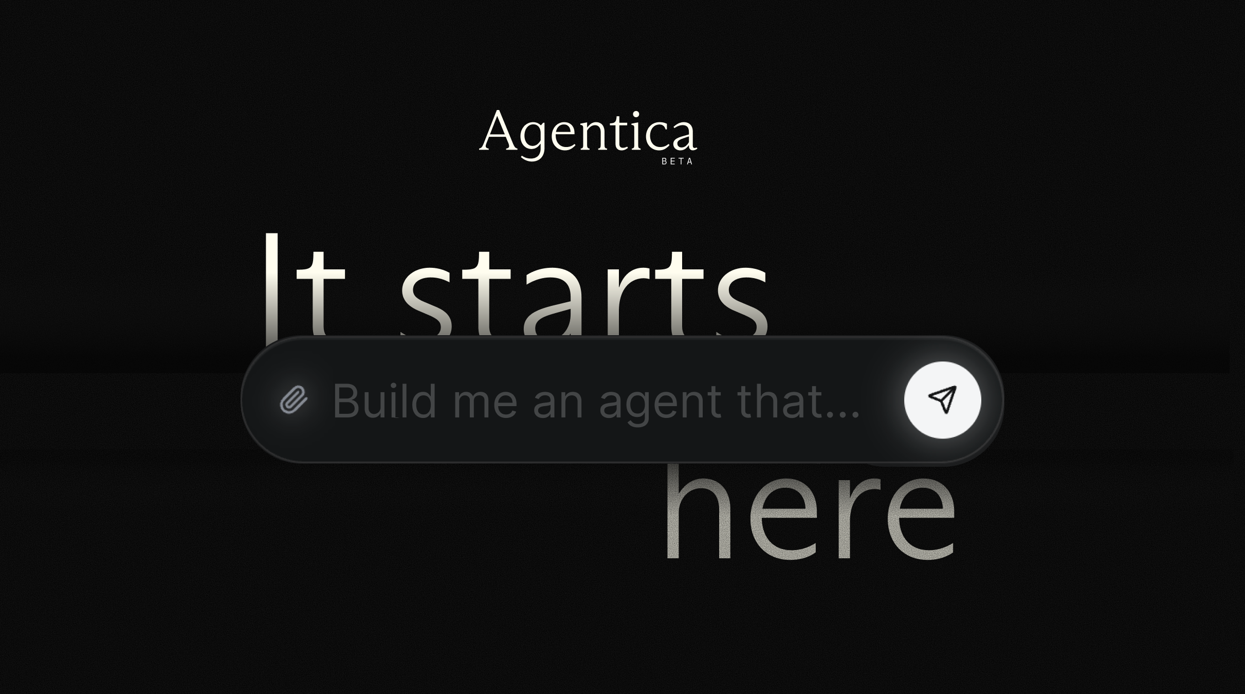
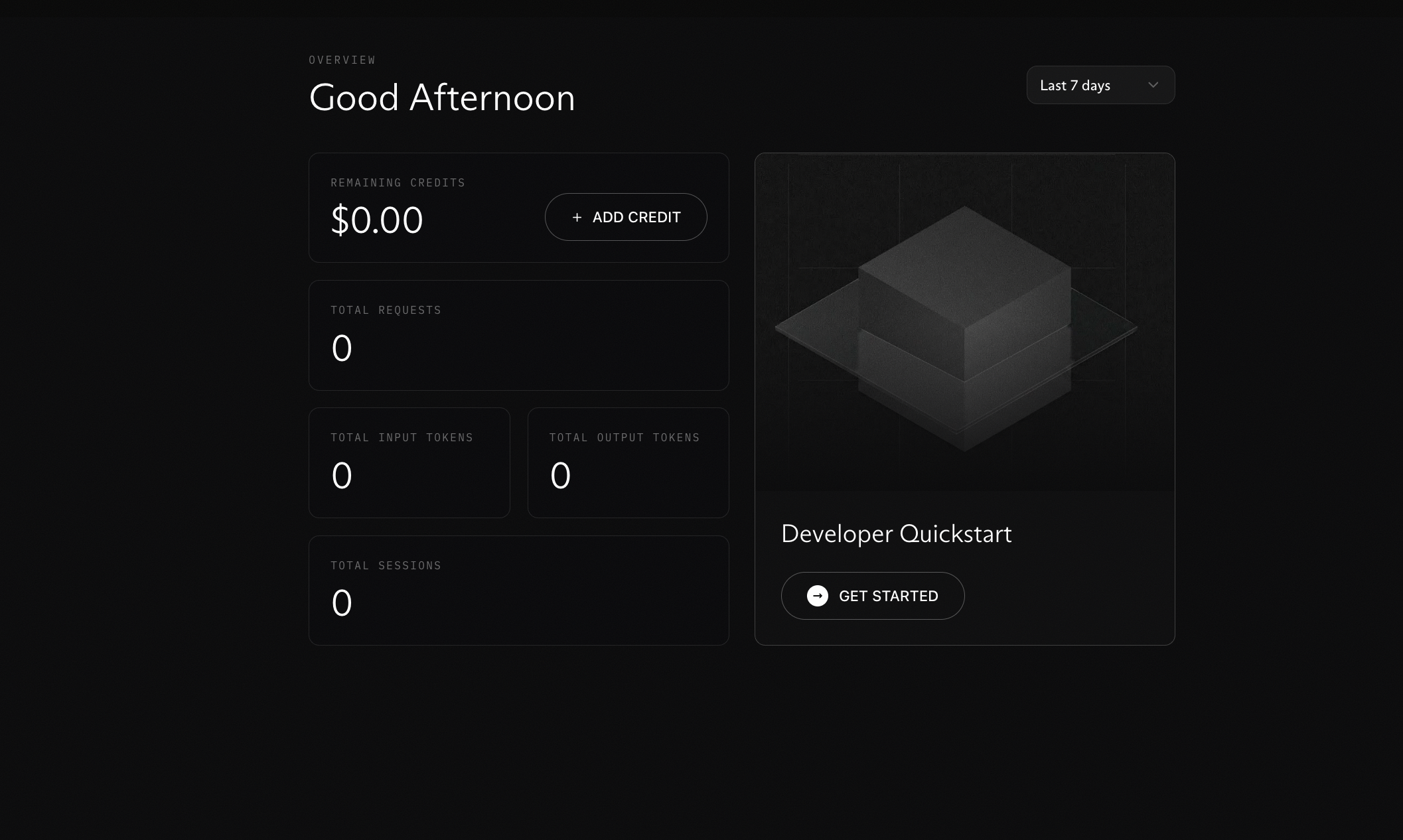
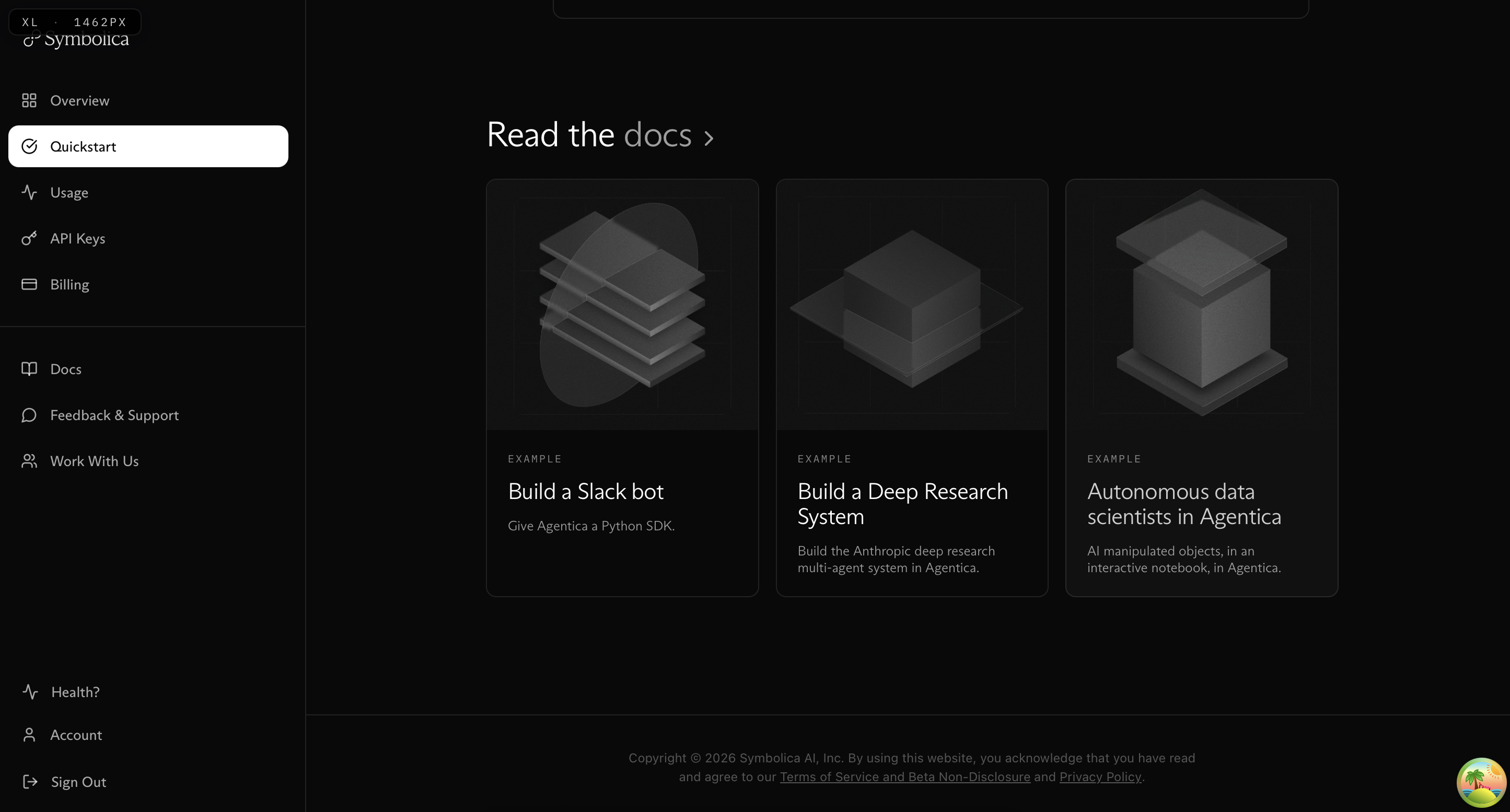
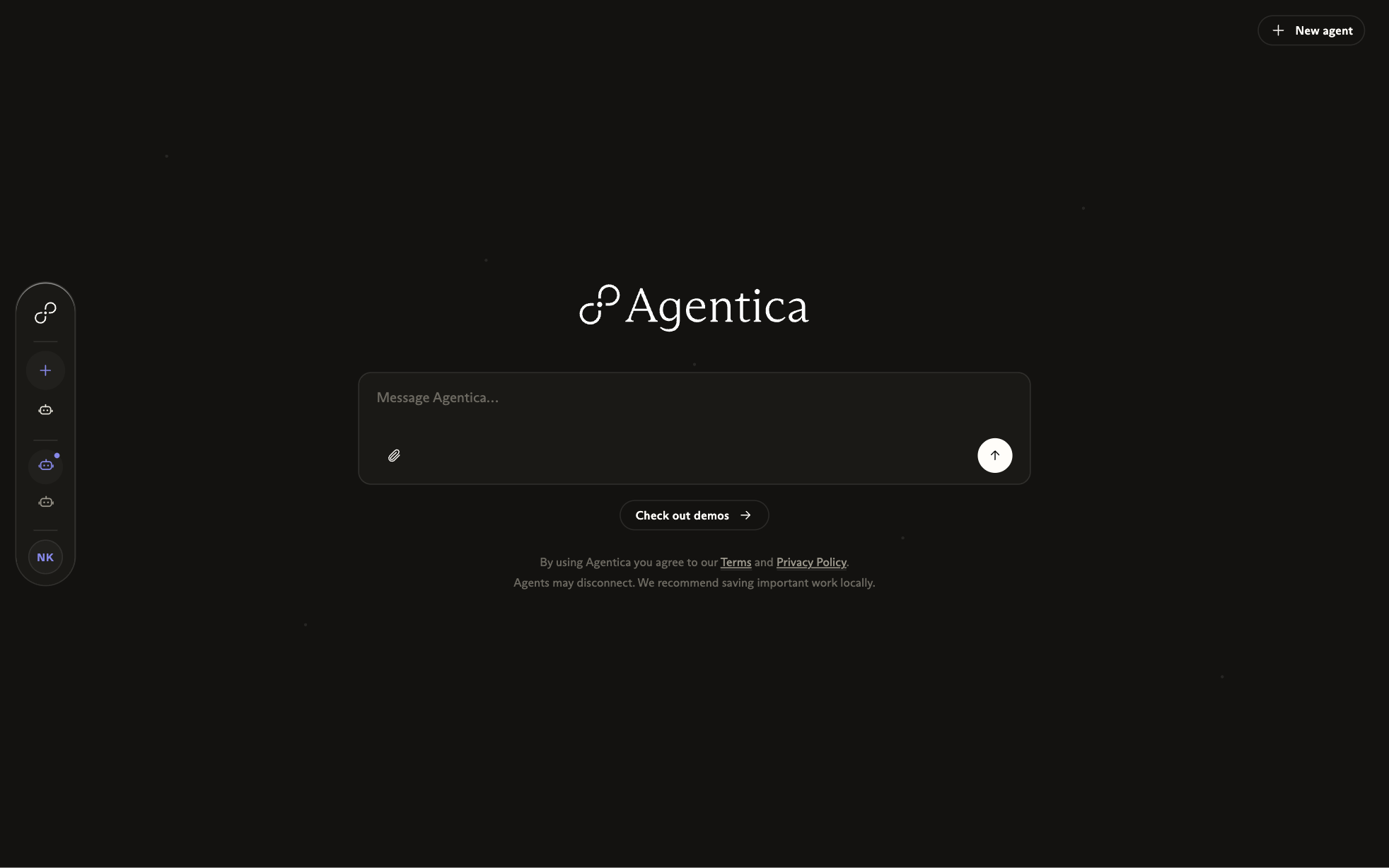
Anyone can build a long-running agent.
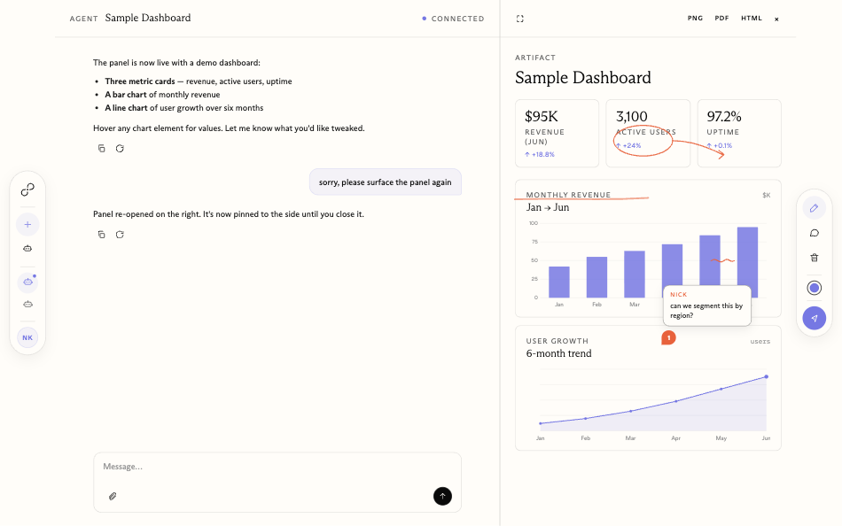
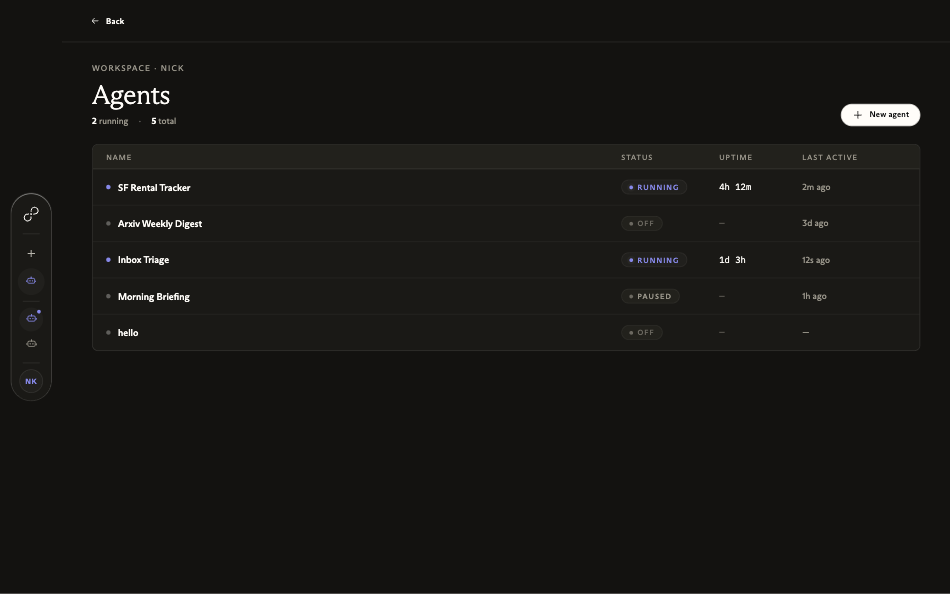
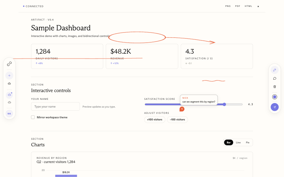
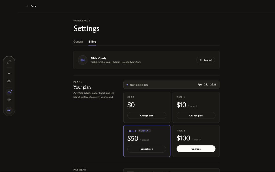
The consumer product wraps the same orchestration in a deliberately simple chat interface: long-running agents you can talk to, with a live artefact panel beside the conversation. These are the real product screens.

Three creative directions.
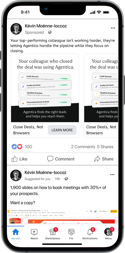
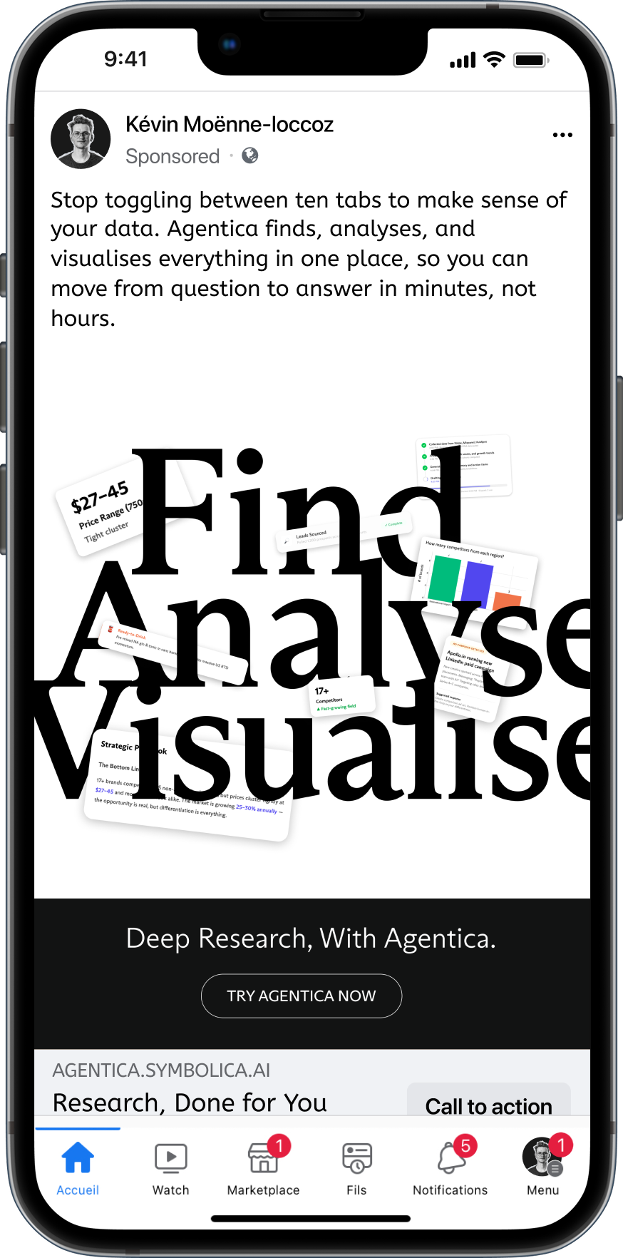
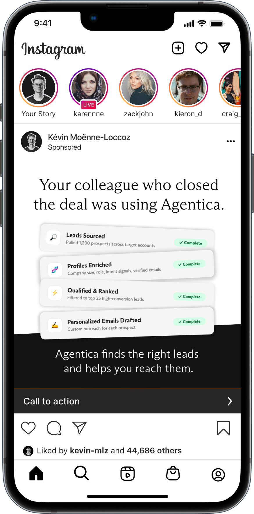
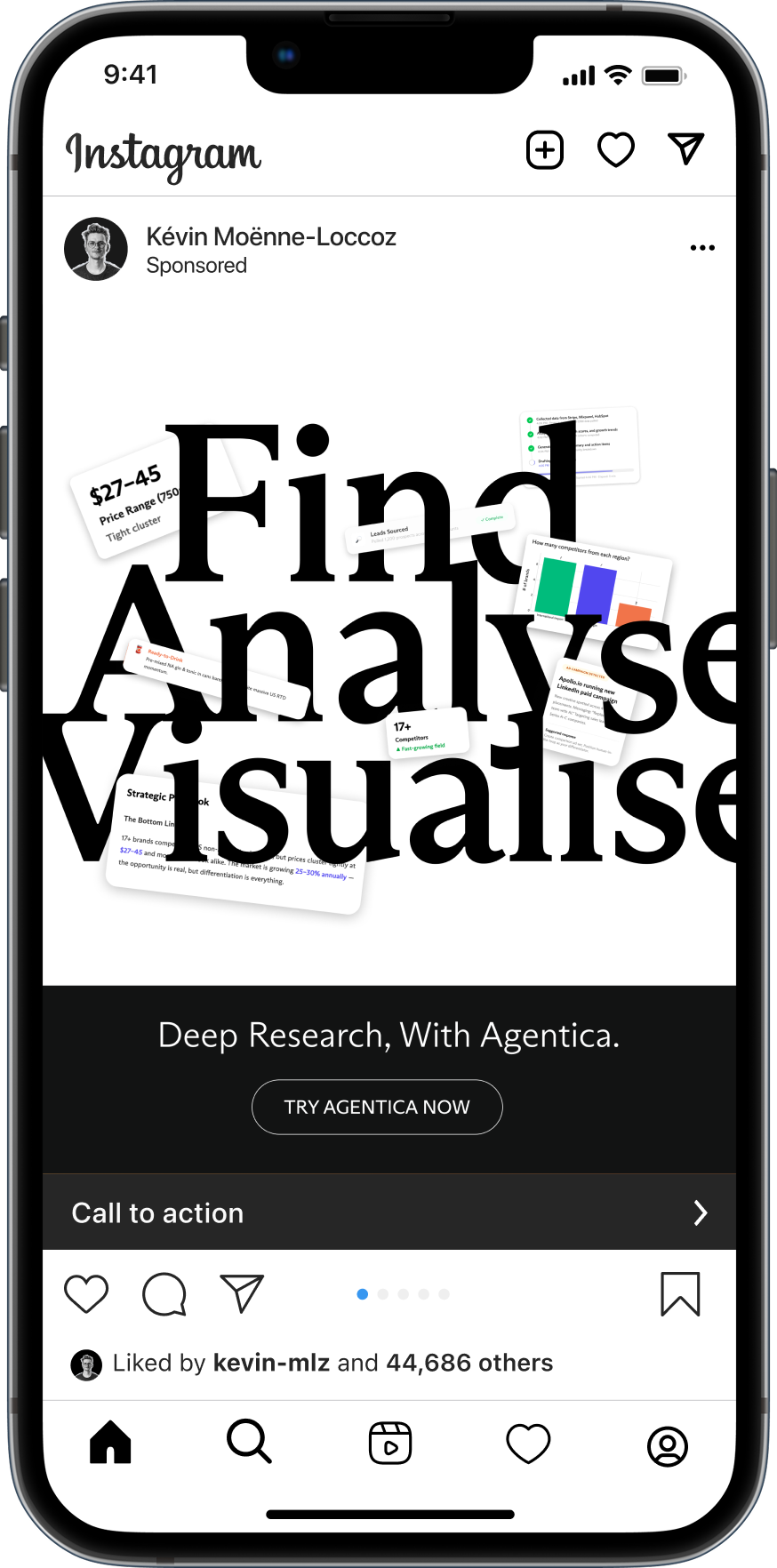
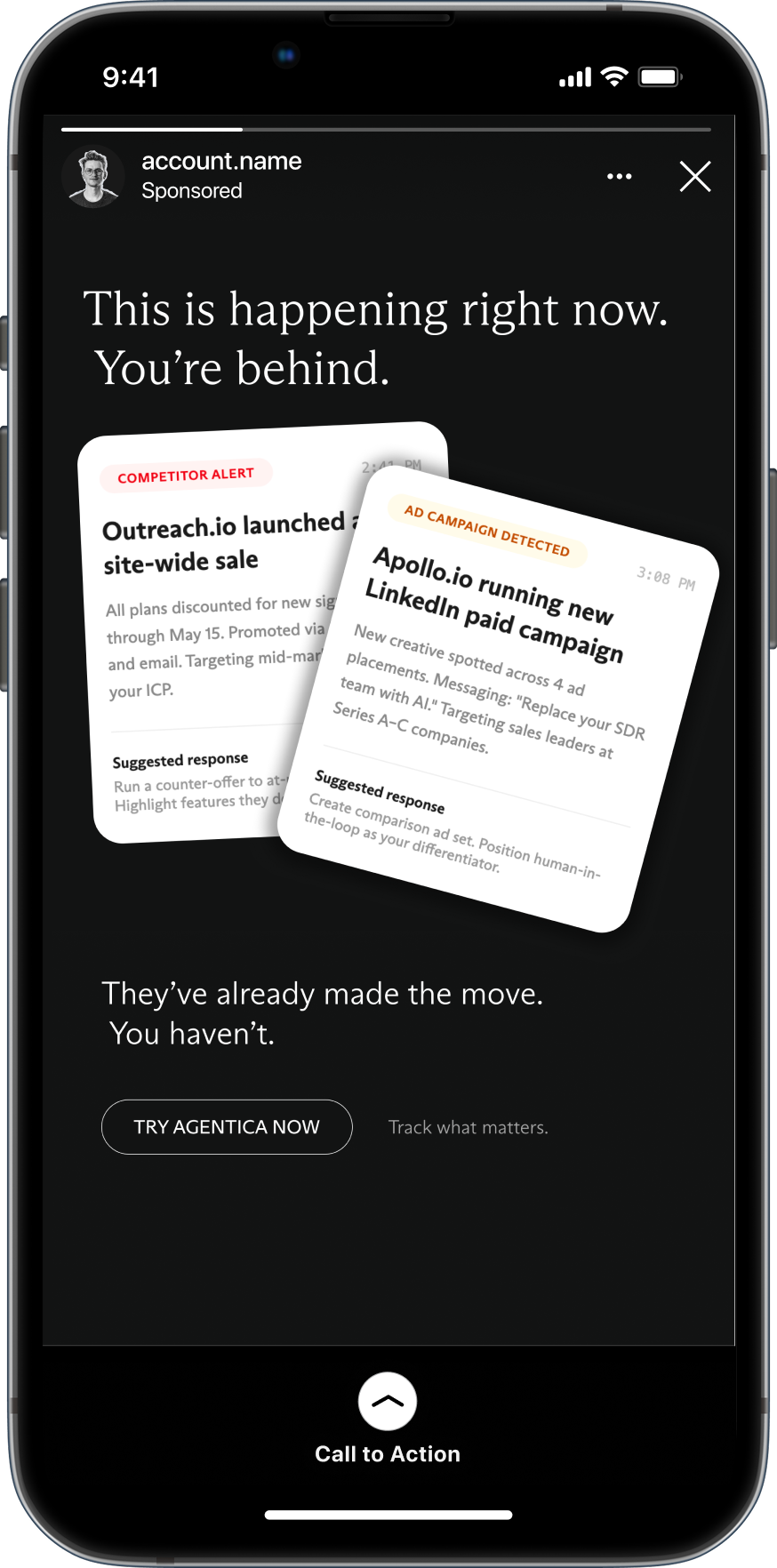
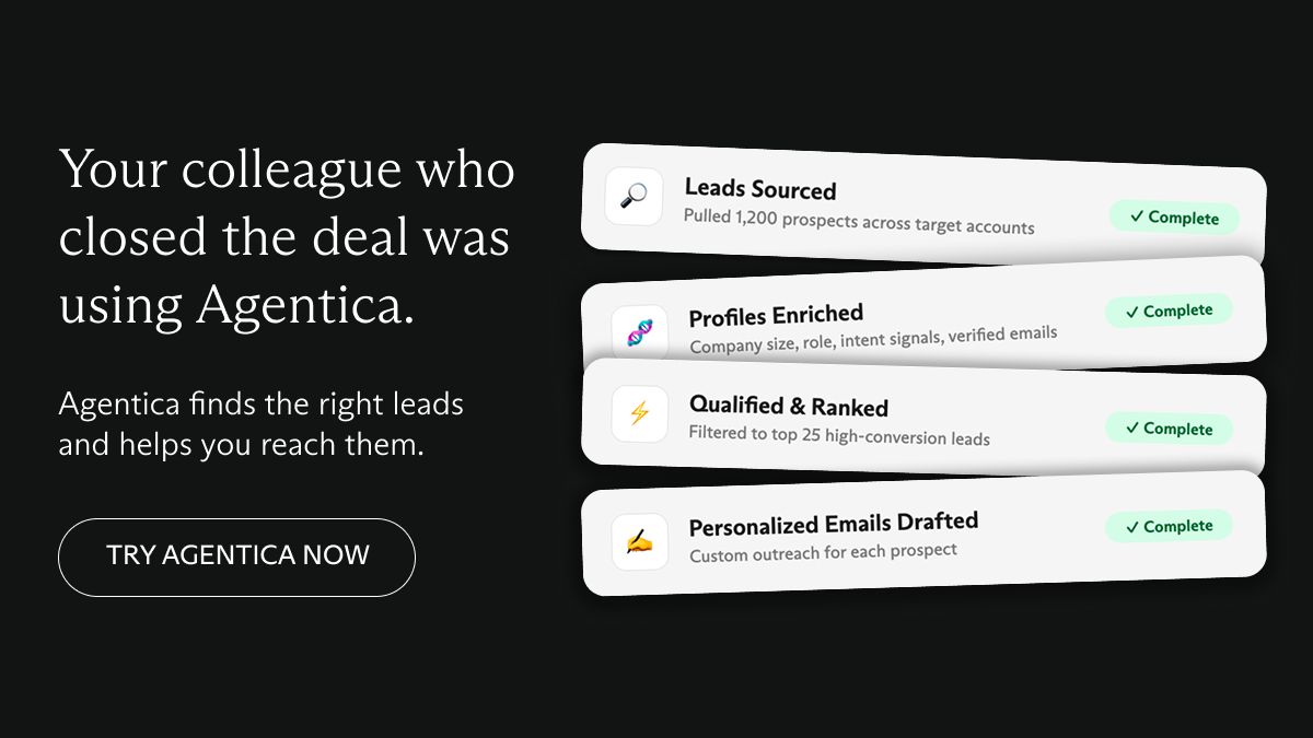
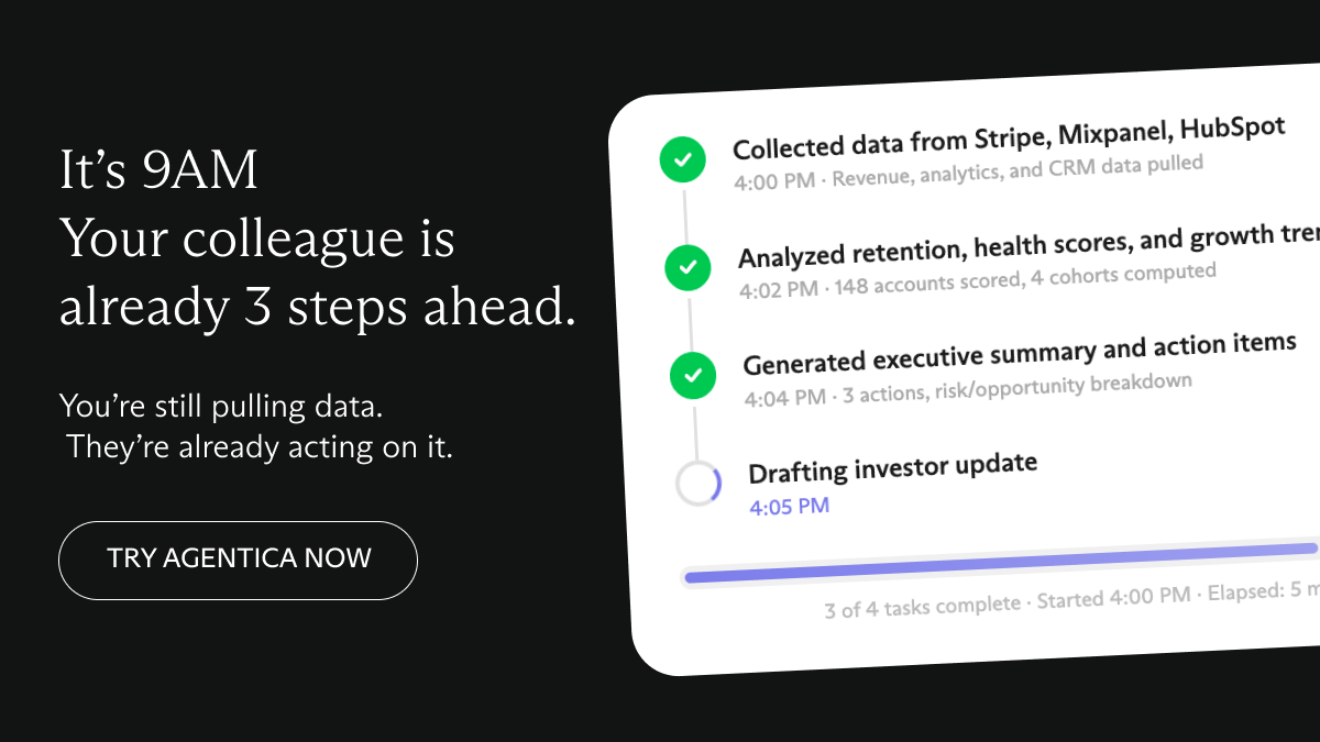
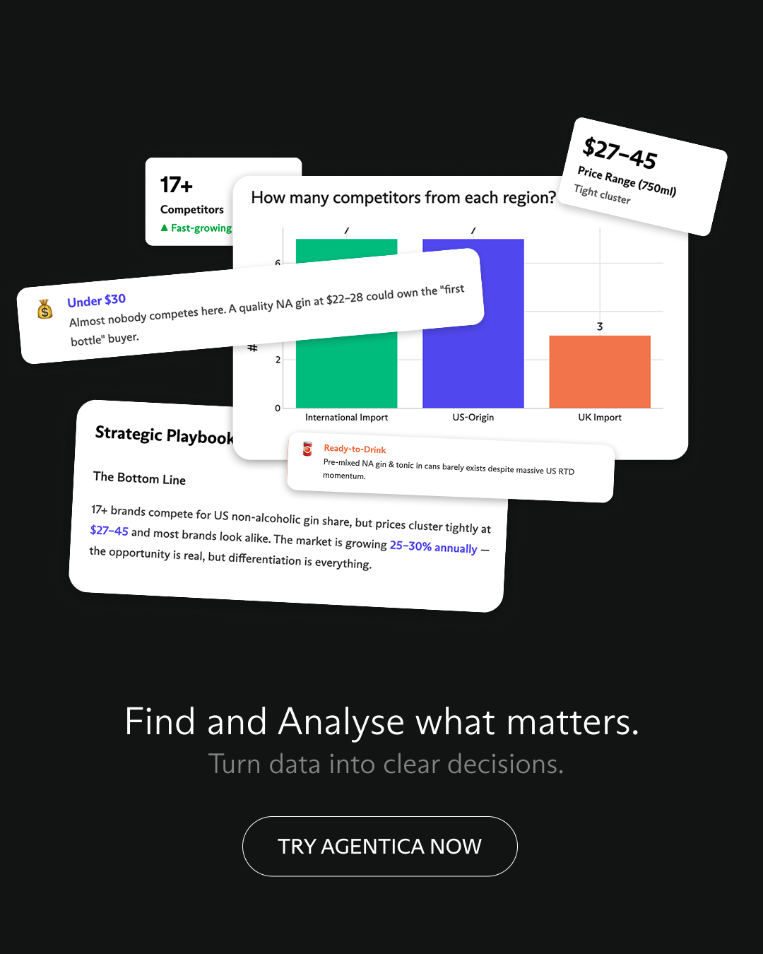
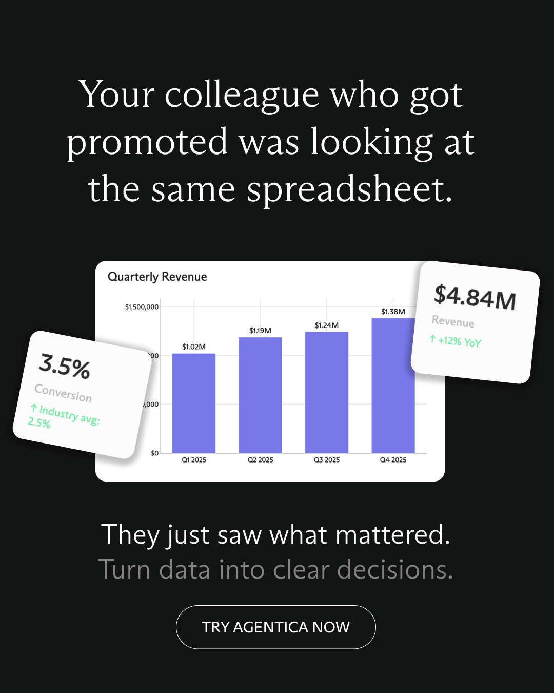
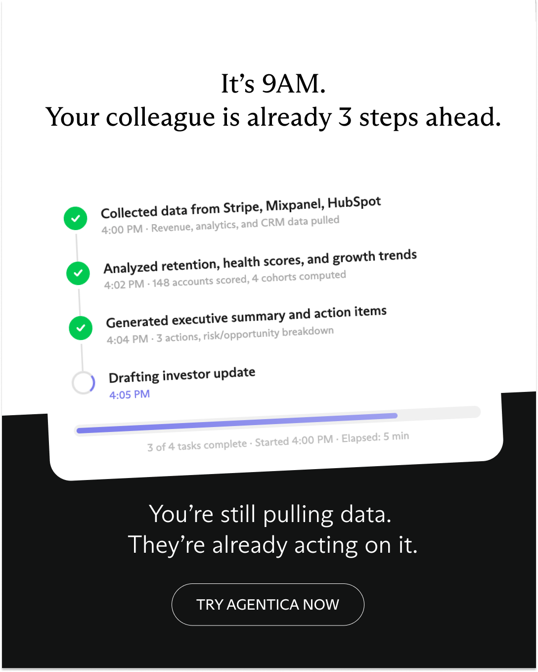
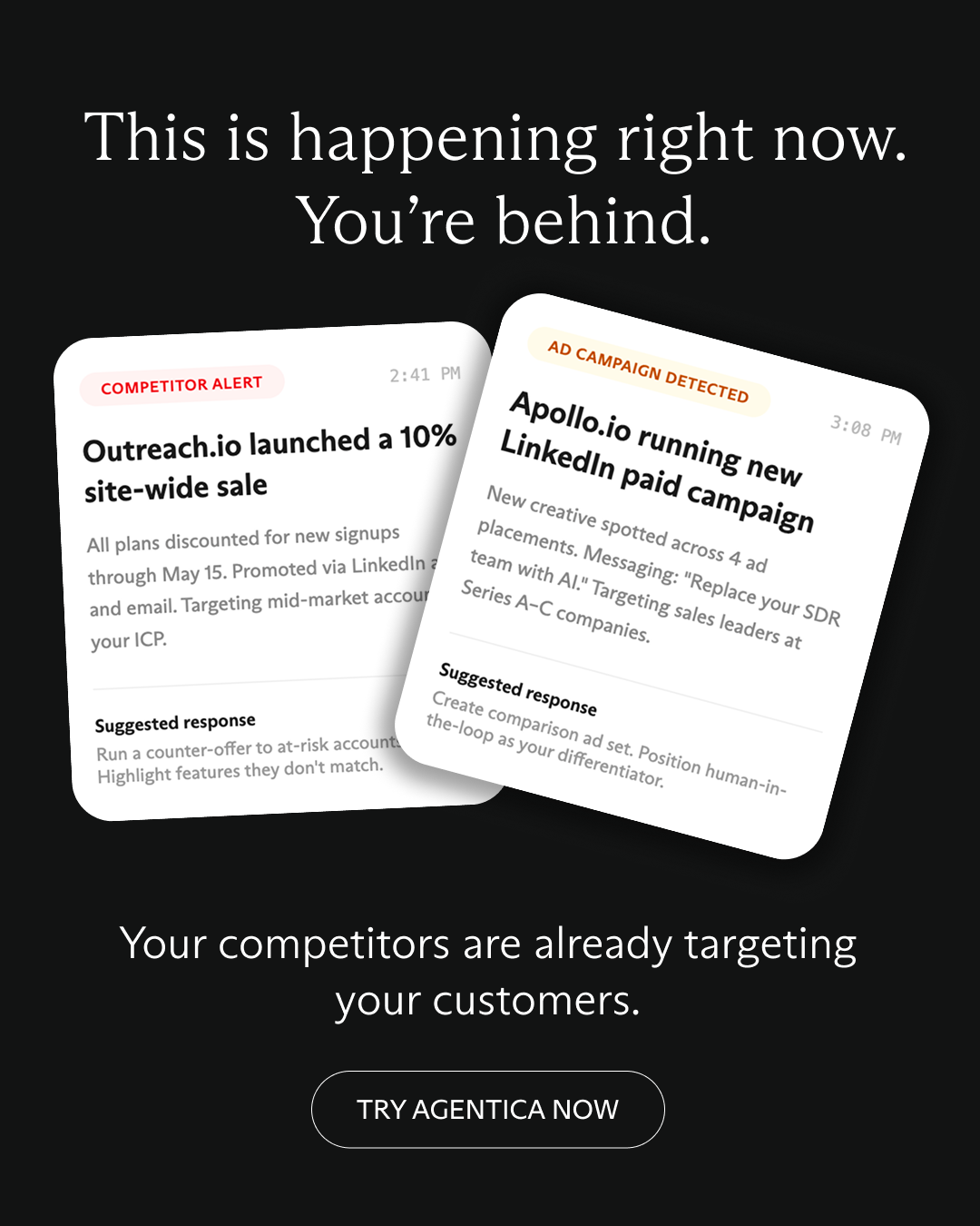
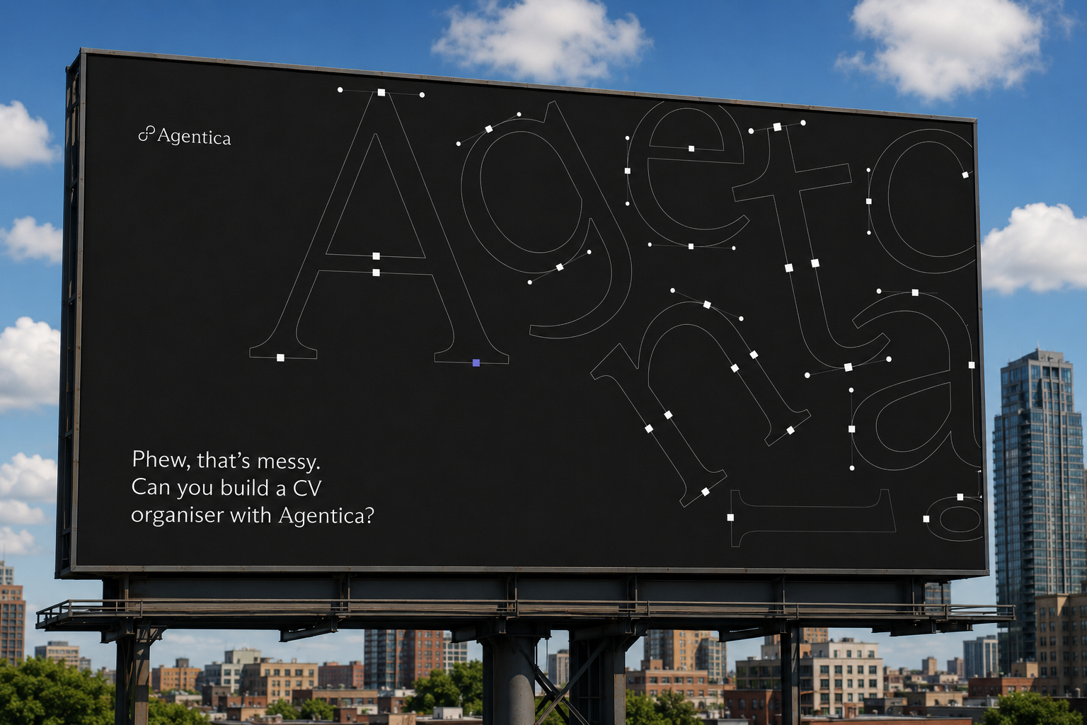
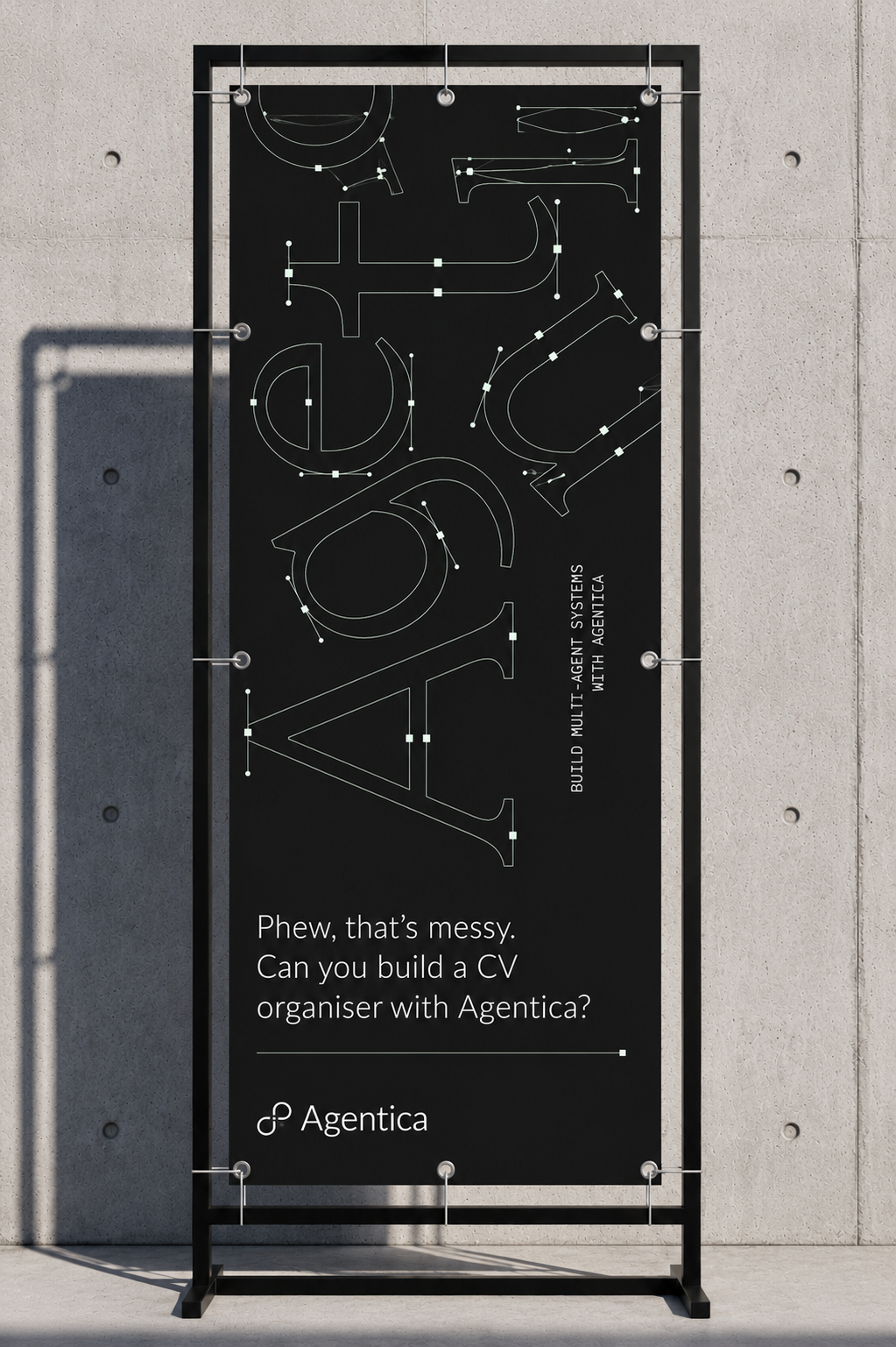
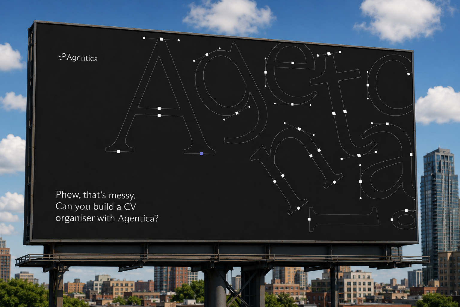
I explored three creative directions for paid social.
Important changes happen in real time, while most teams react too late. Agentica helps teams see and act sooner.
Agentica completes multi-step workflows automatically while others rely on manual work. Designed as demo videos.
Specific tasks like market mapping or lead generation make Agentica’s capabilities immediately clear.

Symbolica AI
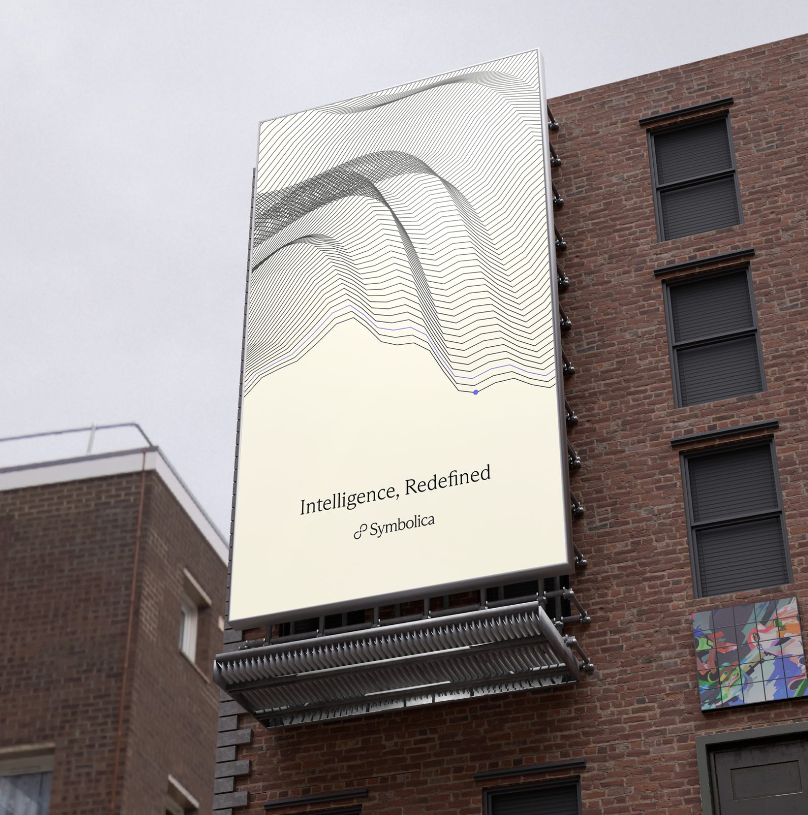
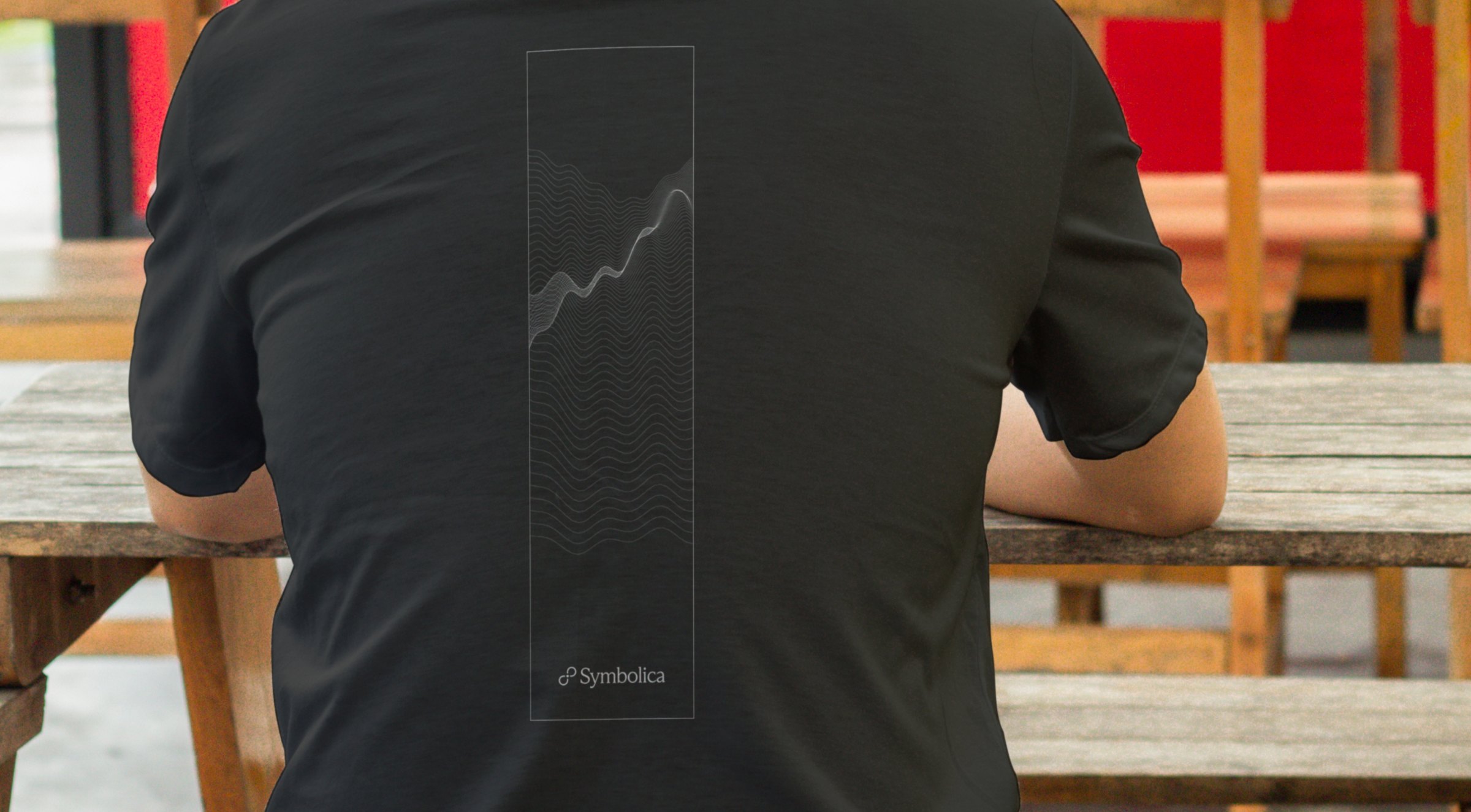
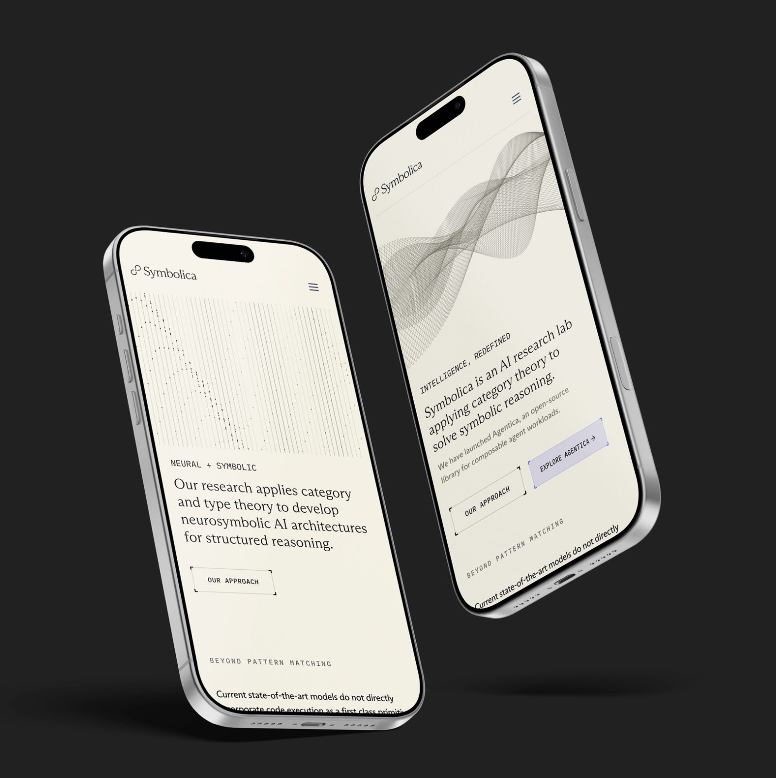
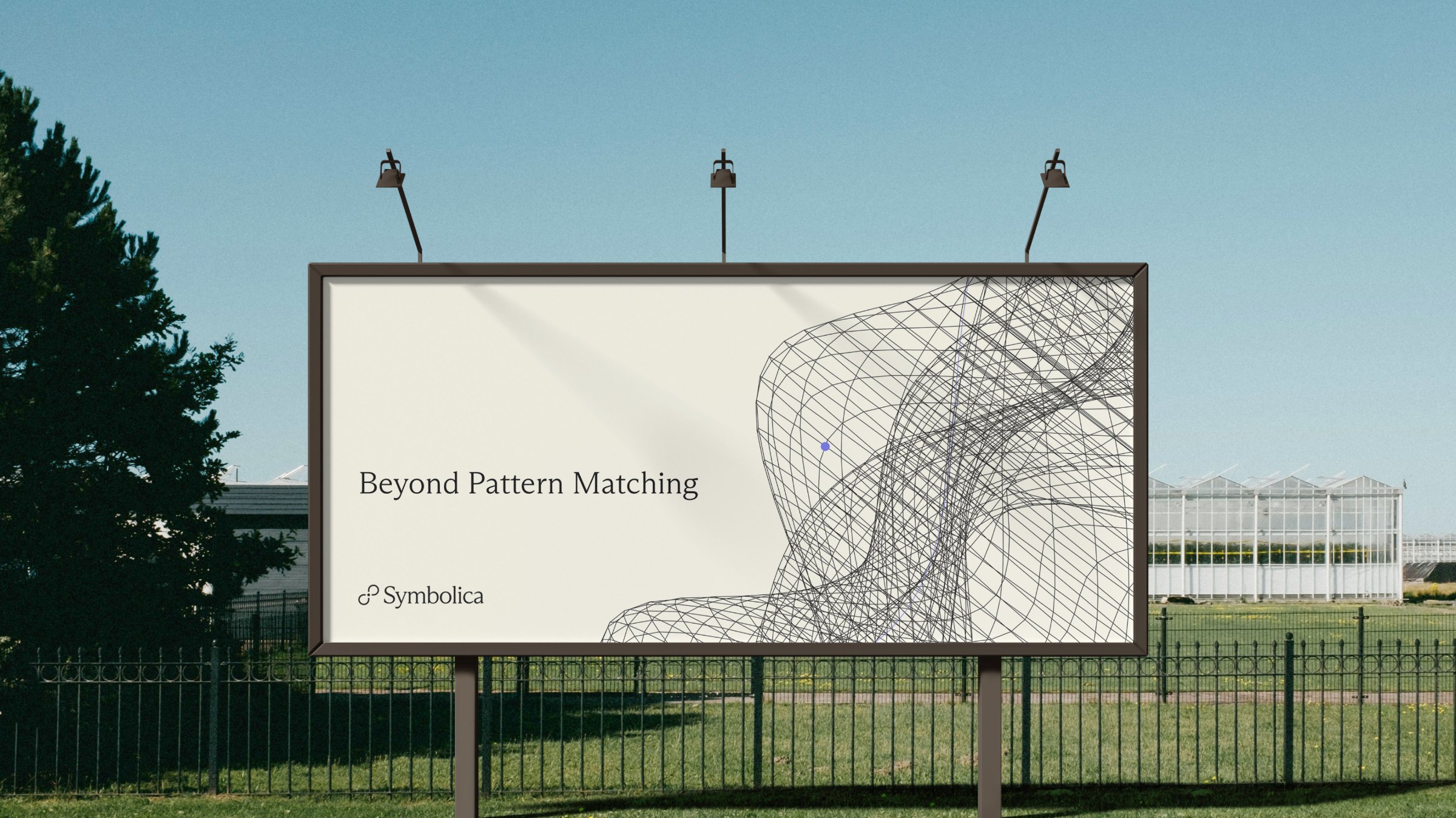
As the first design and brand hire at Symbolica, I rebuilt the identity and the motion system, then carried it across the site and the company's material.
A visual identity that doesn’t try to look like AI.
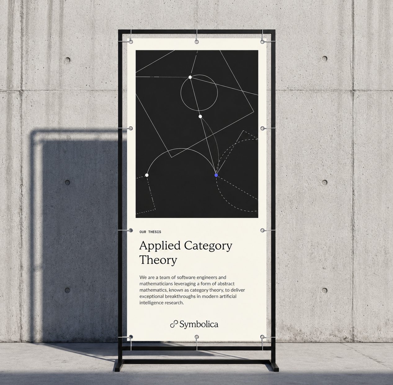
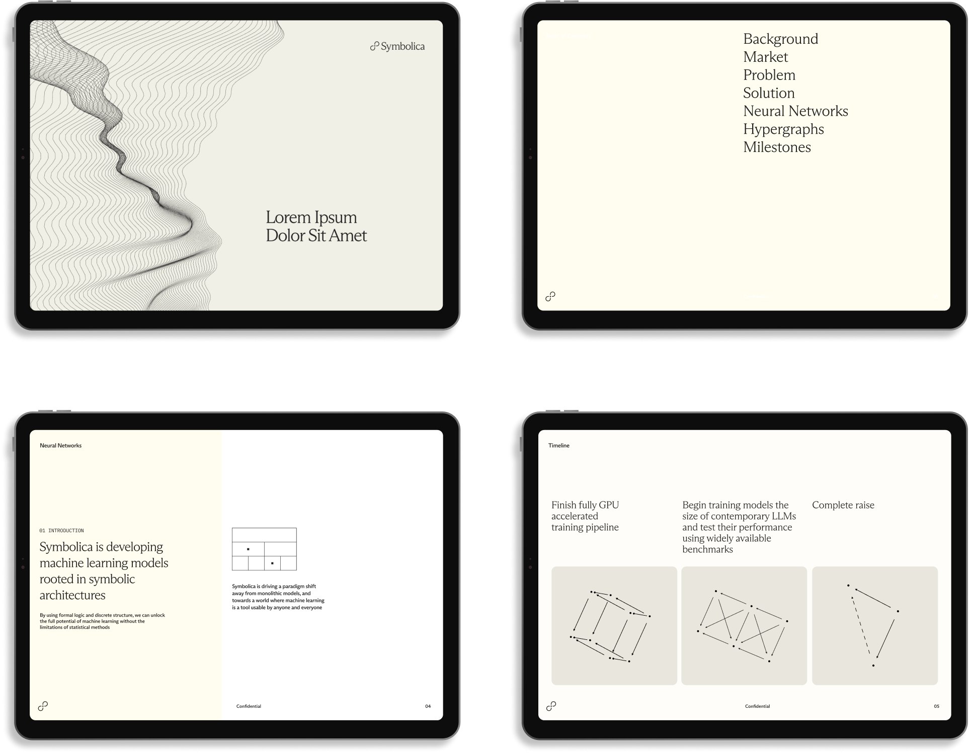
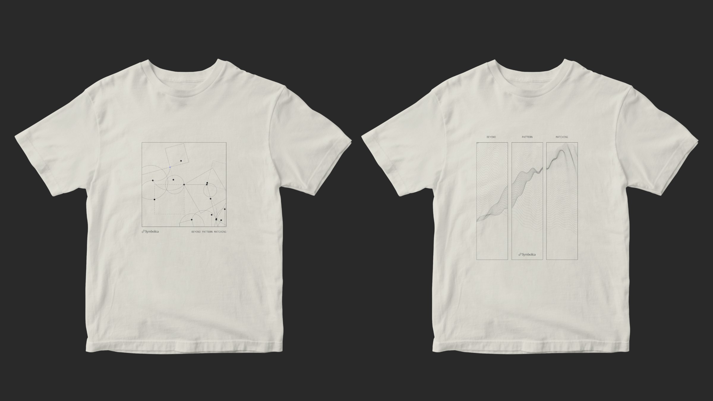
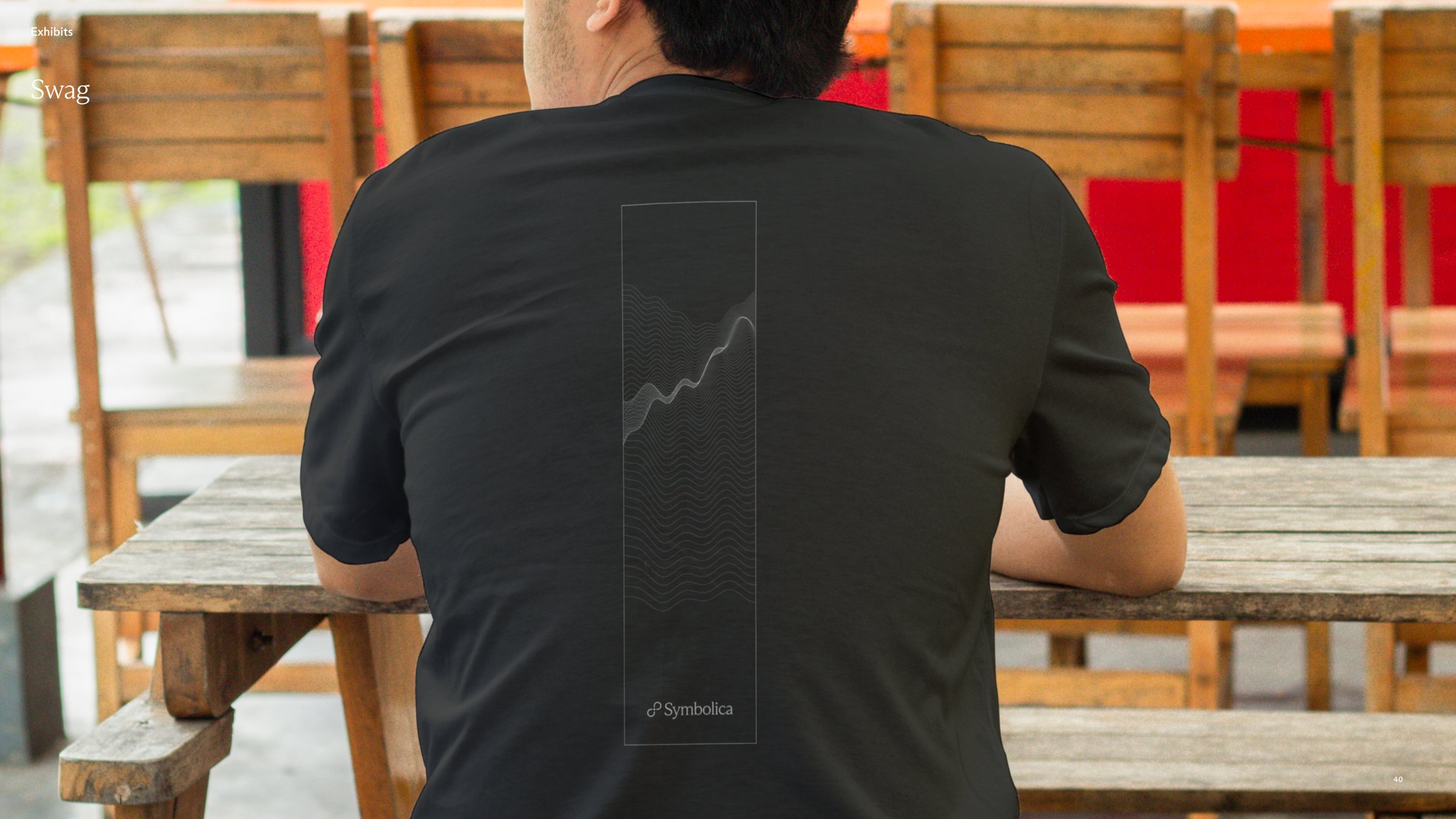
As the first design and brand hire at Symbolica, I shaped an identity that refuses to take part in AI hype design — drawn instead from the mathematics itself. Category theory’s structure, repetition and controlled variation carry the rigor; bespoke illustrations from commutative diagrams bring the research to life; and motion is a living, code-driven system that evolves alongside the work.
View Official Brand Guidelines ↗Beyond pattern matching.
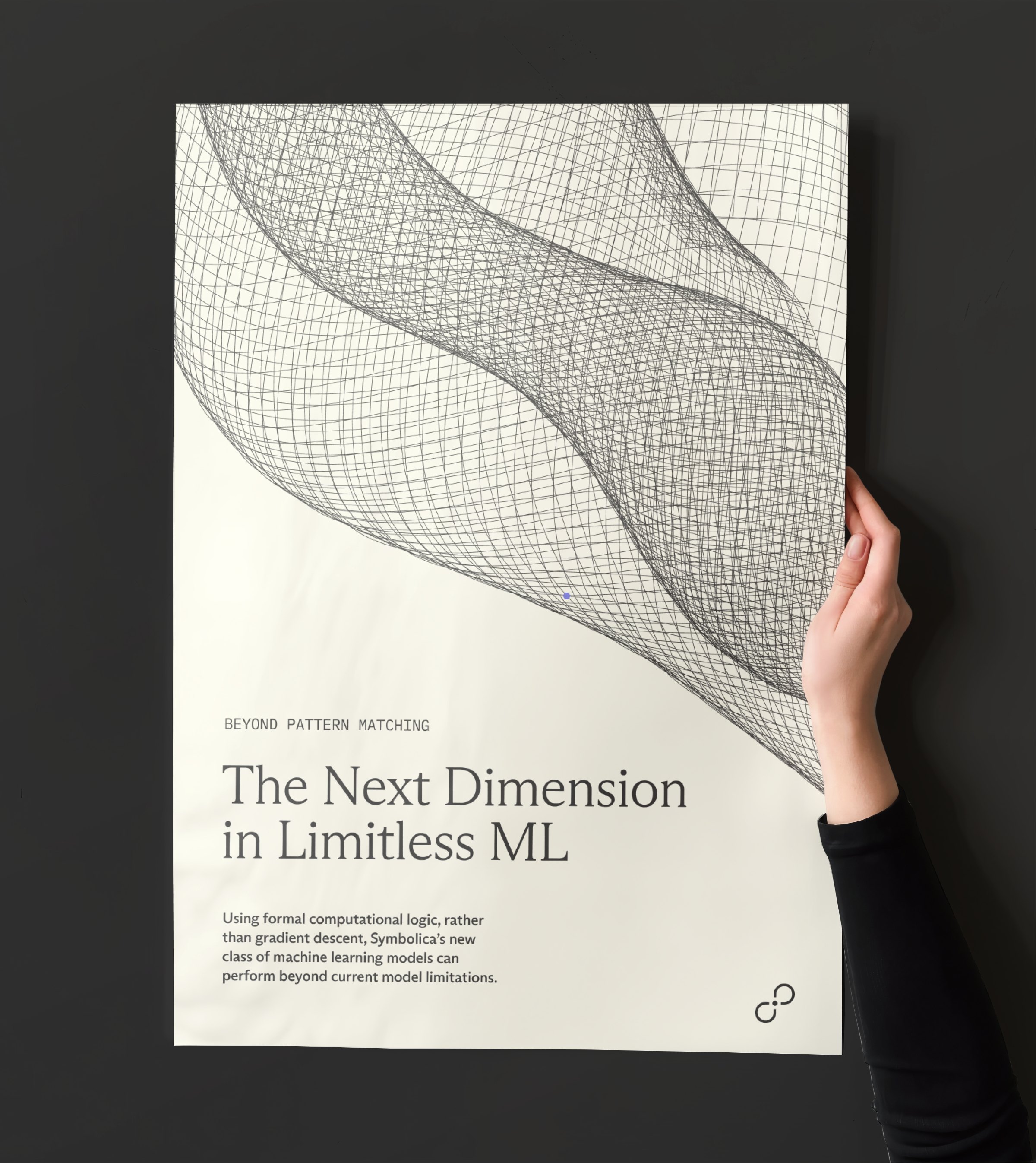
Most models predict the next token. Symbolica builds models that reason over structure — applying category theory to give machines a grammar for thought.
Intelligence, redefined.


Paper, ink & a single periwinkle.
Using formal computational logic, rather than gradient descent, Symbolica's models reason beyond current limitations.
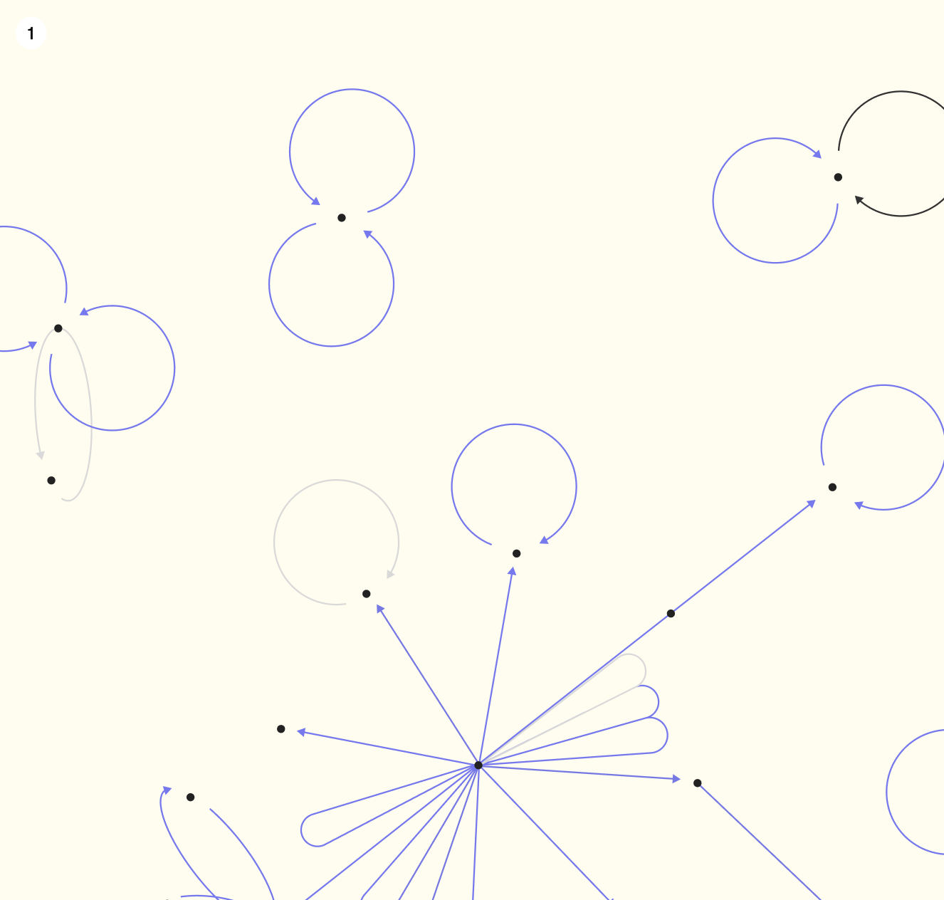
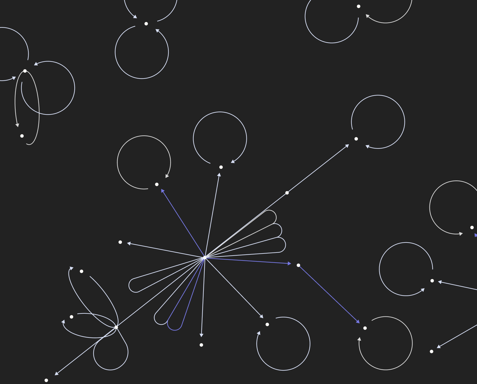
A data point, in motion.
Arrows, self-loops and nodes trace a data point through the learning process — periwinkle as linework, never as a background.
A living motion system.
Real-time generative animations, driven by parameters rather than shipped as fixed assets — a code-driven library that evolves alongside the research.
Play with the asset. Drag the parameters — spawn rate, curvature, frequency — and watch the system render a new variant in real time.
Play with the asset ↗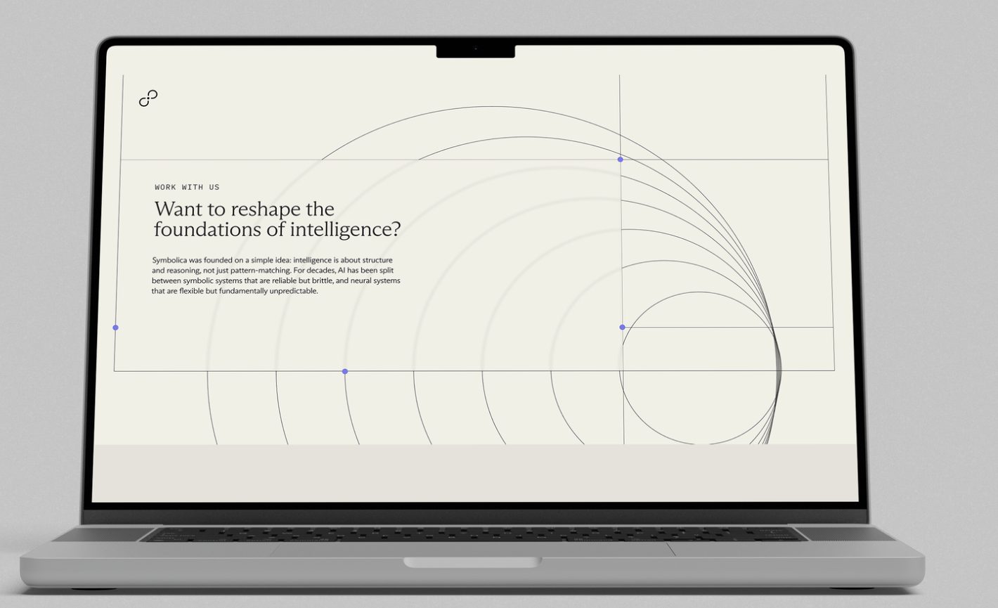
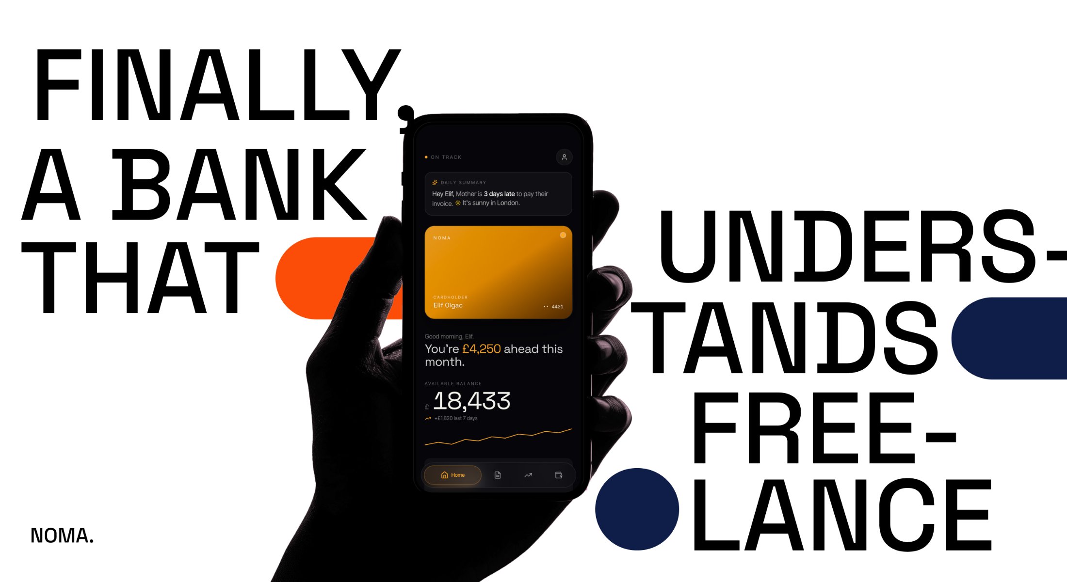
NOMA.
I was asked one day to brainstorm ideas for a neo-bank for freelancers. I brought it to life as a self-initiated project.
NOMA.
I was asked one day to brainstorm ideas for a neo-bank for freelancers. I brought it to life as a self-initiated project.
NOMA is the result. A bank with a backbone, for people whose money arrives in fragments. Built for freelancers, to manage late payers and side projects: a place where invoices, taxes and slow weeks get the same respect as a salary.
one app.
everything money
Banking, invoicing, cashflow and tax, designed for independent creatives.
they make the things
everyone else screenshots.
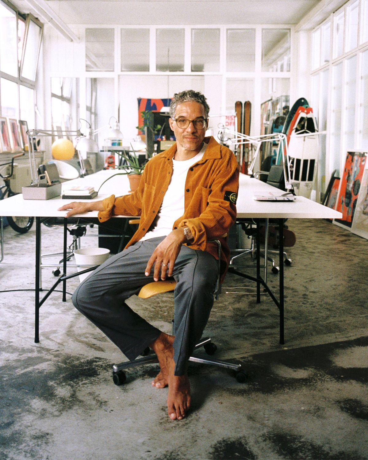
Musicians, videographers, producers, makeup artists, designers. People who spend their days making the work the rest of us save to a moodboard. None of them got into it to chase invoices buried three folders deep in an inbox. NOMA does that part, then gets out of the way.
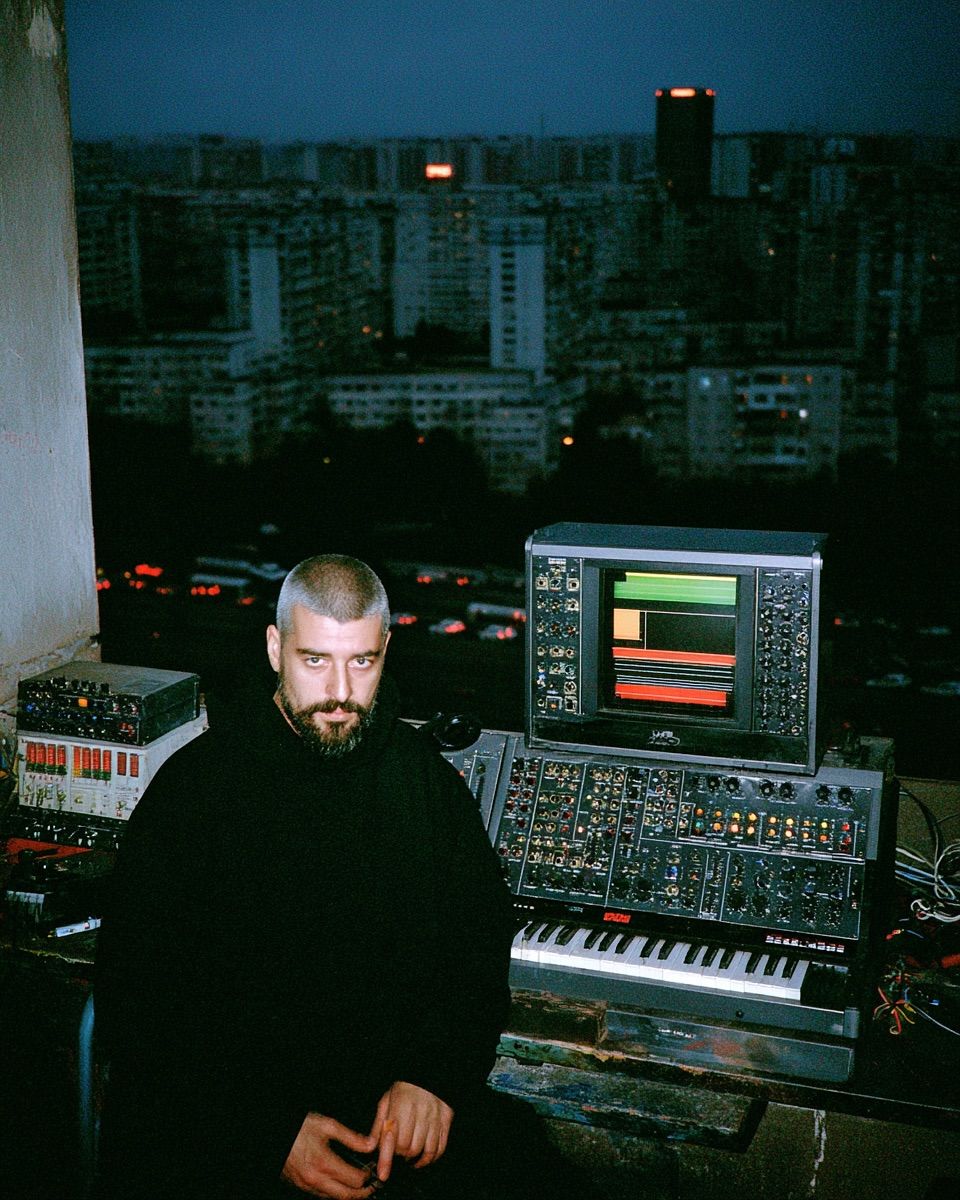
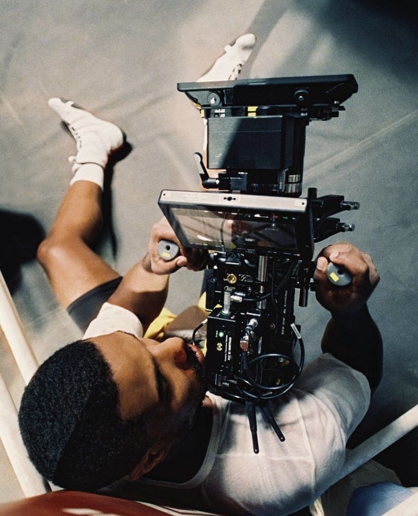
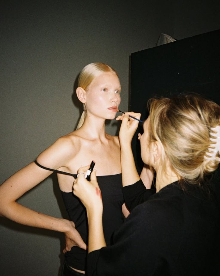
features first,
belief later
The marketing opens on the product, then turns to the story as NOMA grows. Same bank, a louder reason to care.
the features
Campaigns and ads about what it does, and the problem it takes off your plate.
the belief
Who it's for, what this world stands for, and what it refuses to do.
calm where others shout.
precise where others fudge.
warm where others freeze.
a bank
that listens.
creatives, mid-work
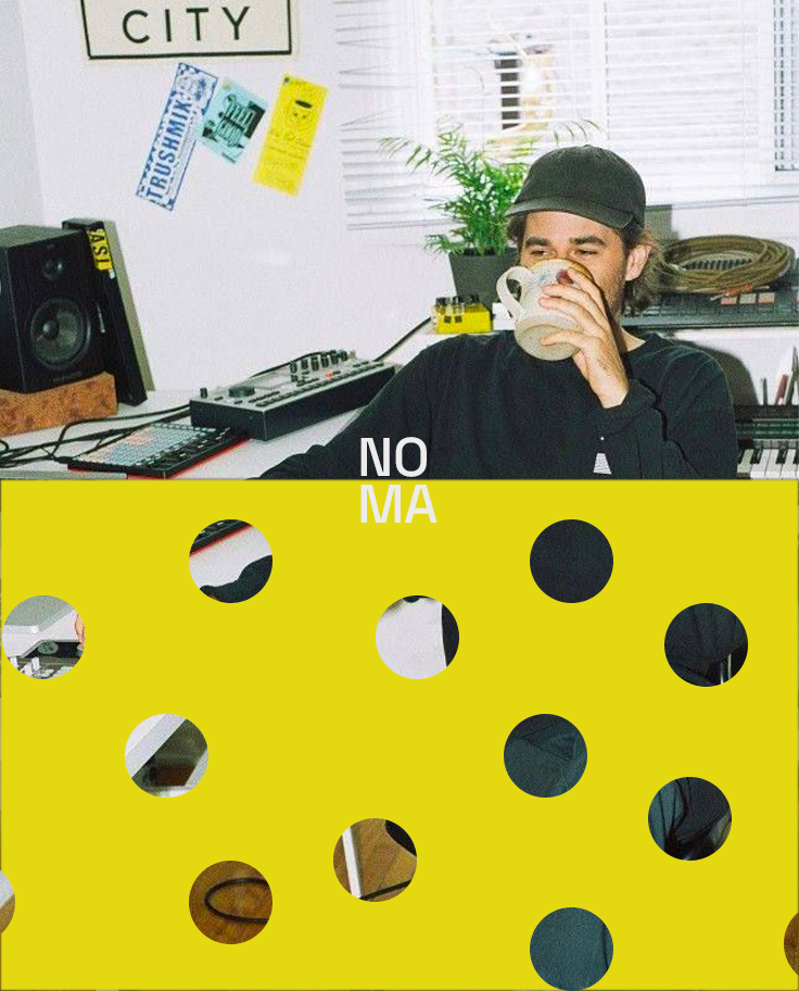
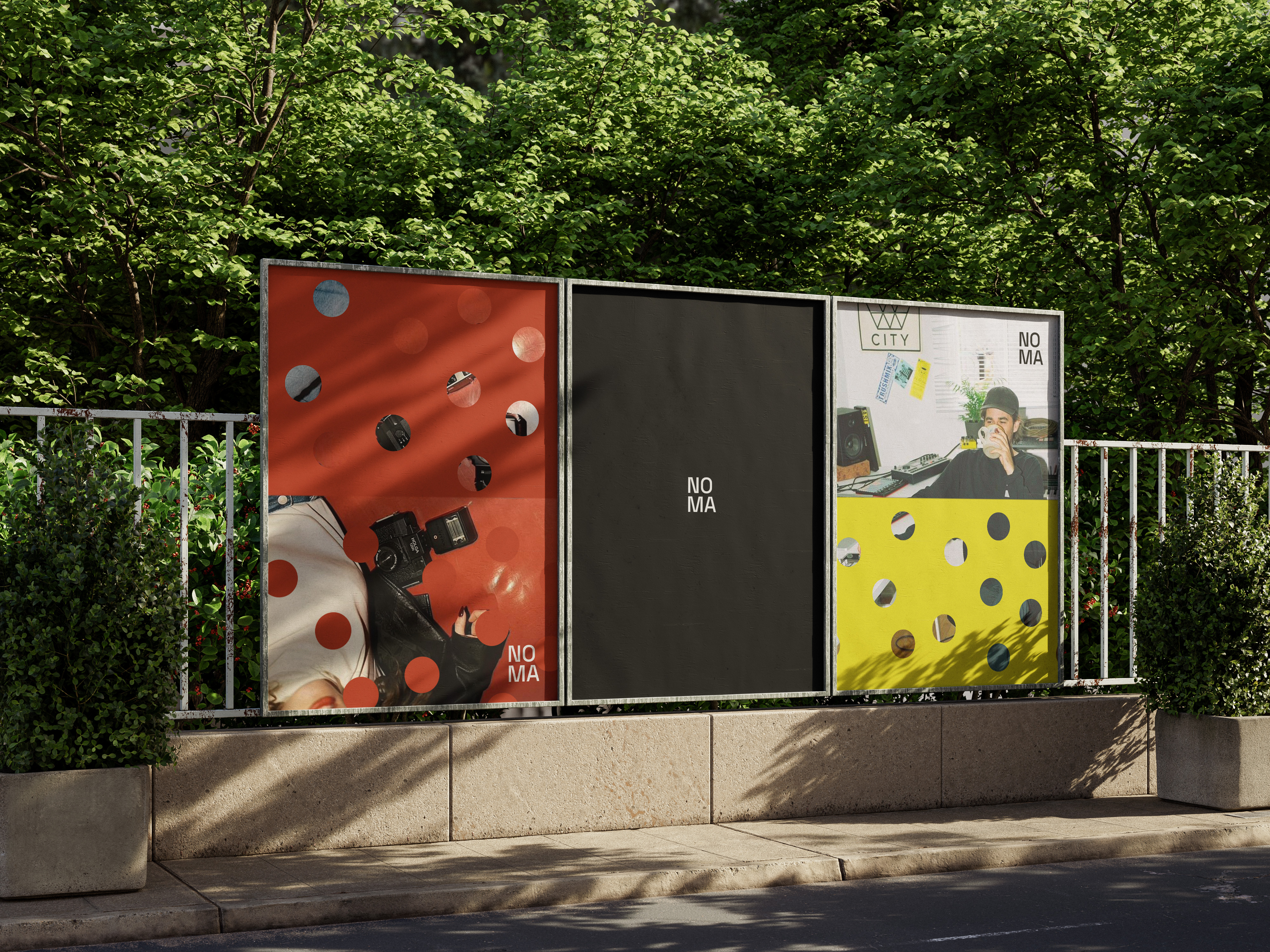
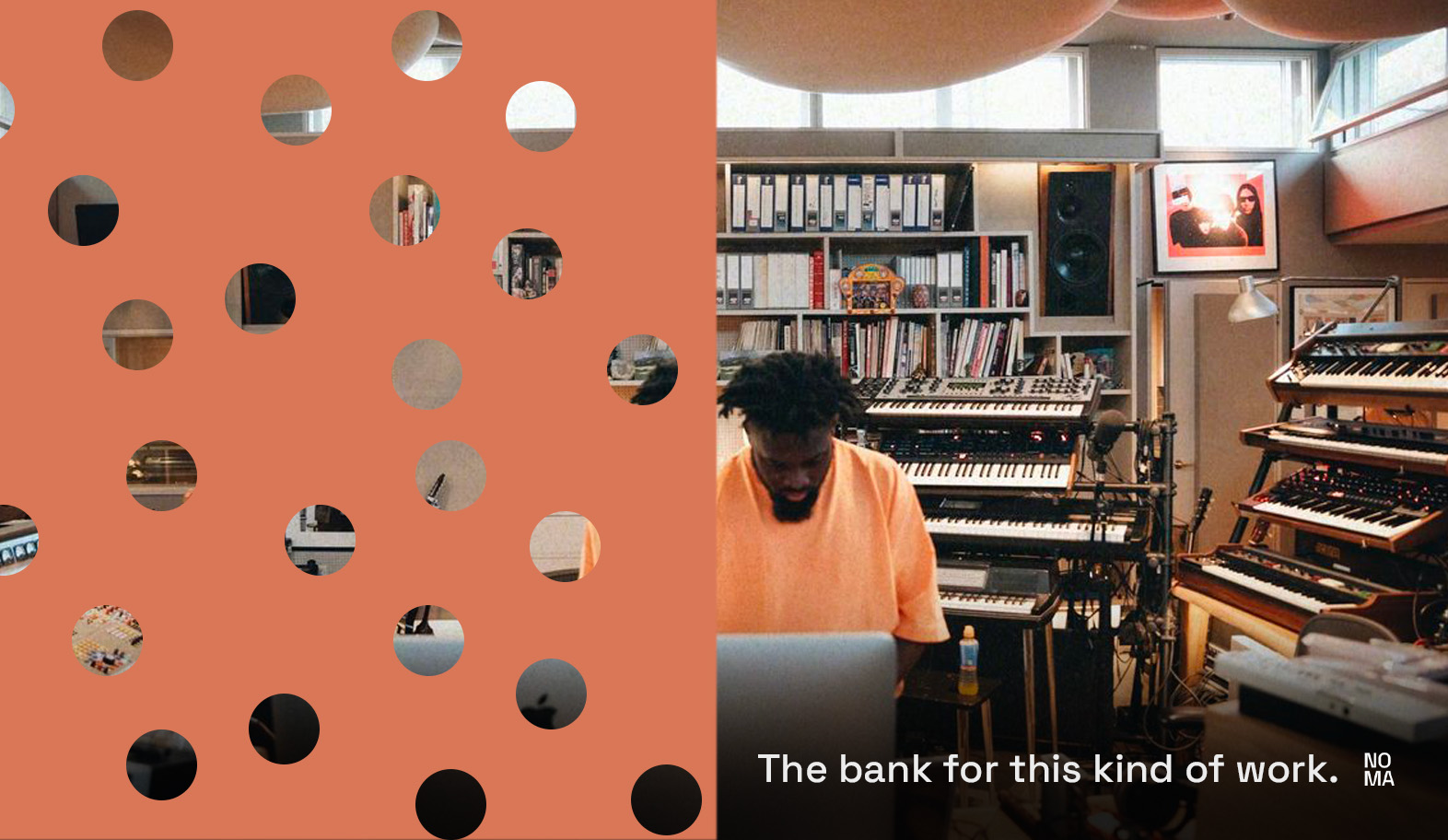
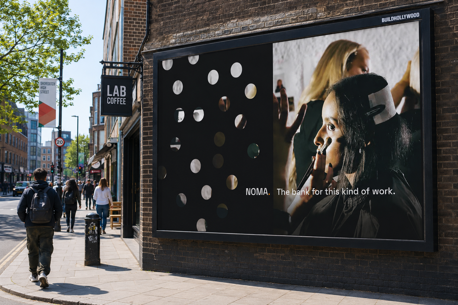
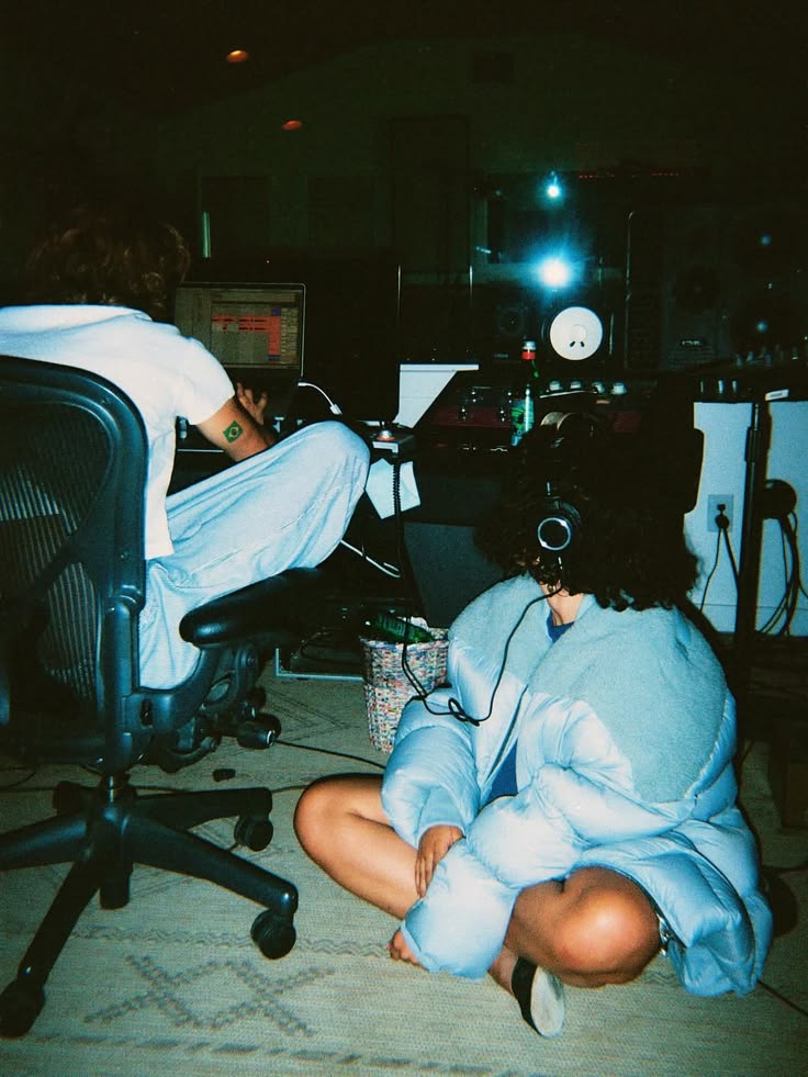
Photographers, producers, studios, shot honestly in the rooms where the work happens. Real desks, real gear, real mess. Over every frame sits the brand polka dot: the circle lifted straight from the orbit mark, punched through the image so the work and the mark become one.
yes, it's clever.
How else would it read your inbox, pull the invoices and track exactly who's paid? NOMA handles the admin in the background. You just get the result. Draw your own conclusions.
Every payment in and cost out, tracked the moment it lands.
A salary you can actually afford each month, worked out from the money in and out, then paid to you.
Build an invoice and send it to your client in a single tap.
from hours
to paid
Set your rate, your hours, your days. NOMA does the maths and sends a clean invoice to your client in a single tap.
a salary,
worked out for you
NOMA auto-calculates what you can safely pay yourself each month, from the money coming in and the money going out. Send it to whichever account you like, or keep it in NOMA and spend straight from here.
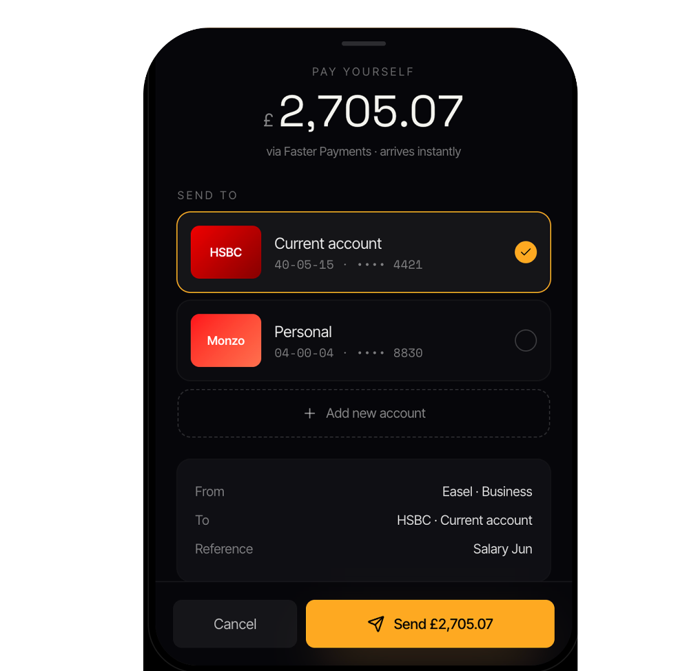
your card,
your face
For your card, you choose what goes on it: a piece of your own work, or a single quiet colour. NOMA encourages you to wear your craft. Matte ink, a tangerine edge, tabular numerals.
The orbit mark. One dot, one steady orbit. One account that keeps everything turning.
Tabular figures, always. Money should never dance.
one dot, lifted from the wordmark and set into orbit, the same circle that punches through every NOMA image. the mark and the pattern are one object.
the orbit.
lockup
MA.
· squared
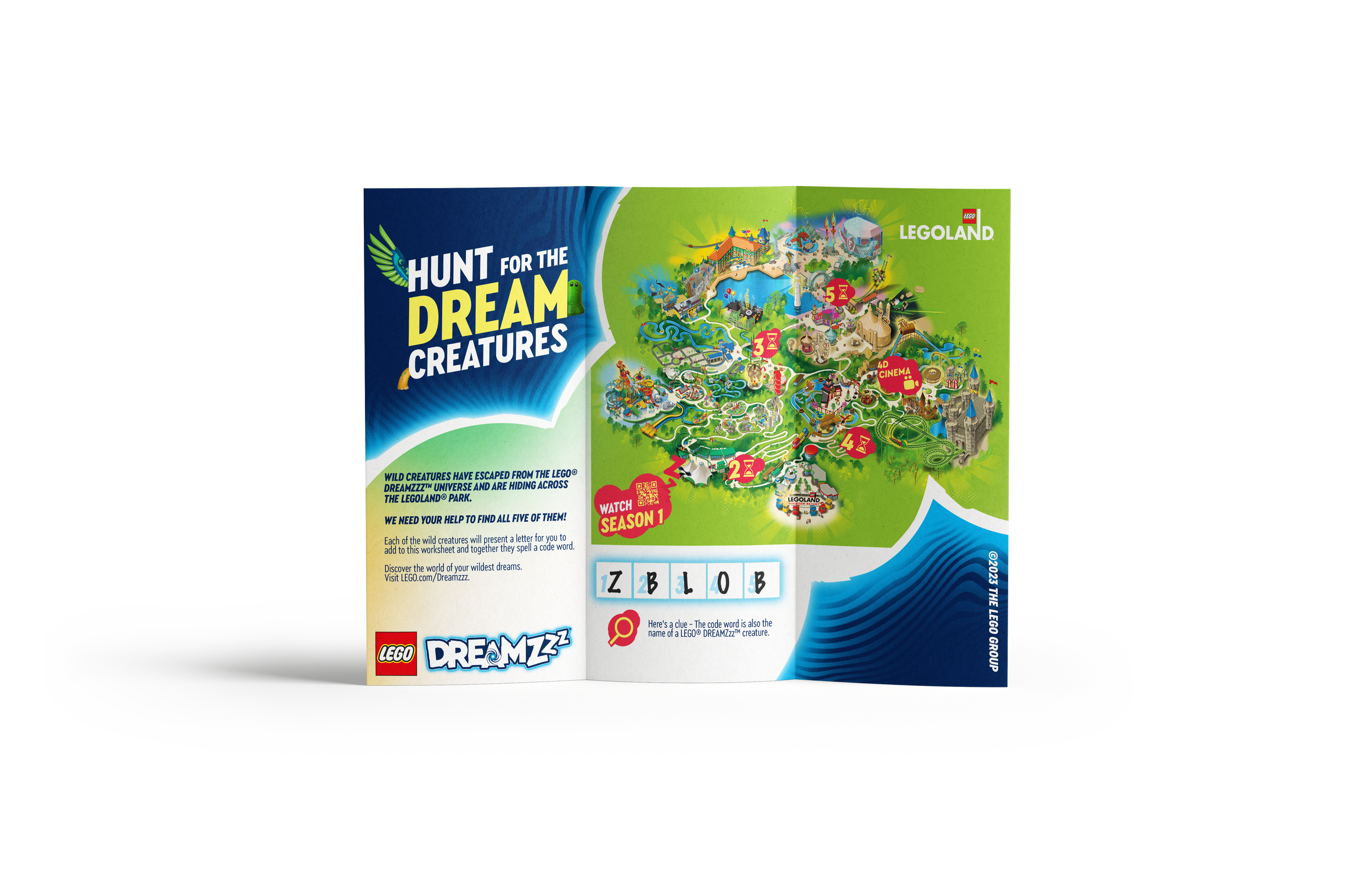
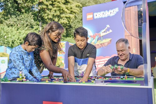
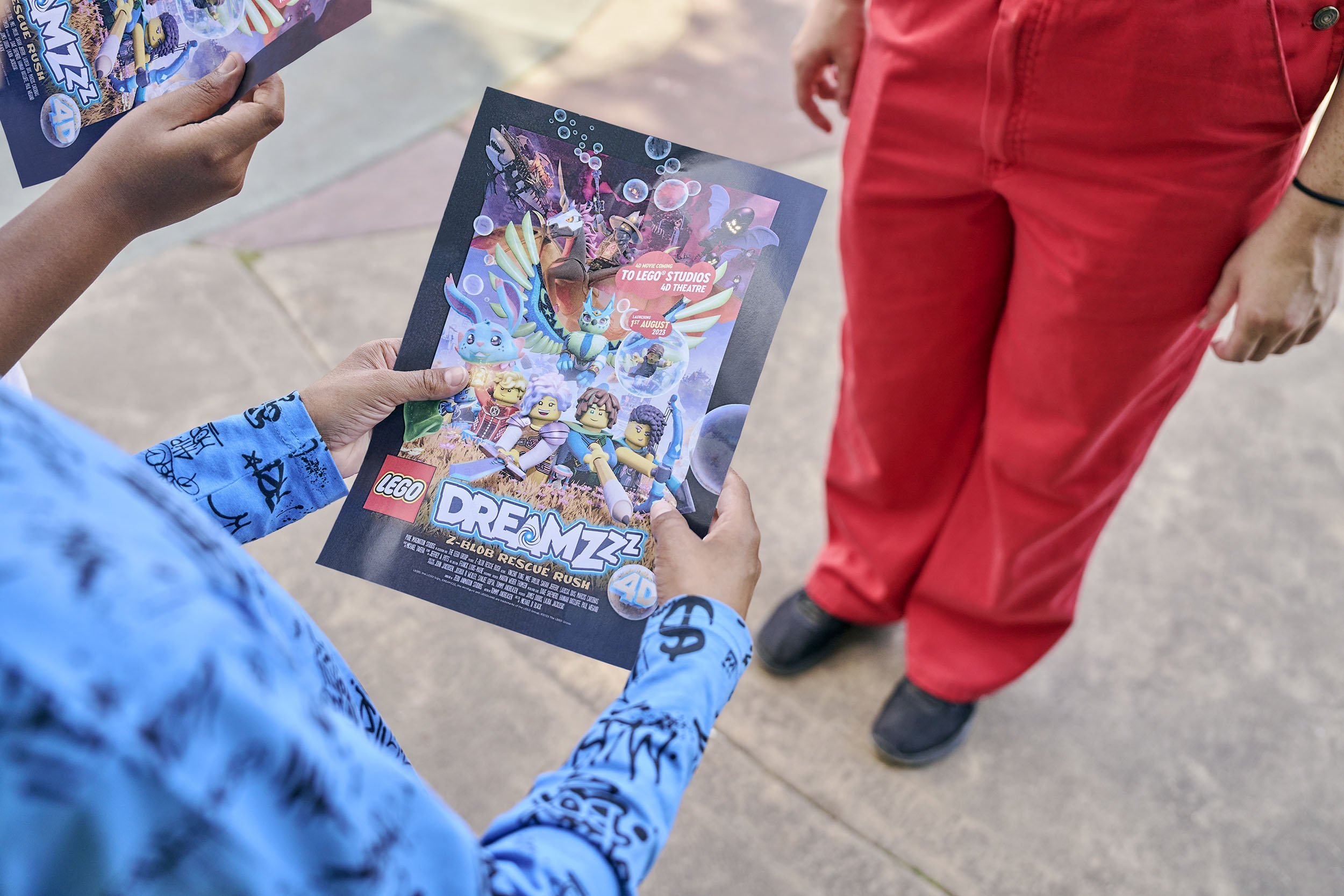
LEGO DREAMZzz
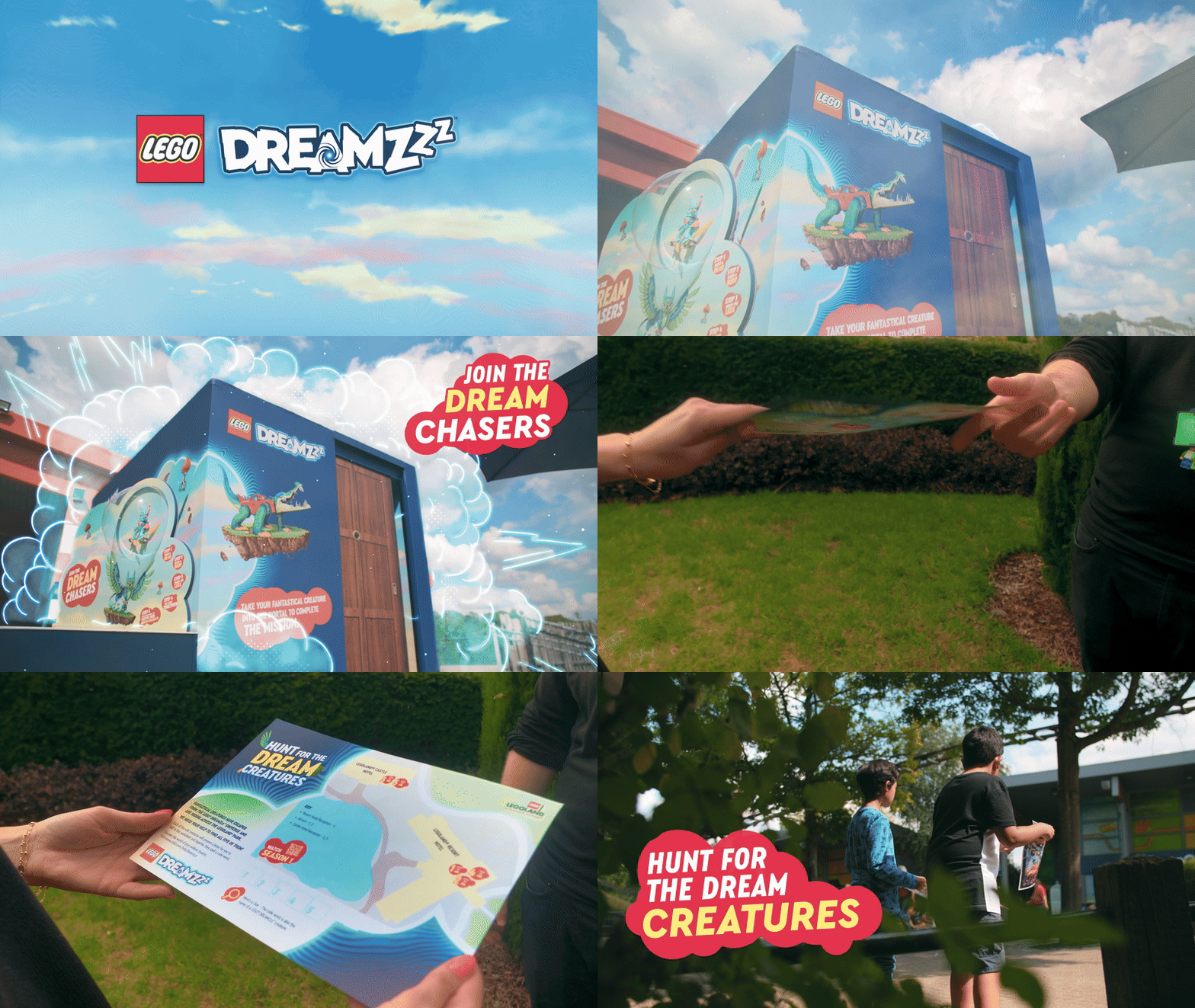
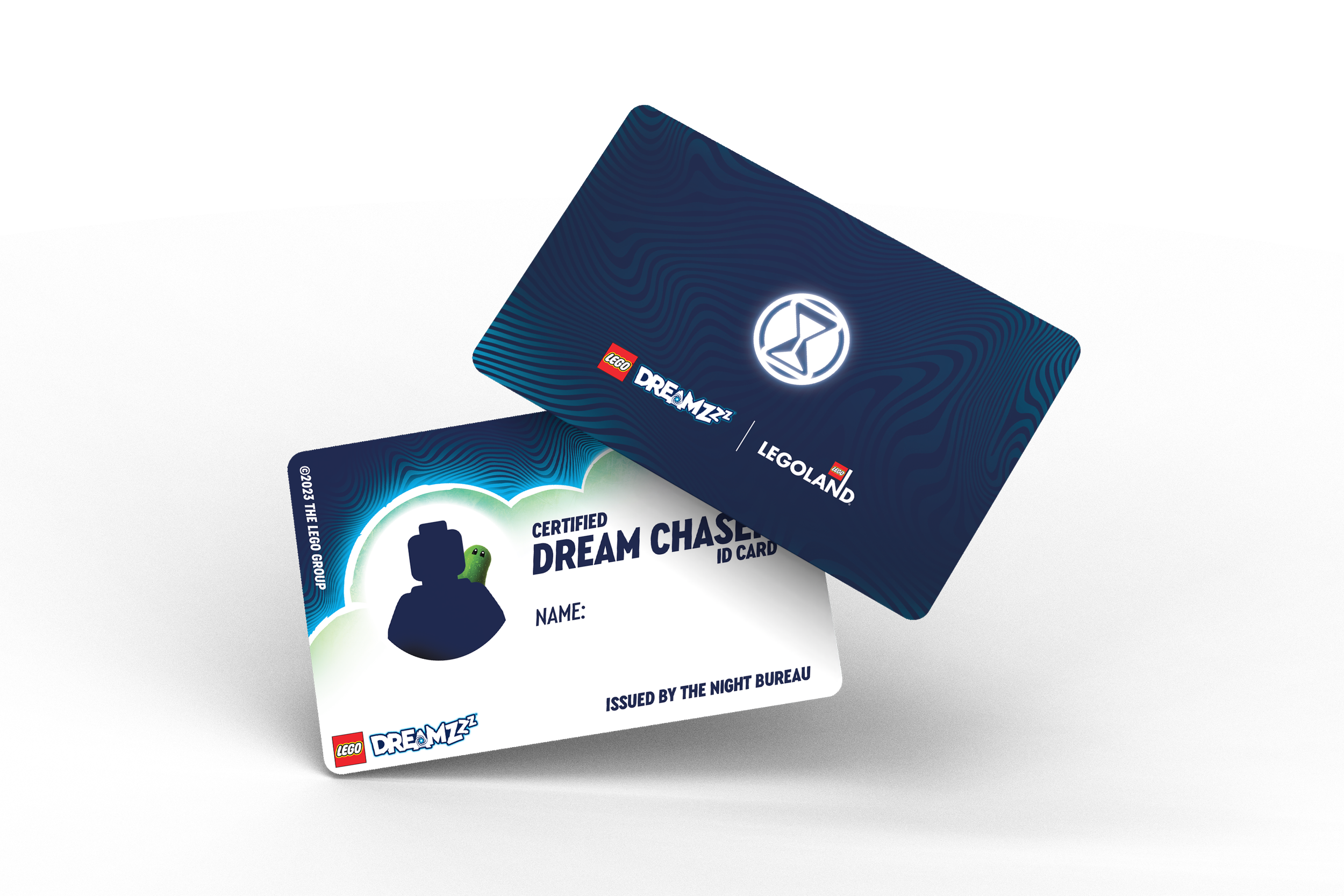
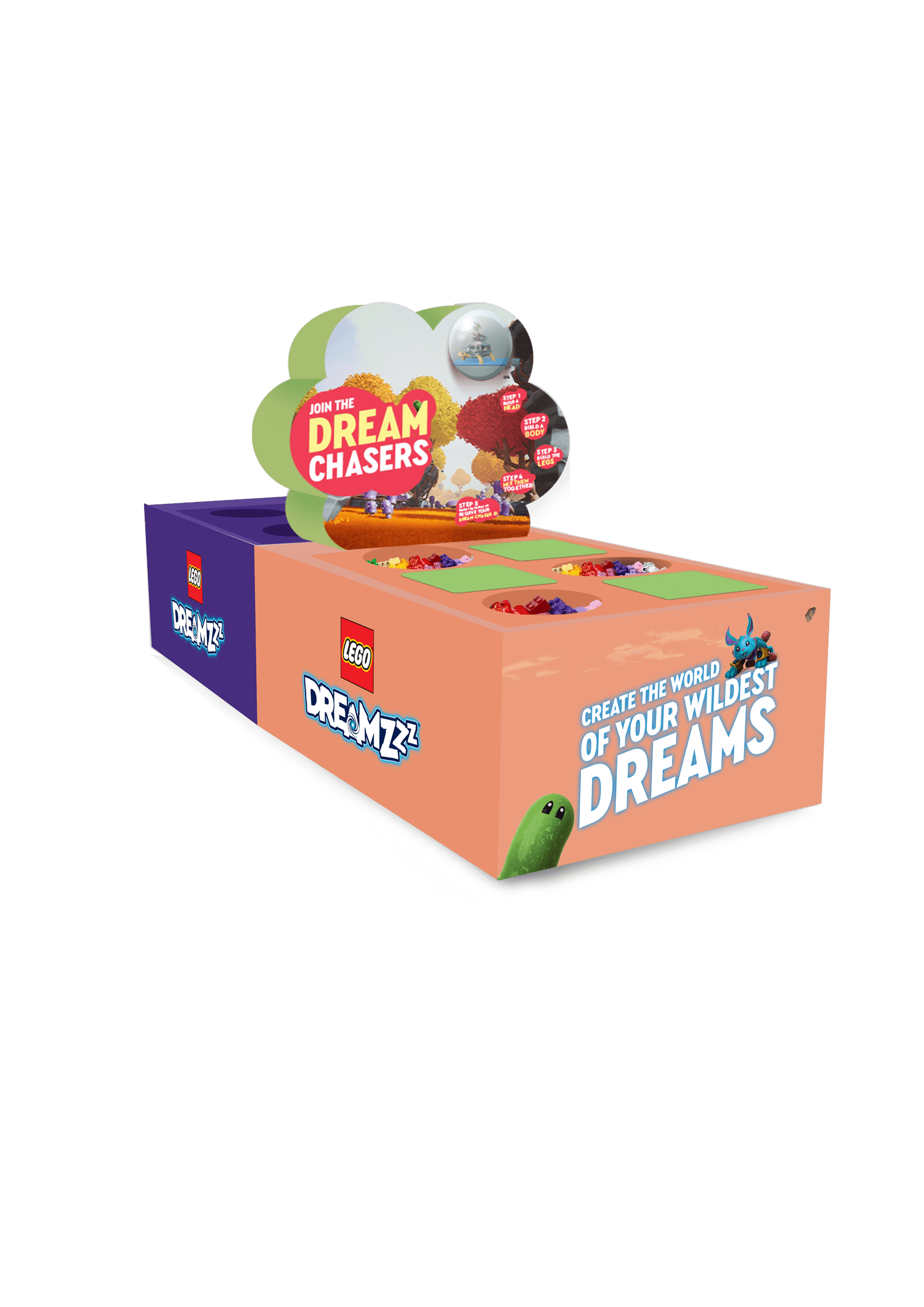
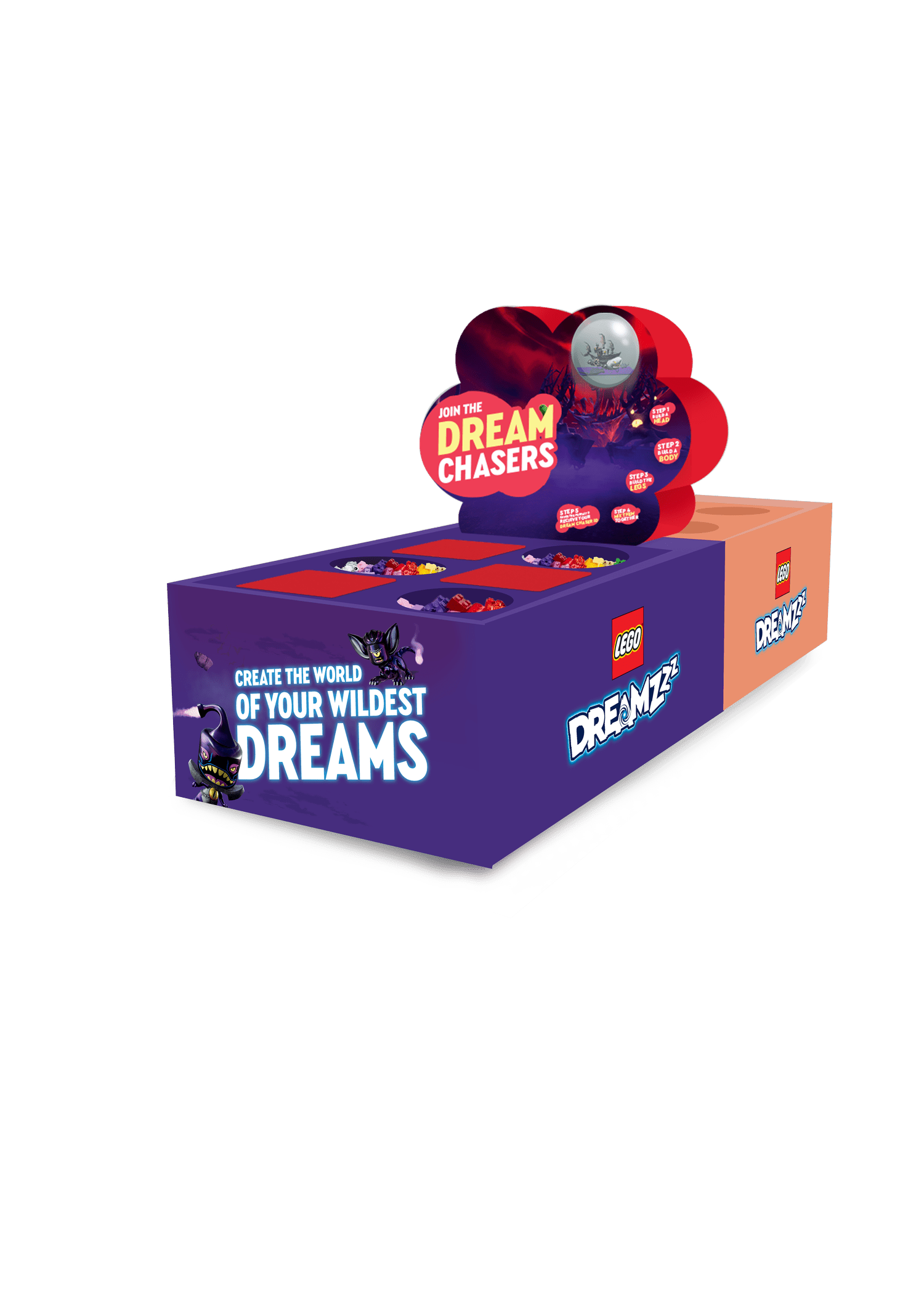
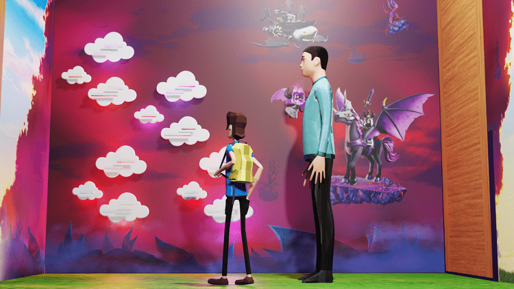
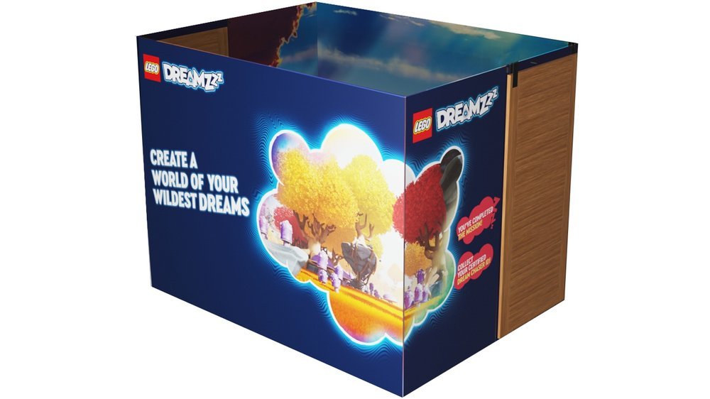
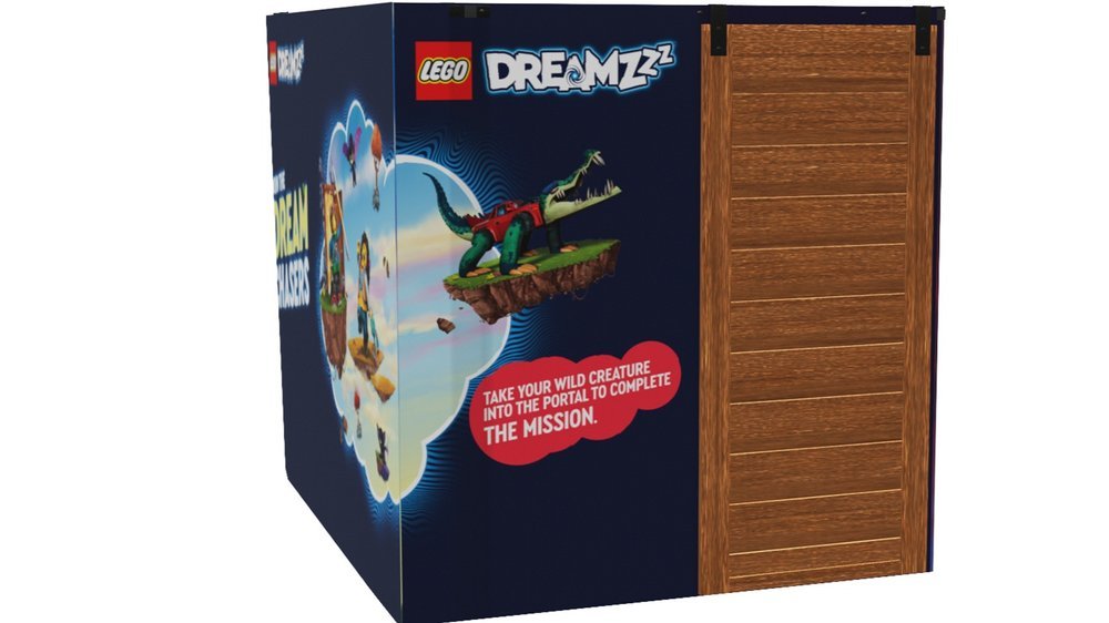
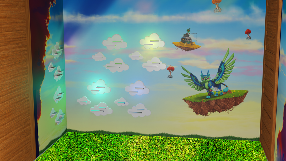
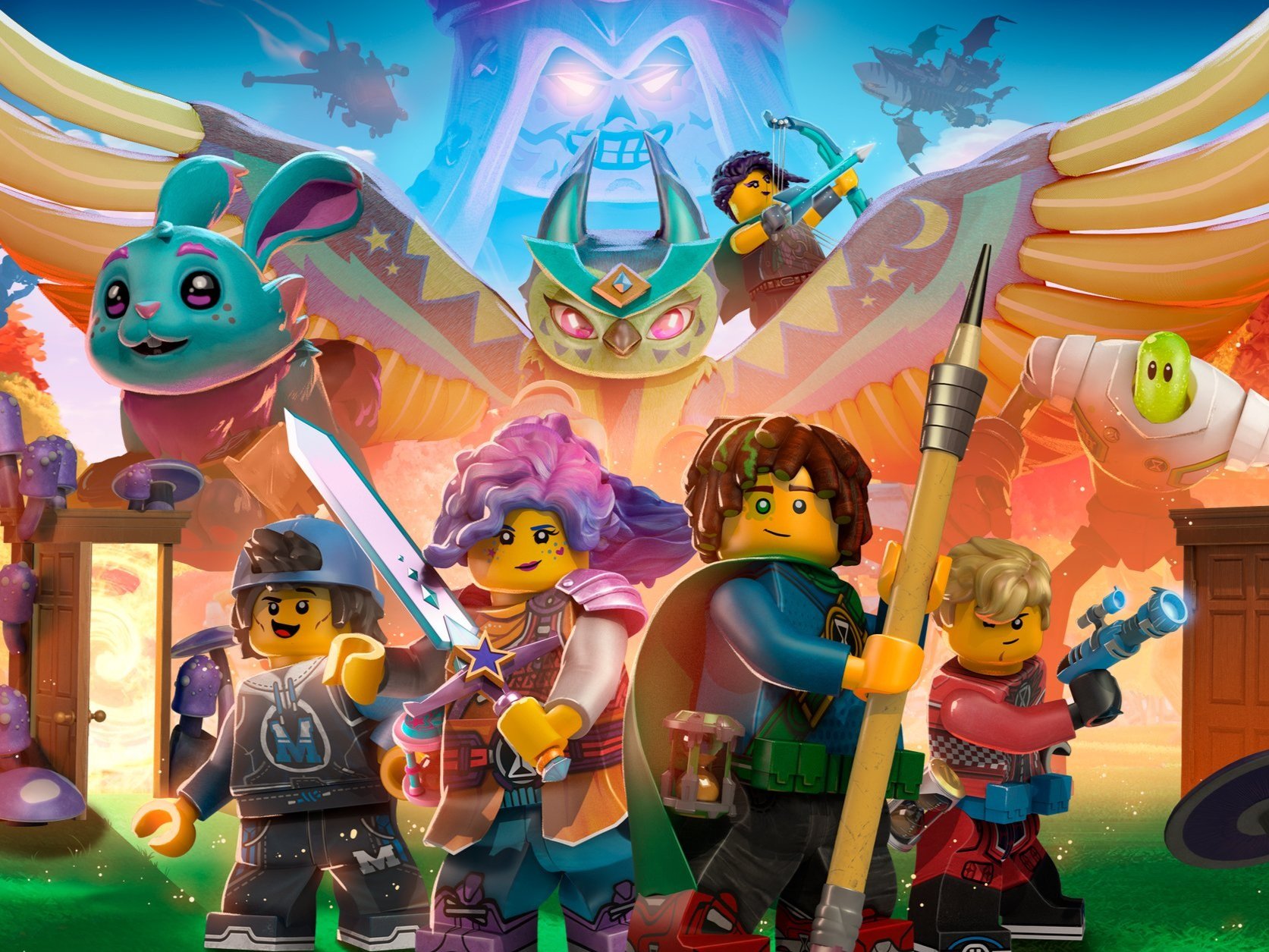
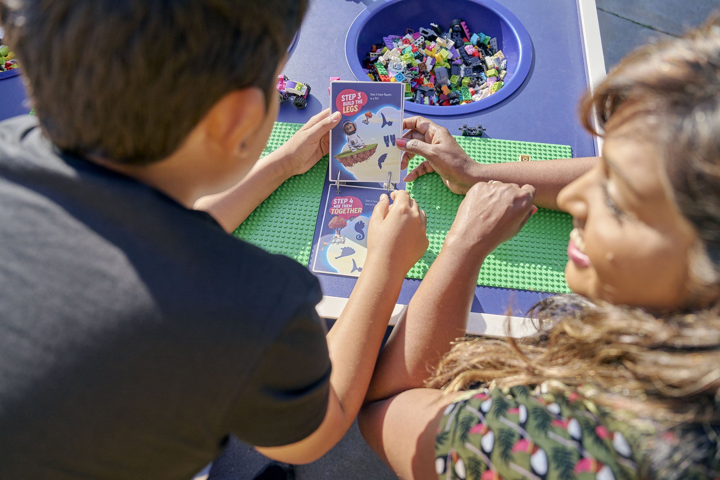
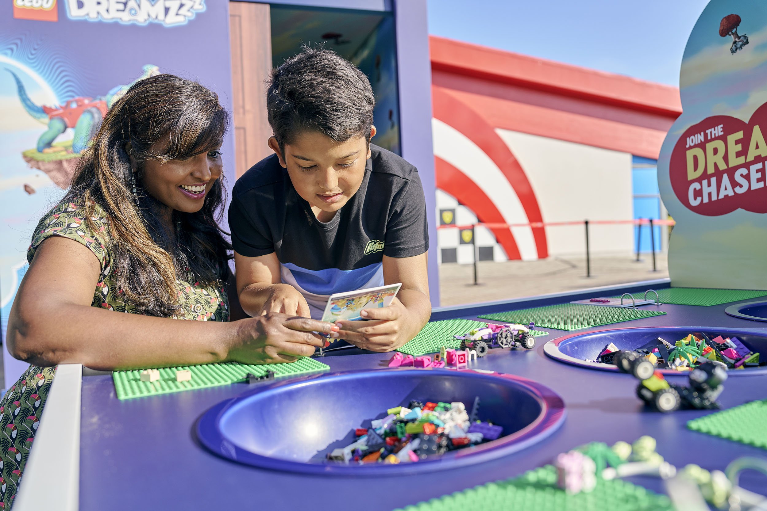
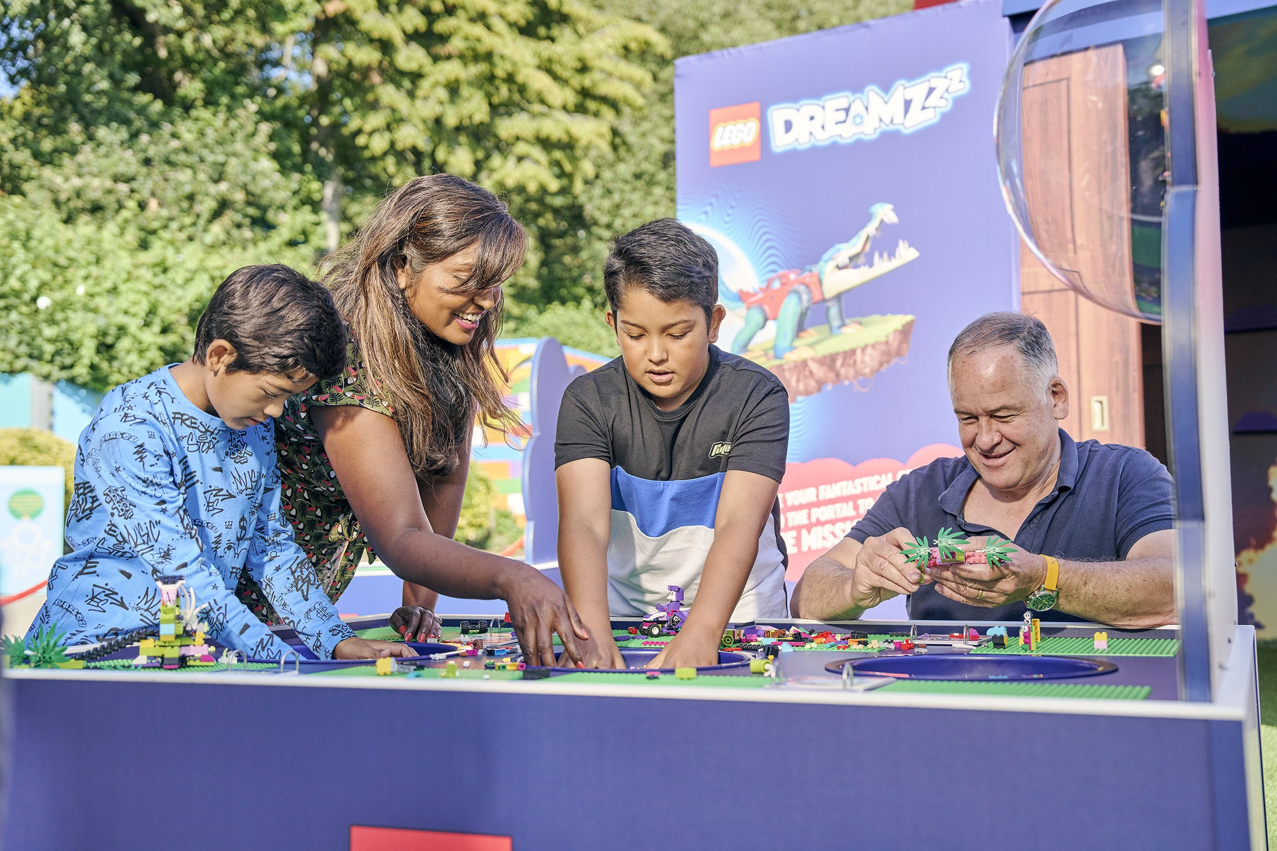
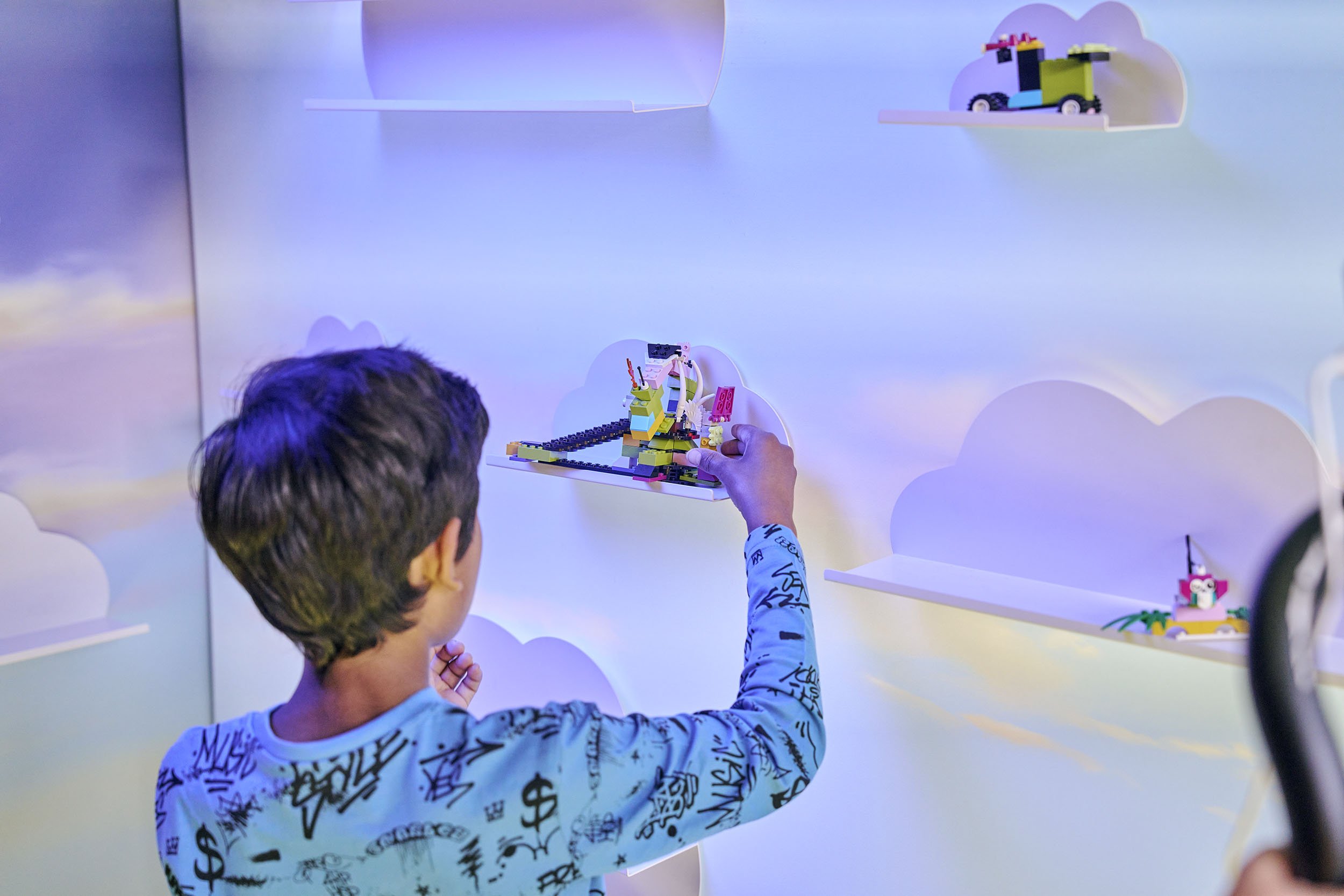
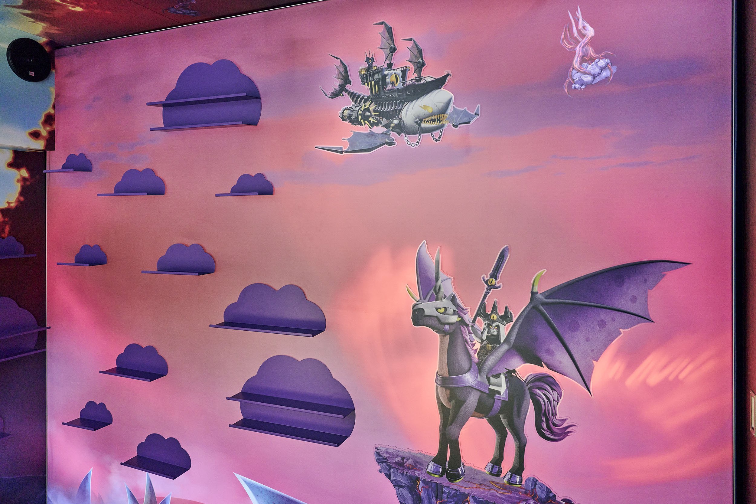
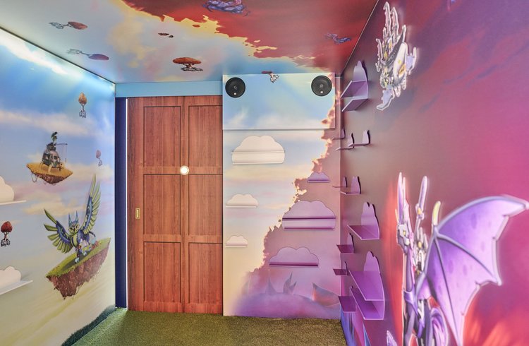
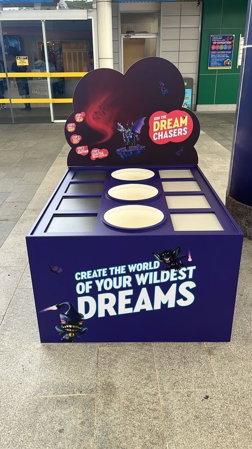
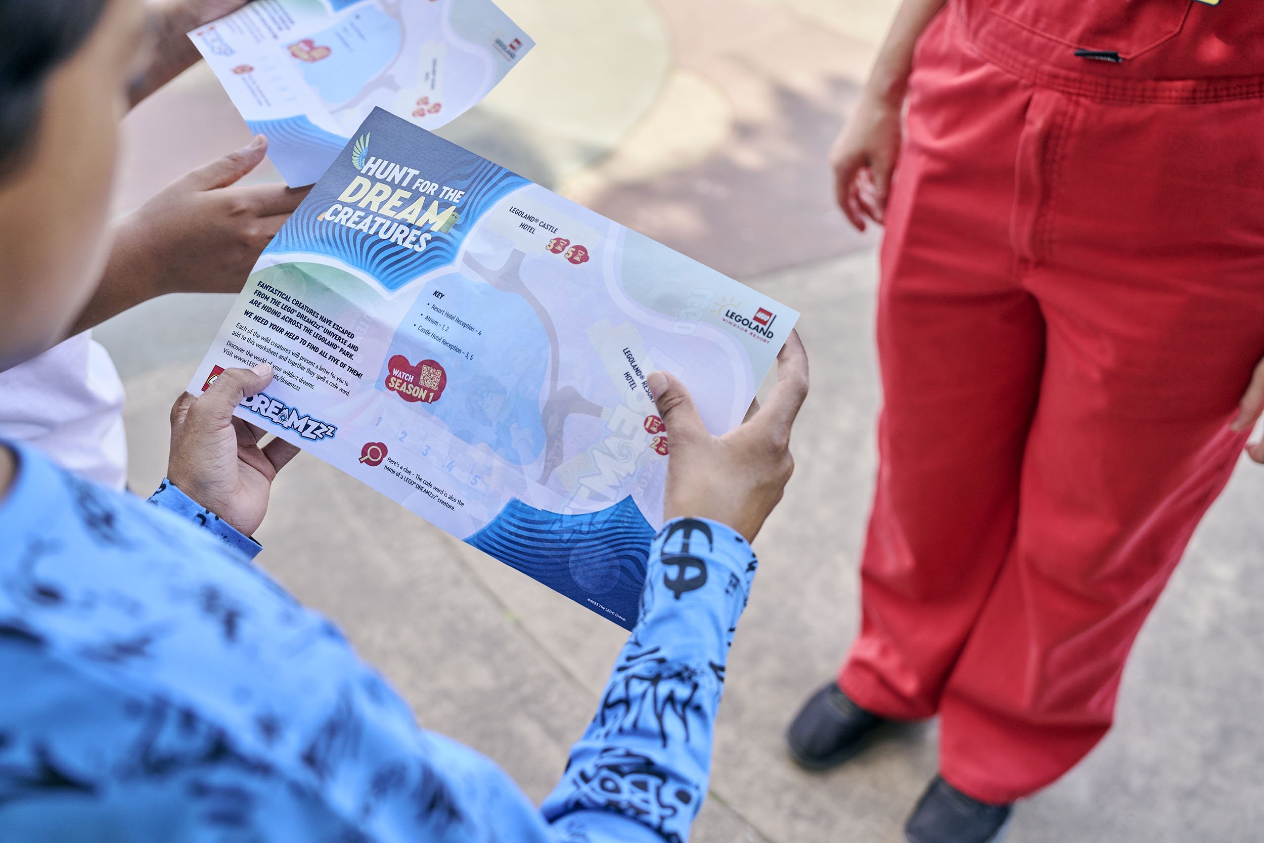
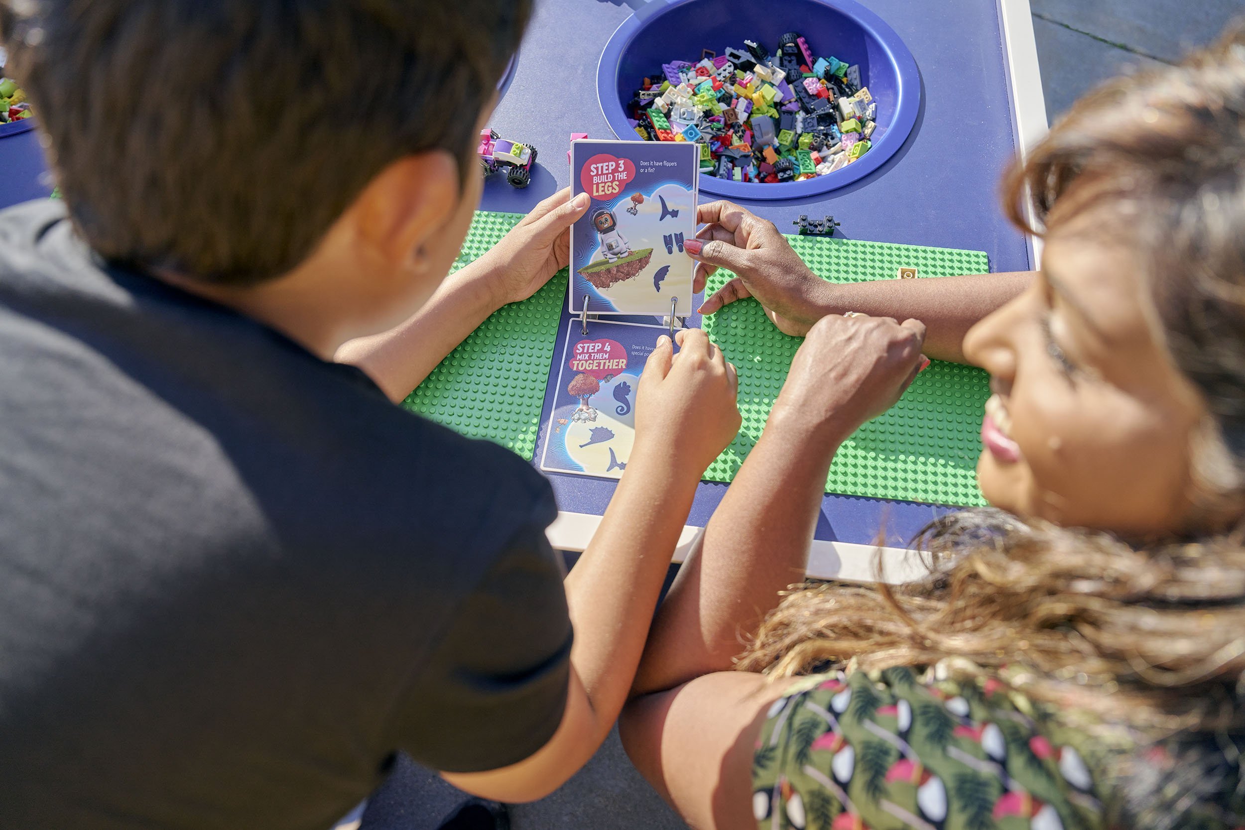
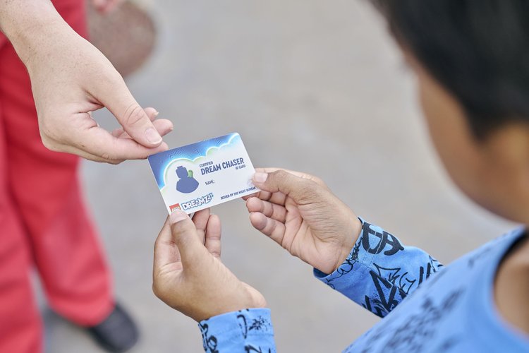
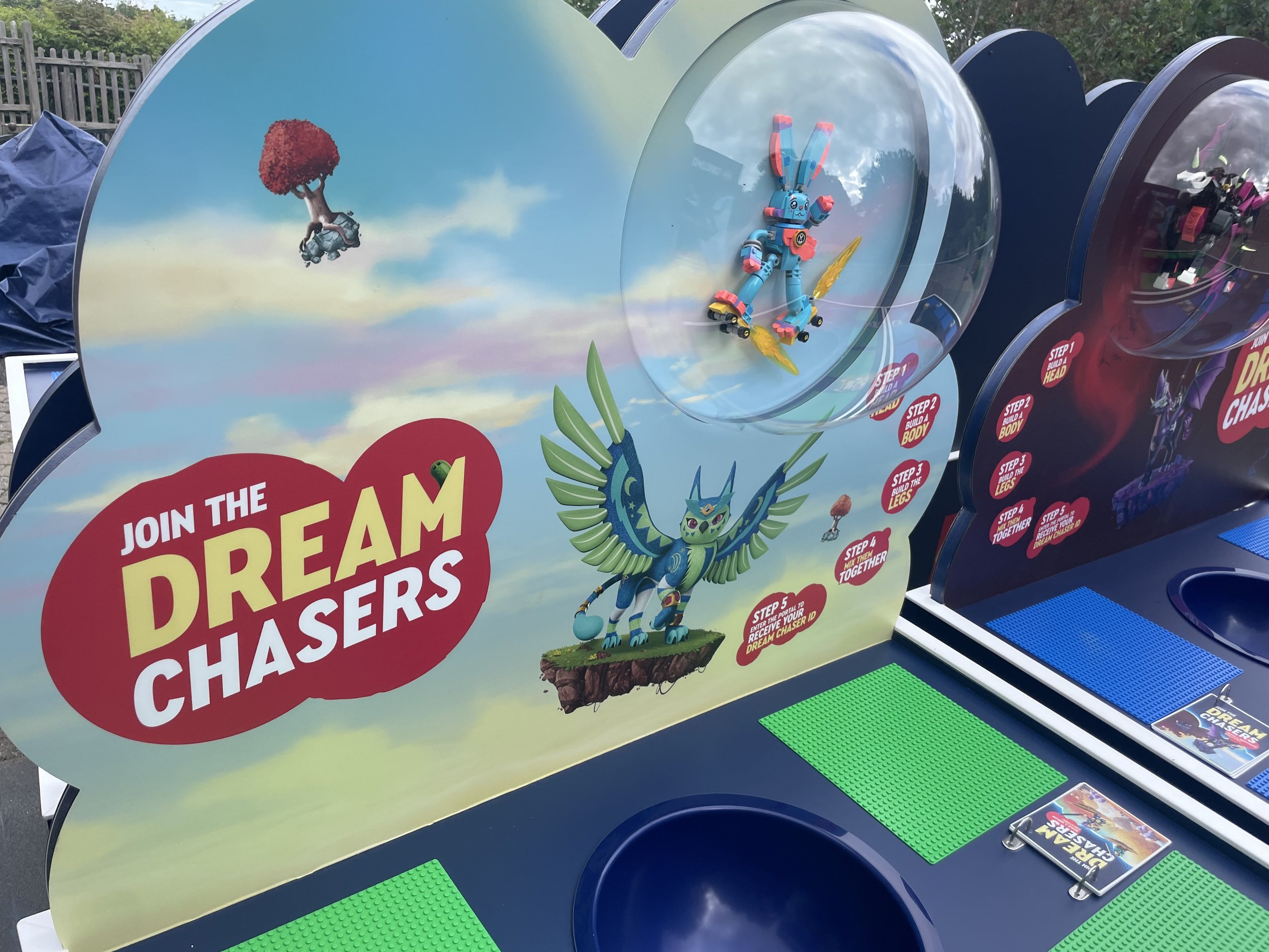
LEGO Dreamzzz is an experiential installation across every LEGOLAND theme park worldwide, letting children build and explore dream worlds using LEGO bricks.
I was lead designer on the project. I developed the concept, created the spatial design and 3D plans, briefed the animation and production teams, managed print and material procurement, and coordinated the global rollout across all LEGOLAND parks to ensure consistency at every location.
The EMEA rollout led to a US expansion across the Florida and California parks.
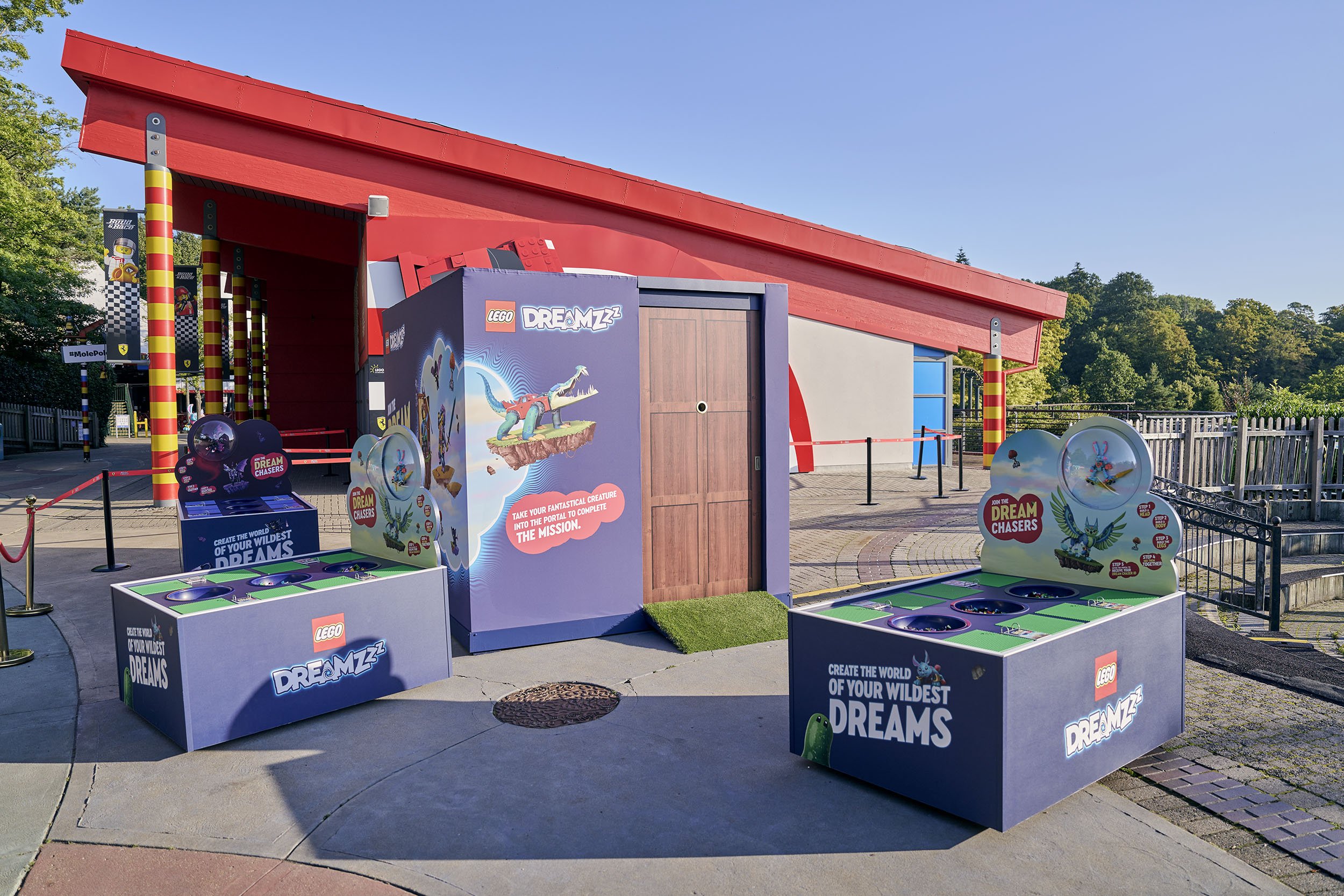
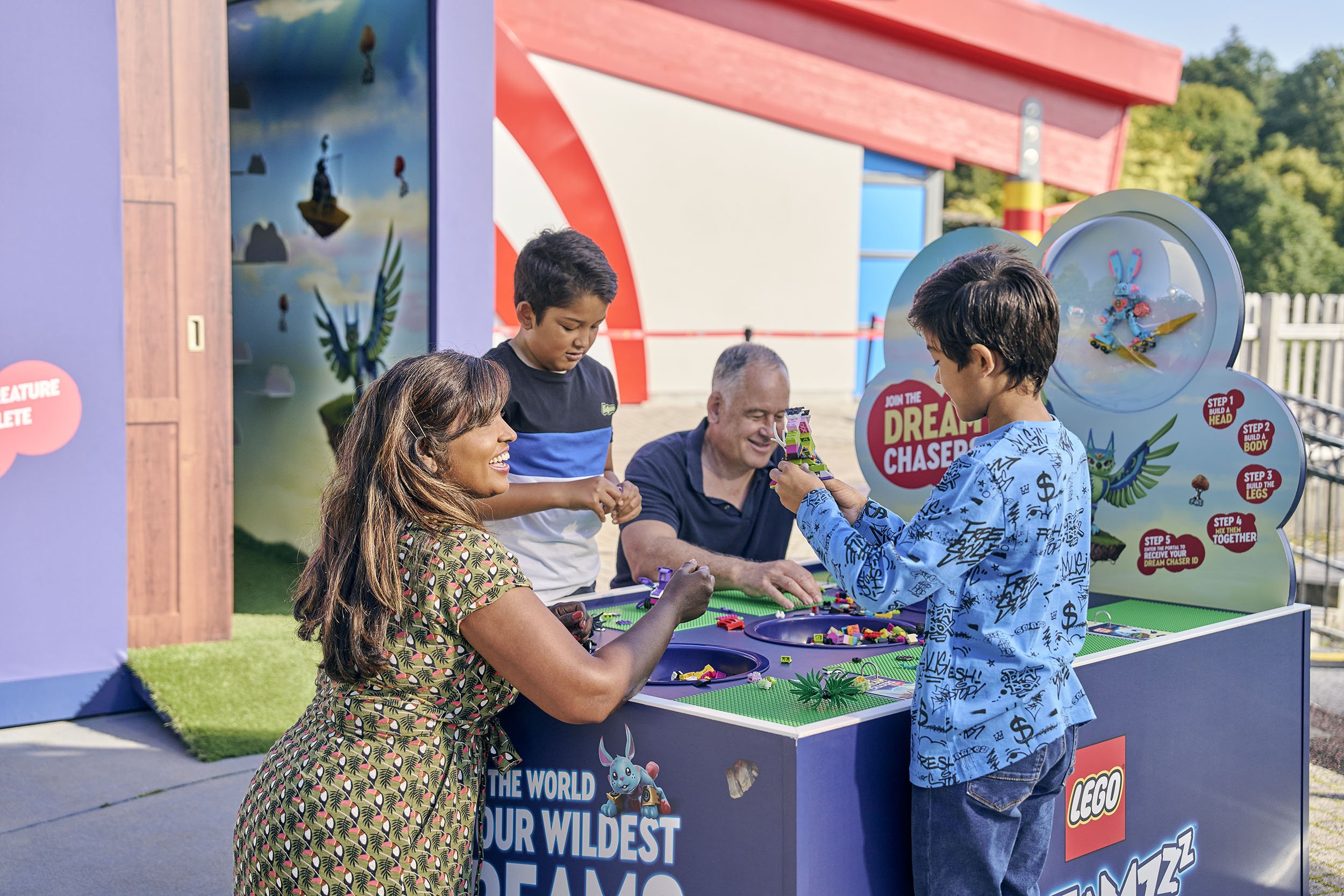

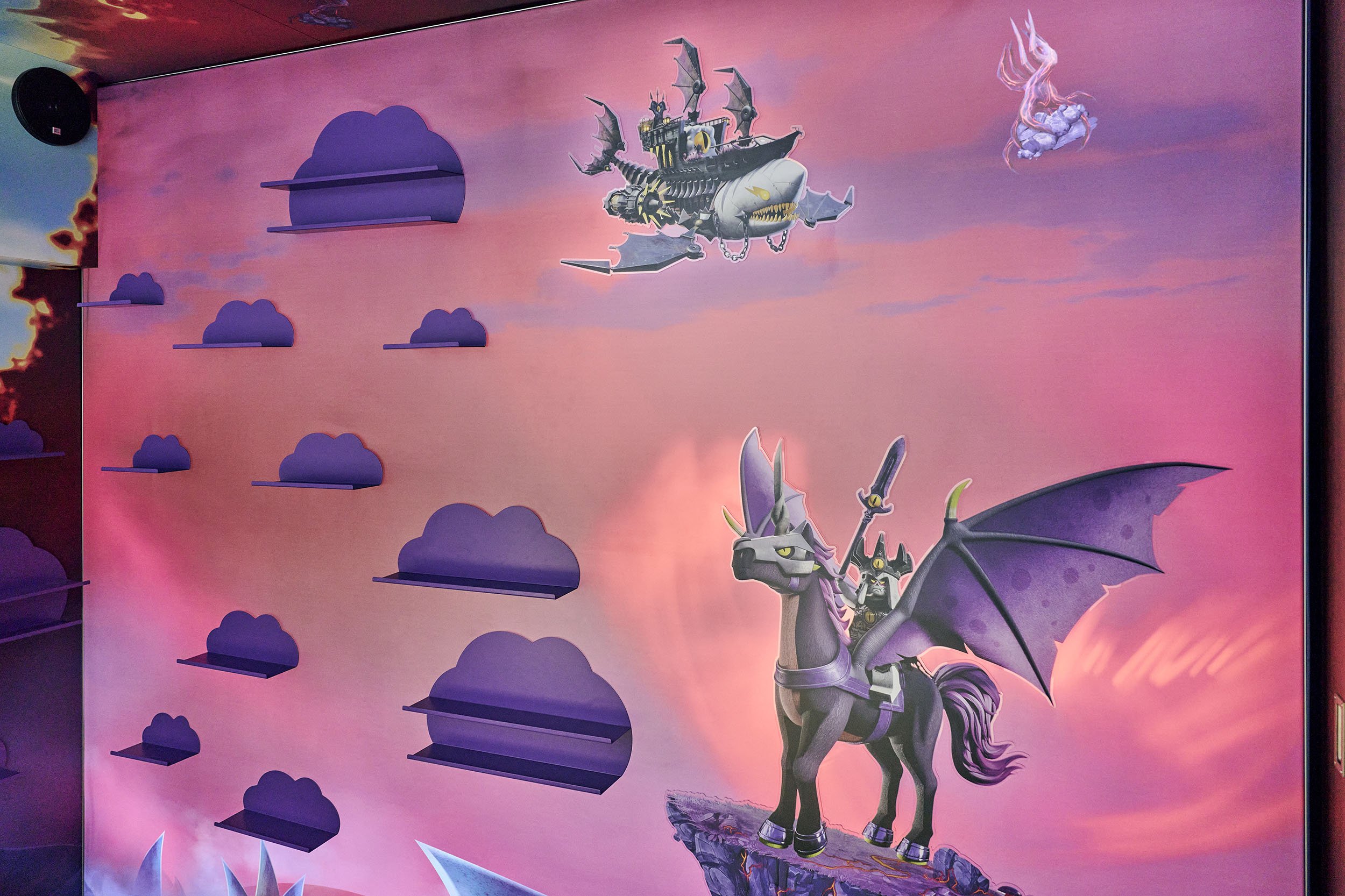
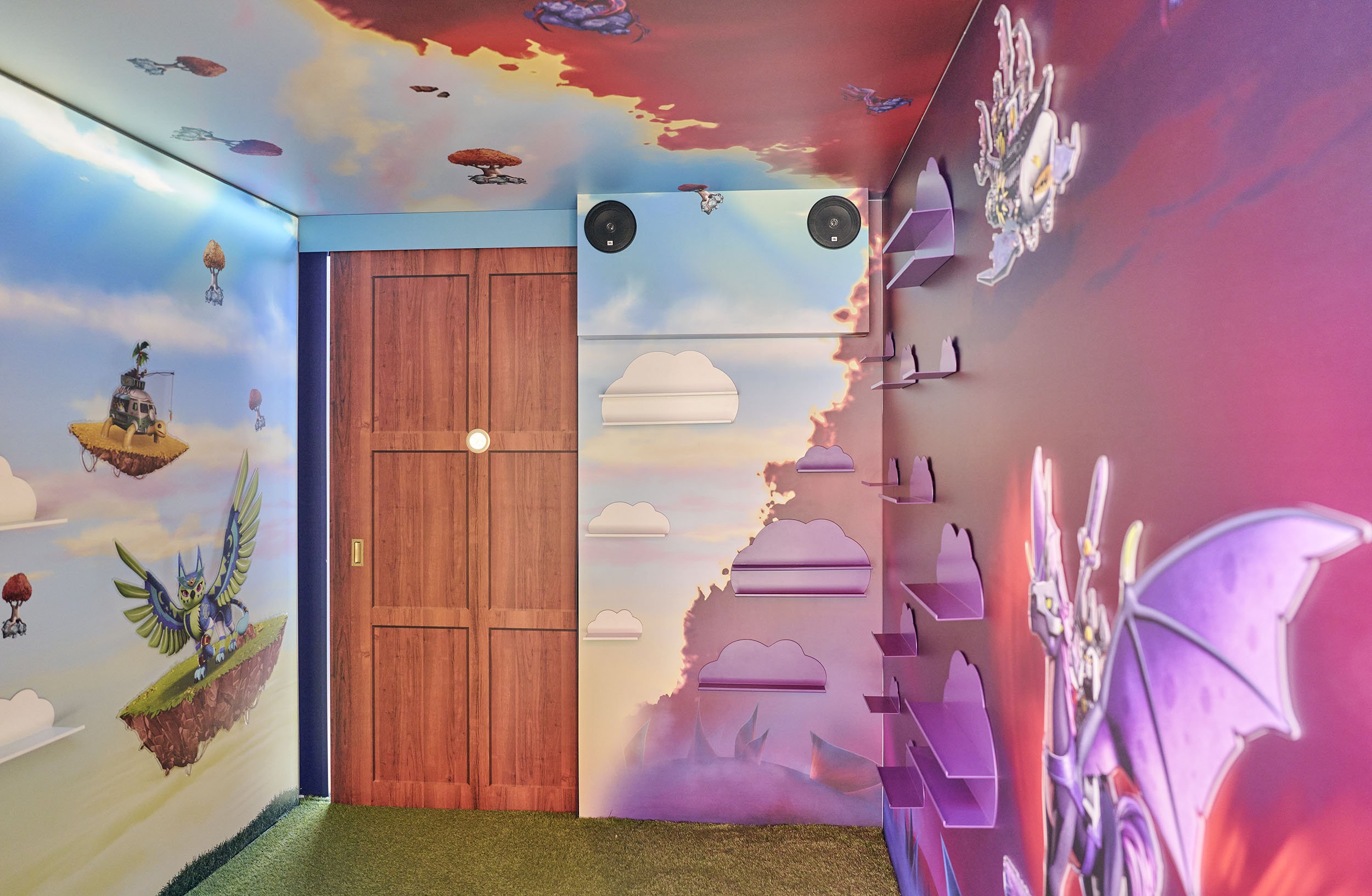
LEGO × F1
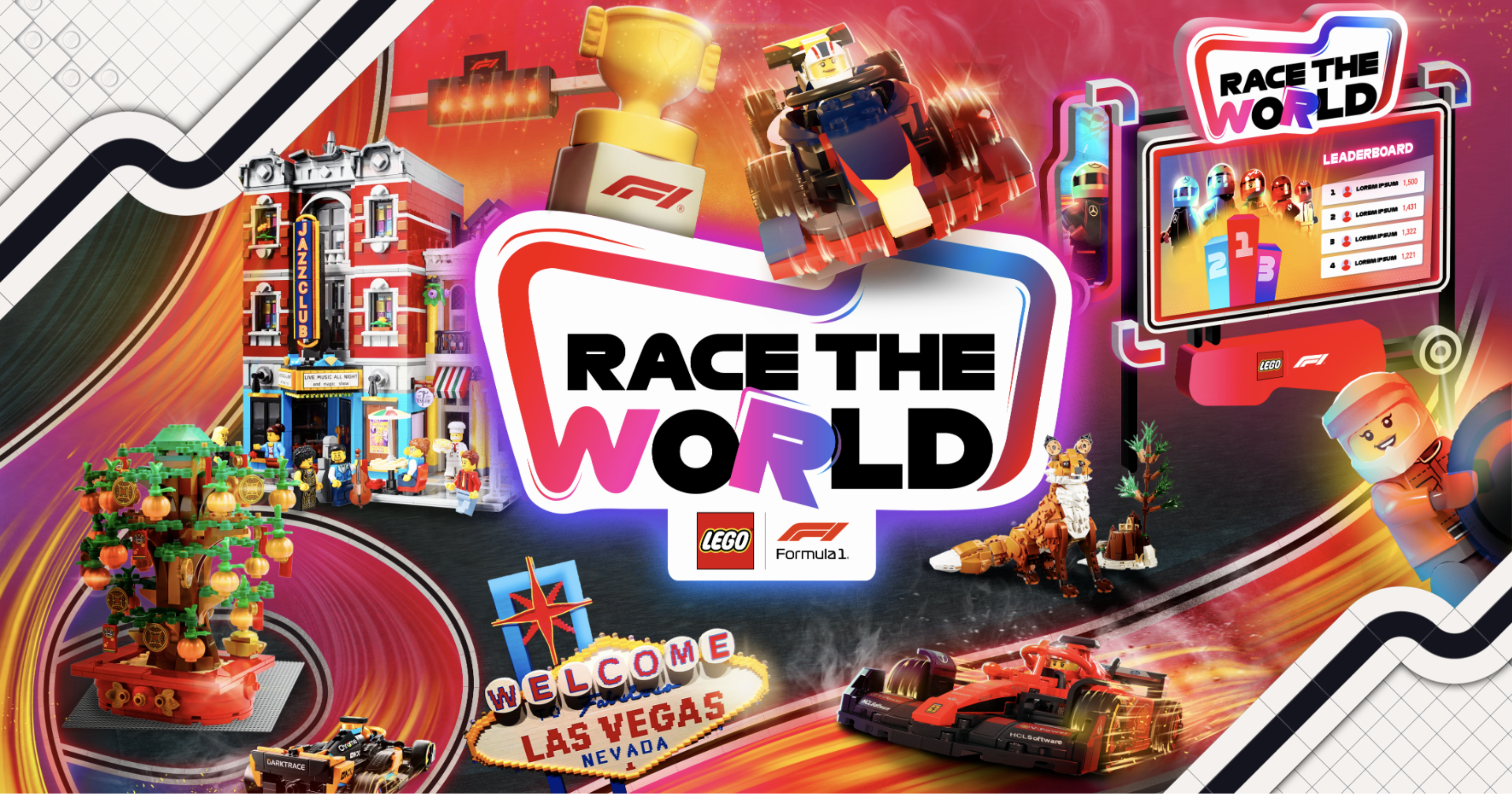
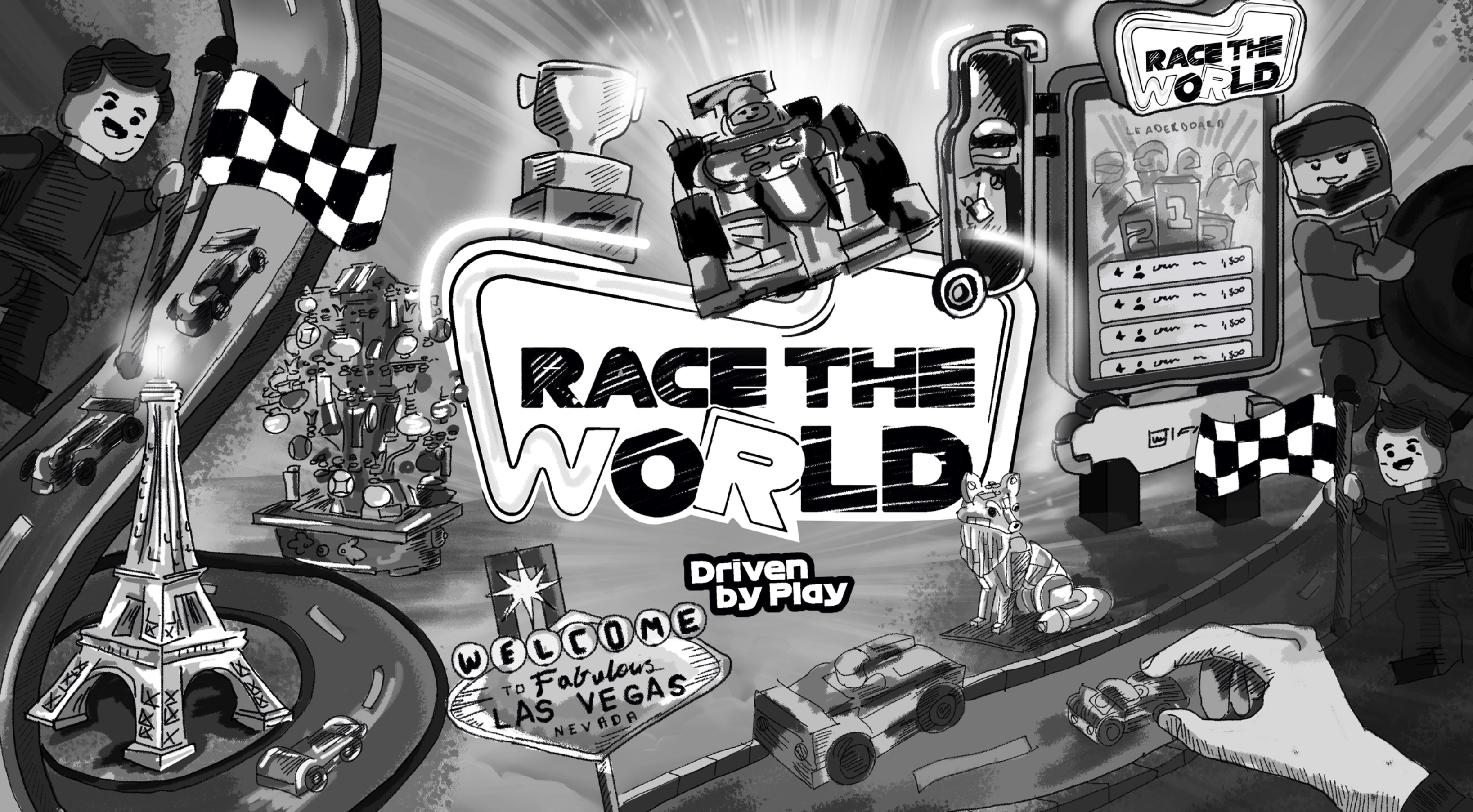
Lead designer on the LEGO x F1 pitch. I set the creative direction, developed the key visual and campaign lockup, designed the activation space concept, and briefed the 3D and motion graphics team on execution.

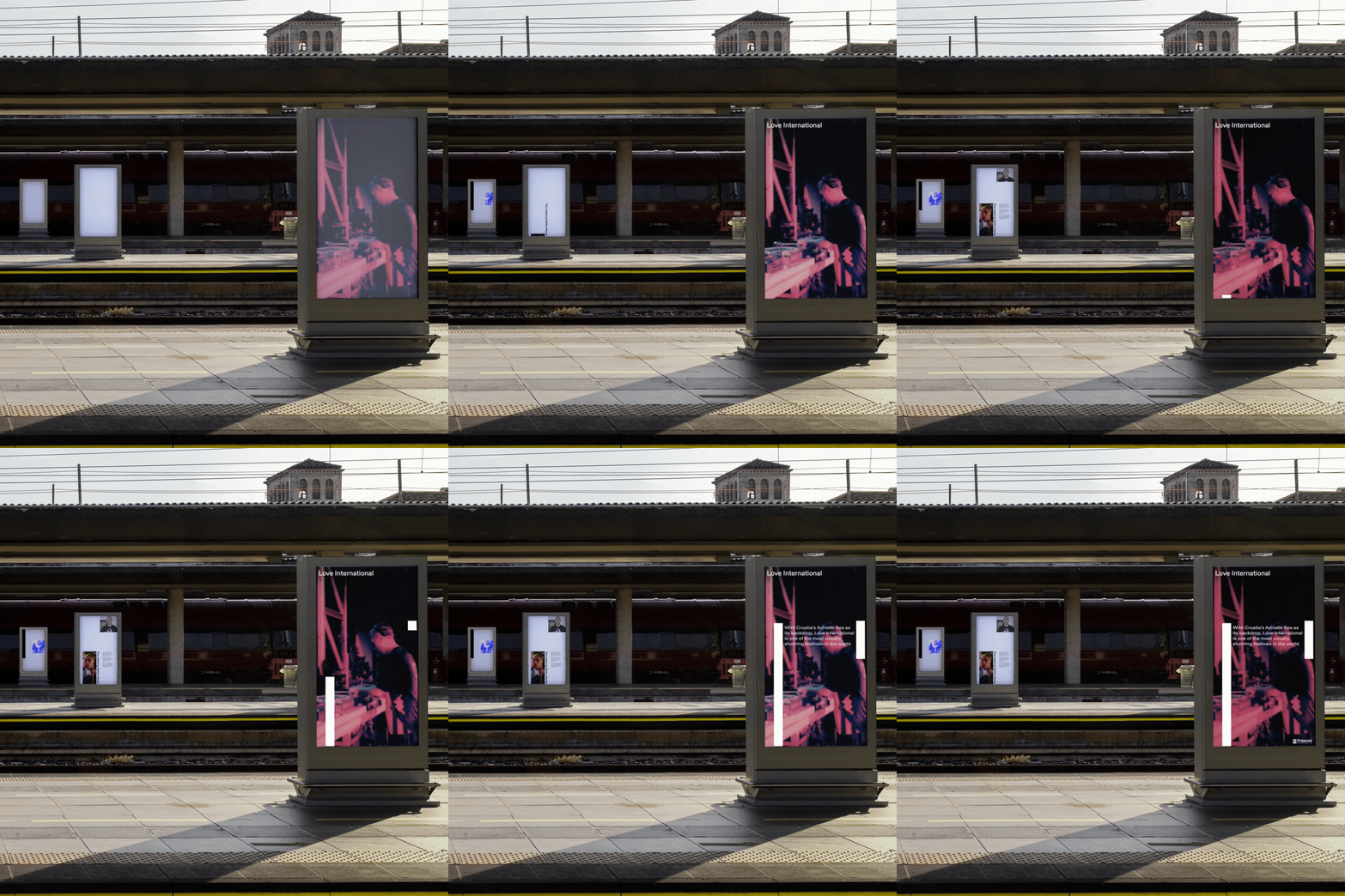
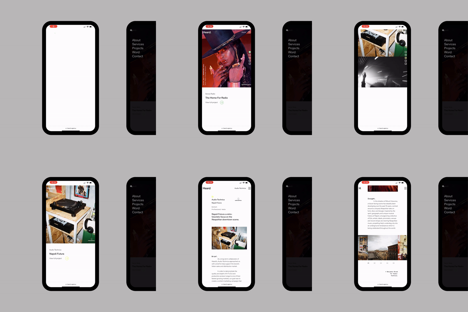
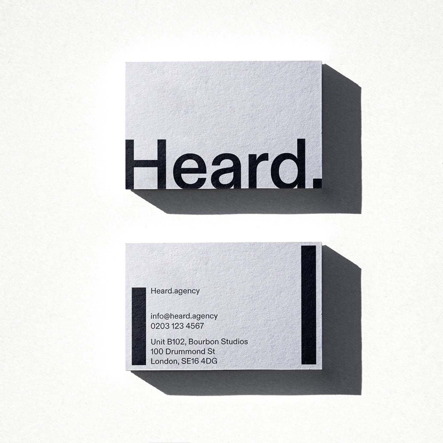
Heard
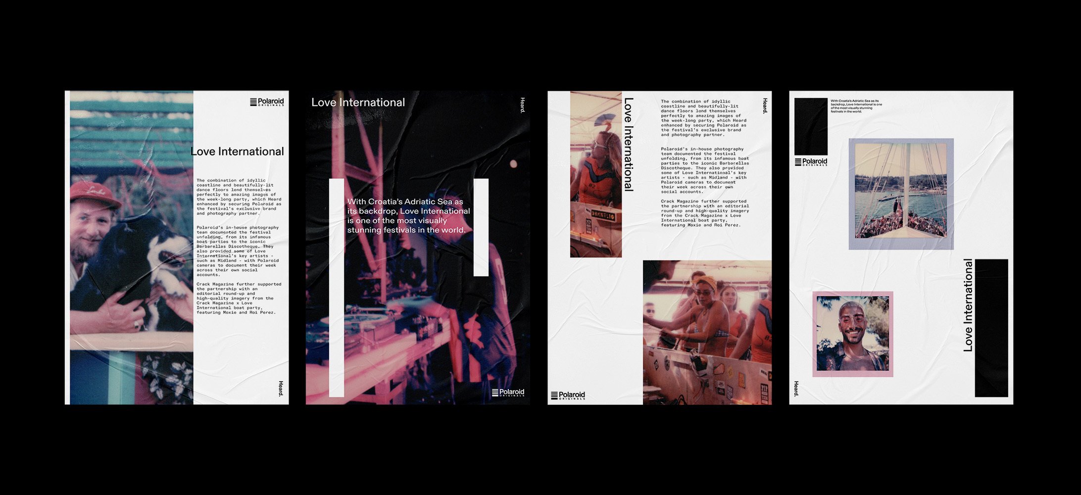
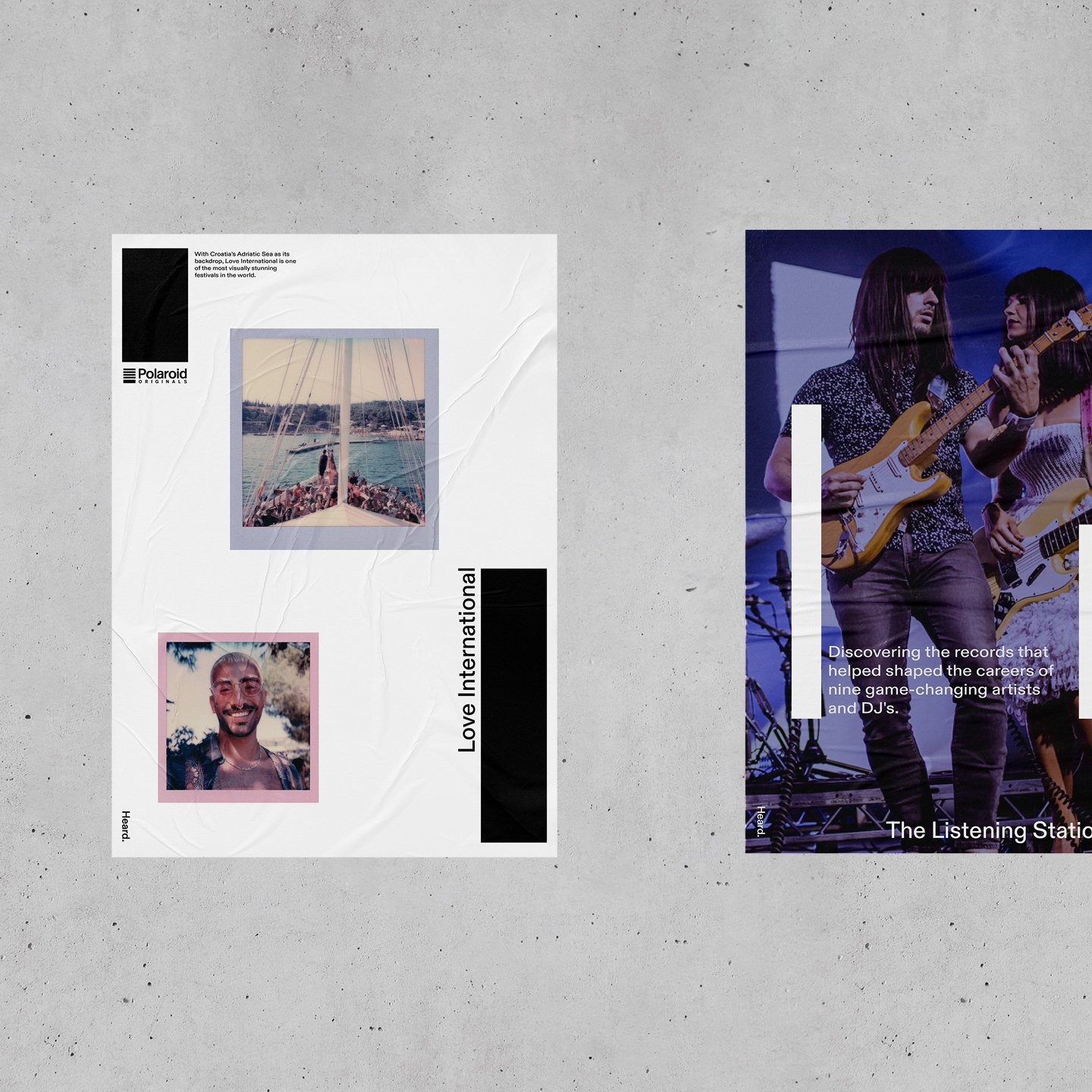
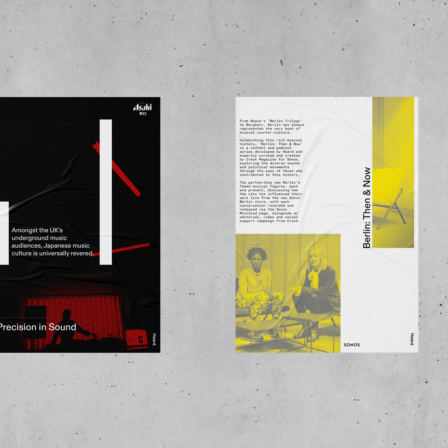
Rebrand for a music and entertainment company.
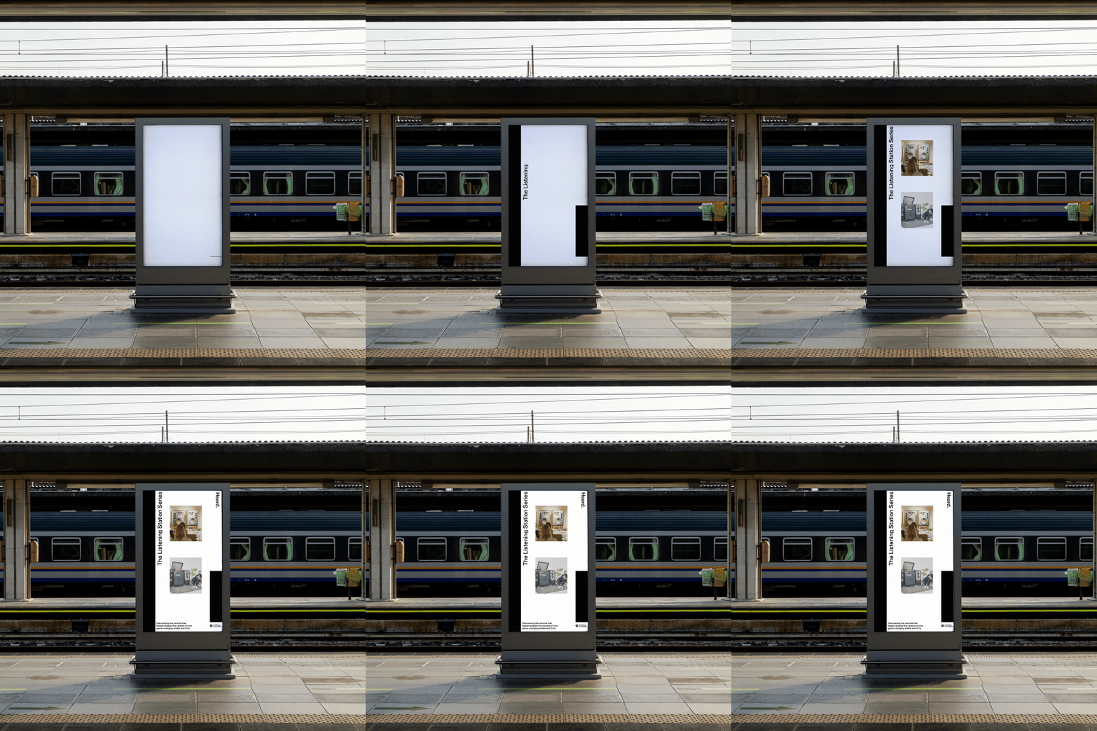
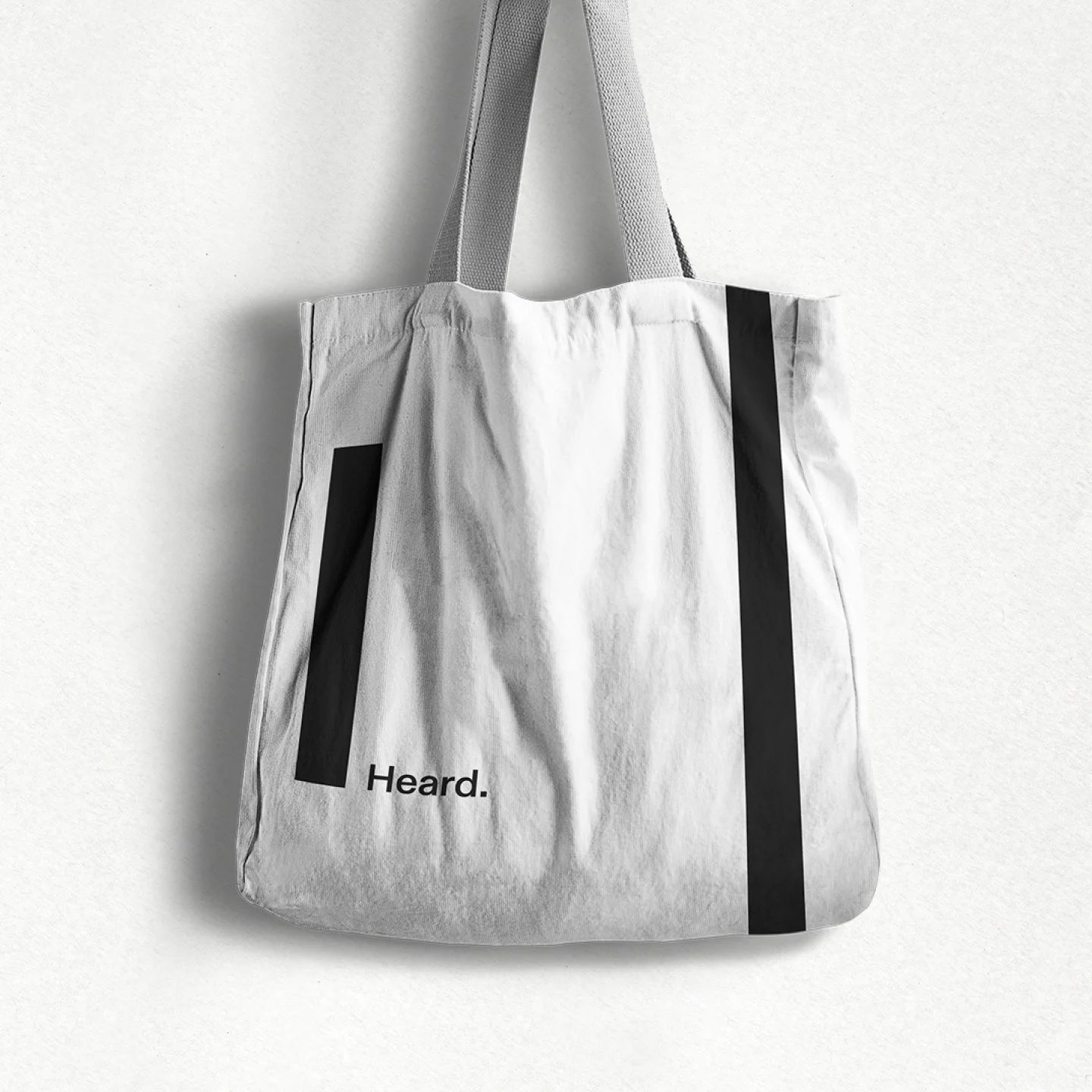
Design of a responsive website across desktop, tablet and mobile, extended into the brand rollout — social assets, editorial layouts, motion graphics, posters, and partnership content for Polaroid Originals × Love International.
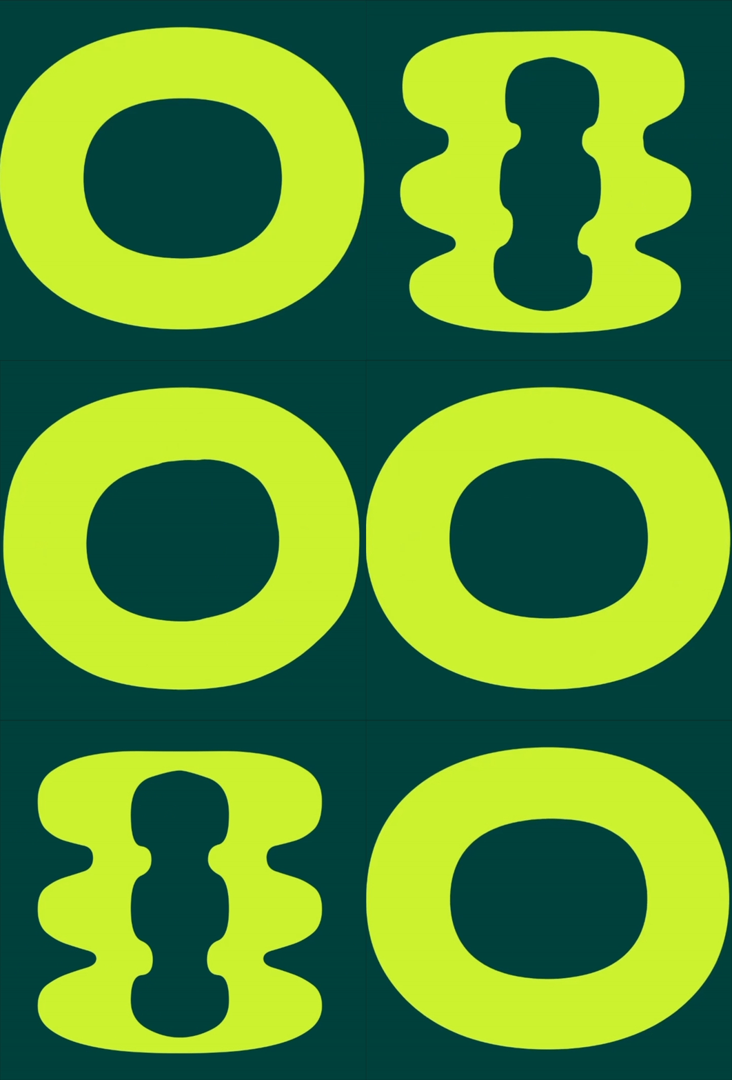
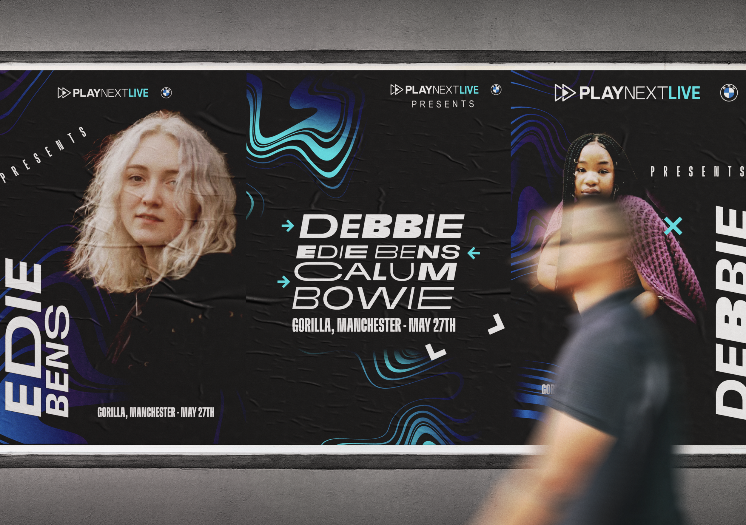
Print, out-of-home and motion, all carried by one typographic system.

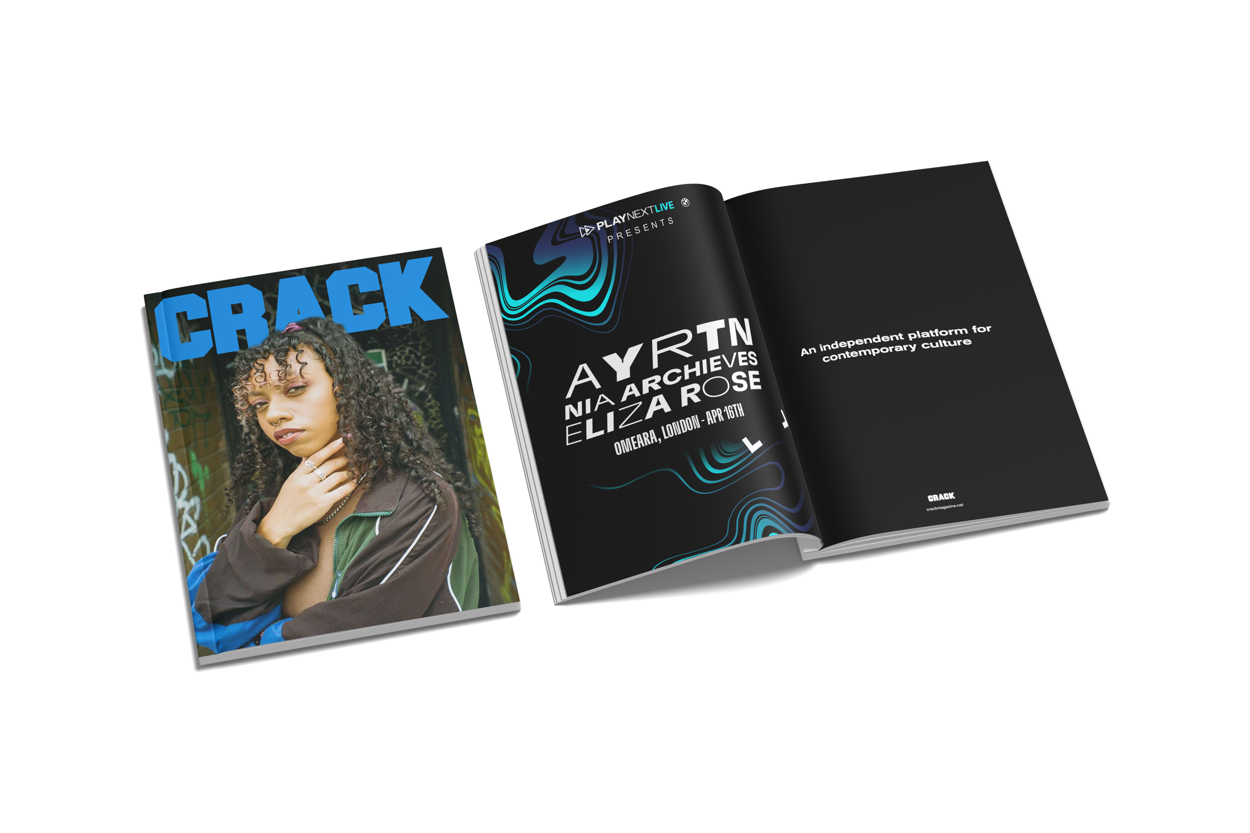
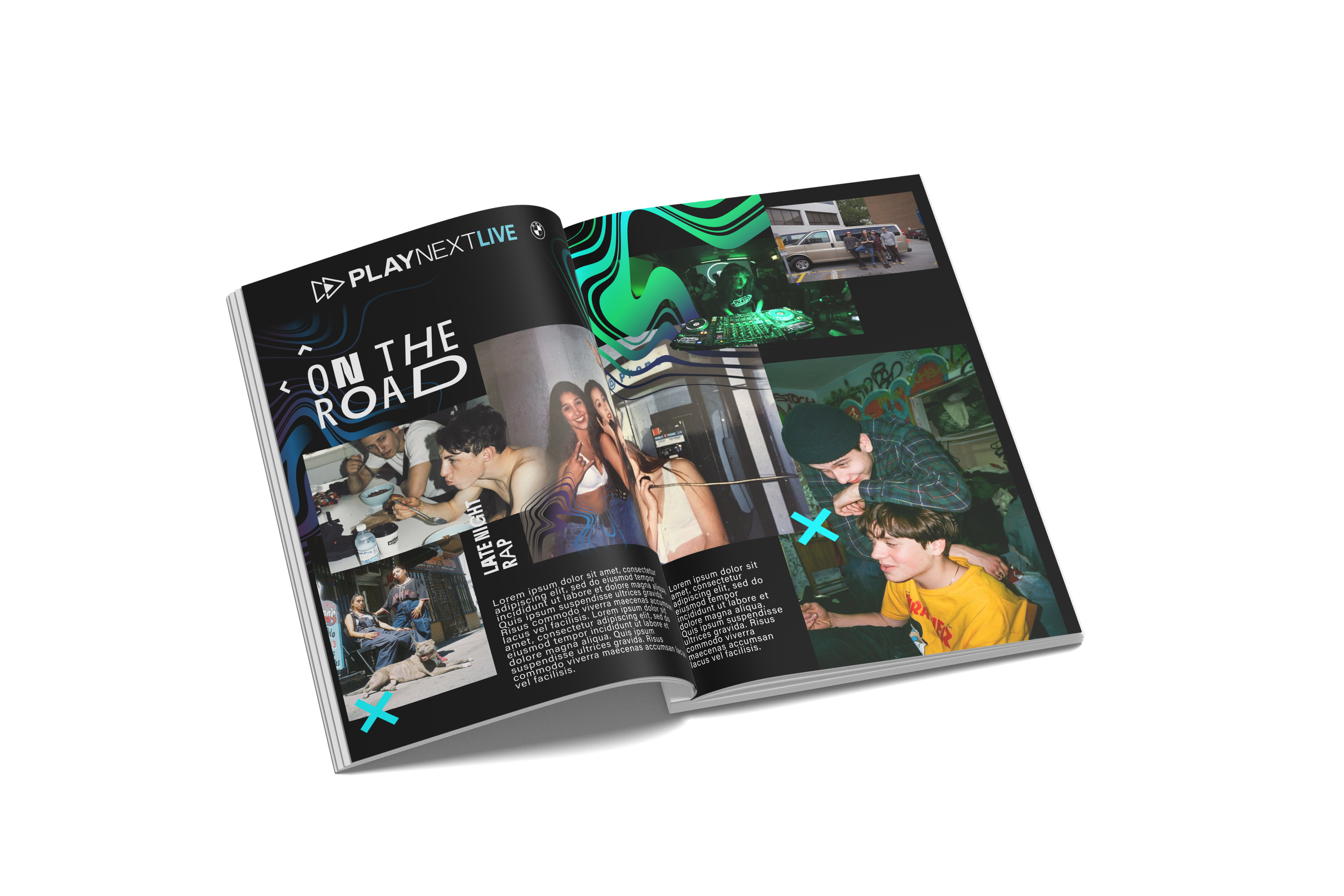
BMW × PLAYNEXT LIVE
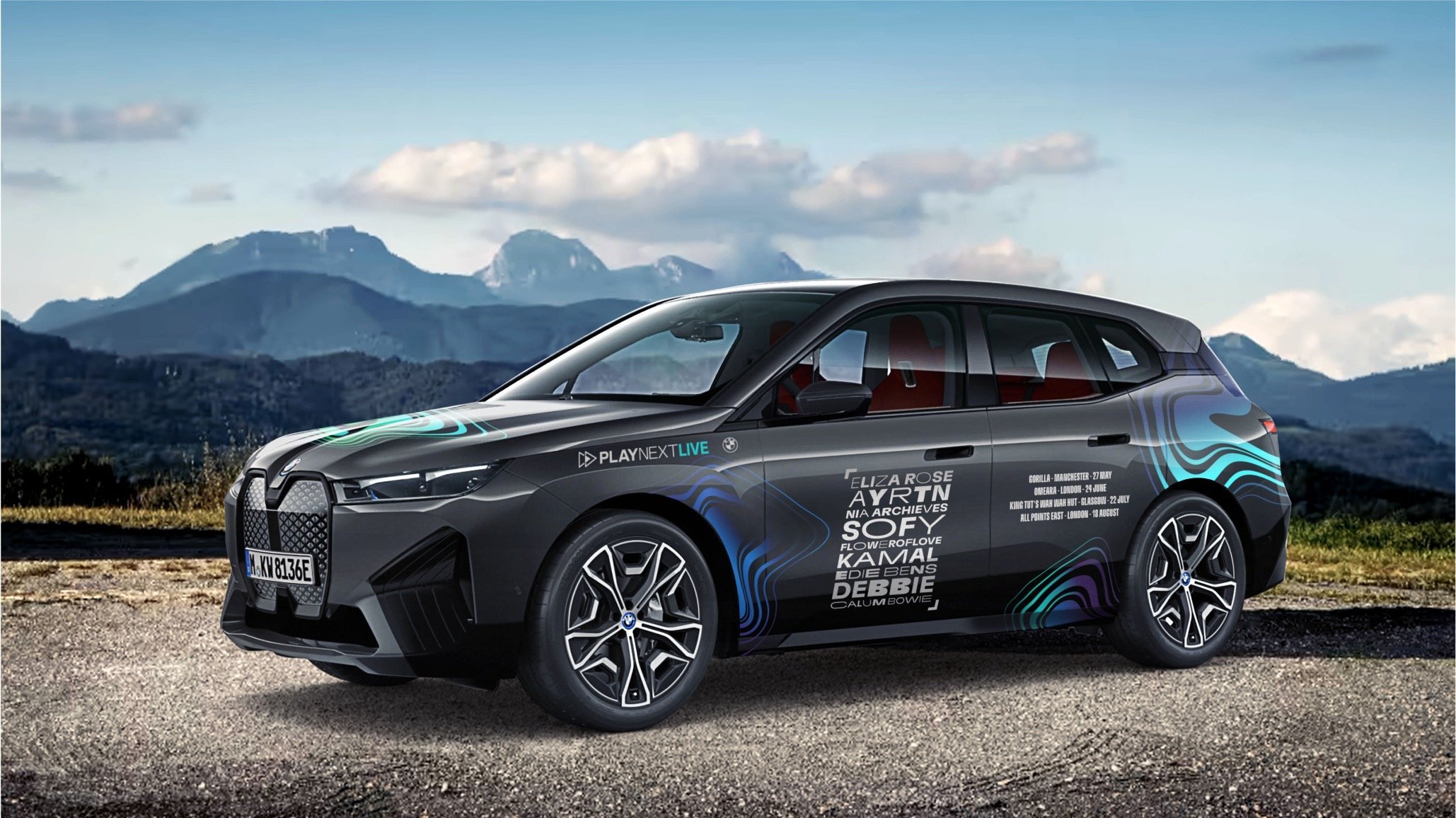
BMW's emerging-music platform.
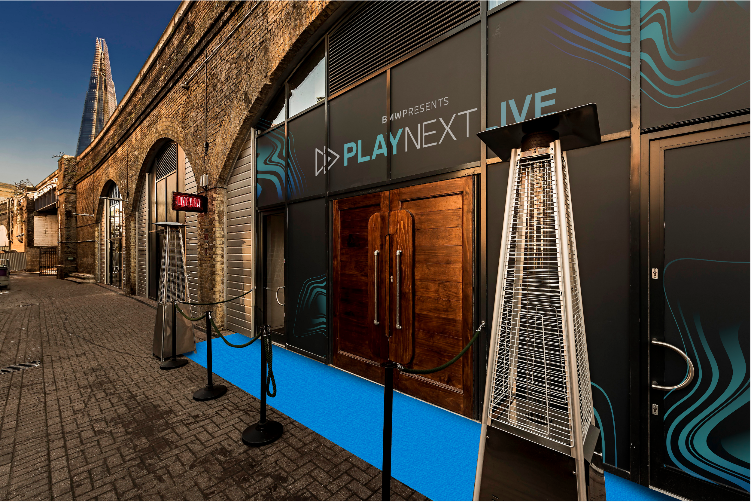
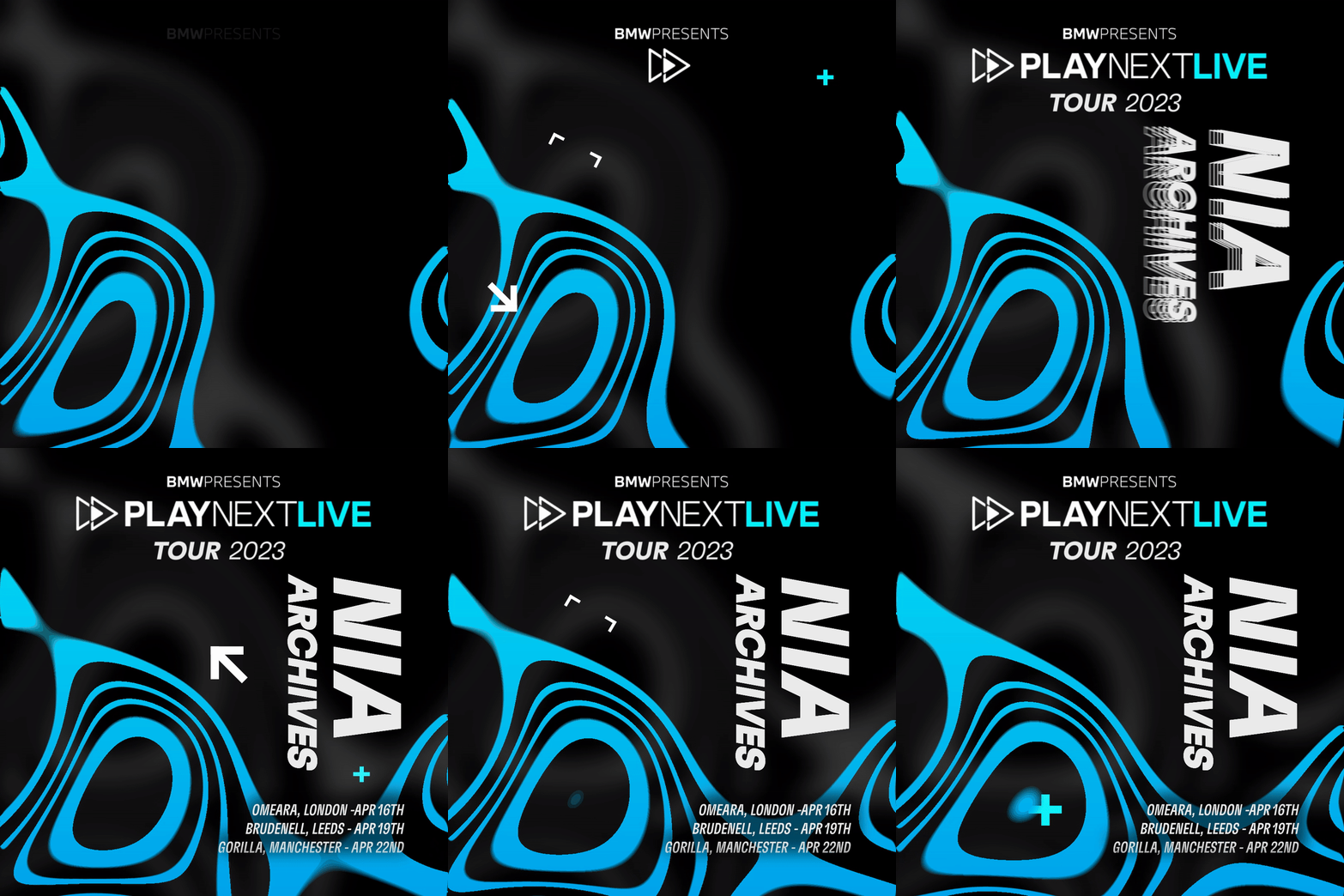
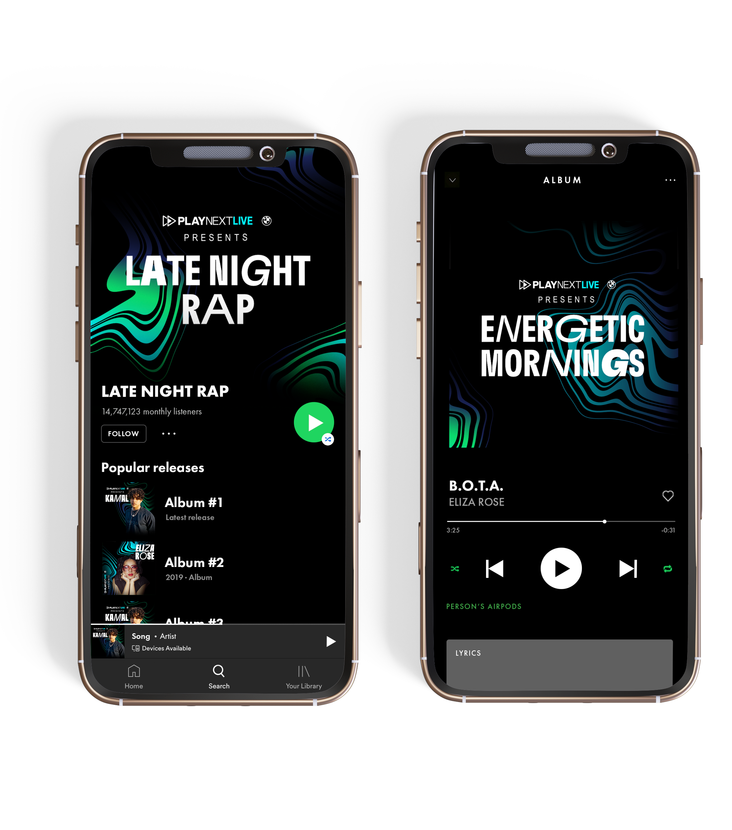
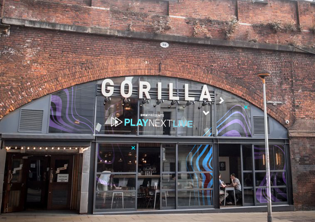
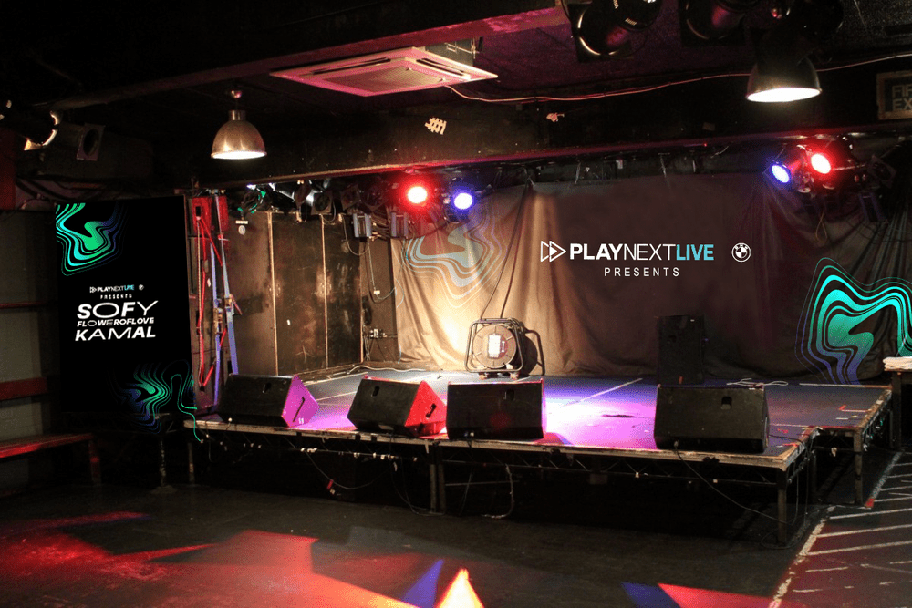
A podcast and four-date UK tour showcasing nine new acts, in collaboration with Wasserman Music. I created the identity and rolled it out across social, a CRACK Magazine feature, car wraps, and venue branding.
Social, editorial, car wraps and venue branding across four cities.

popchips
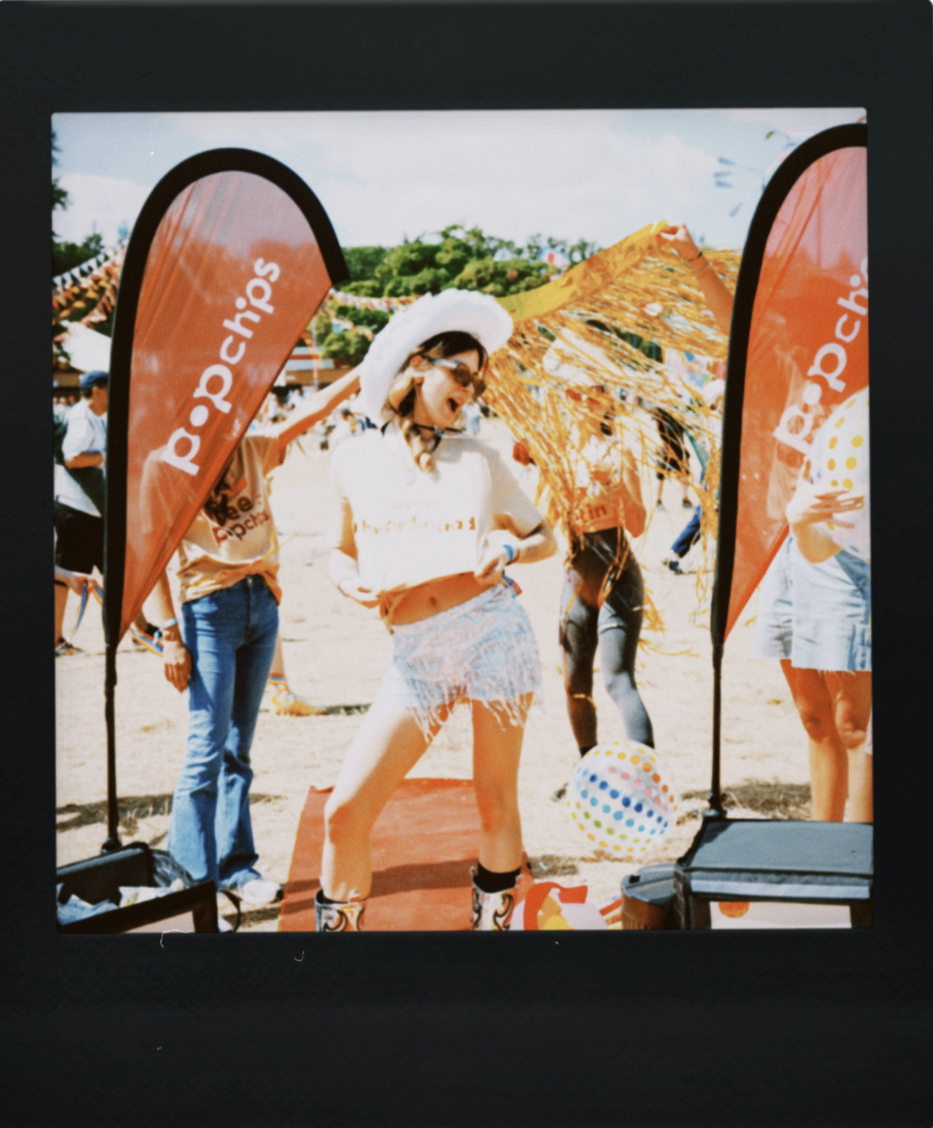
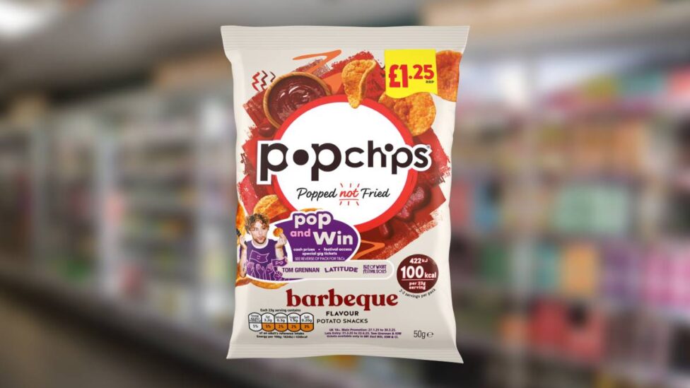
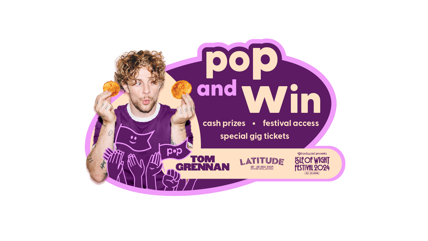
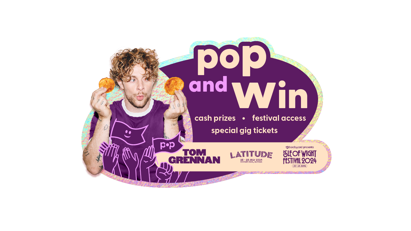
Popchips × Live Nation summer campaign featuring Tom Grennan.
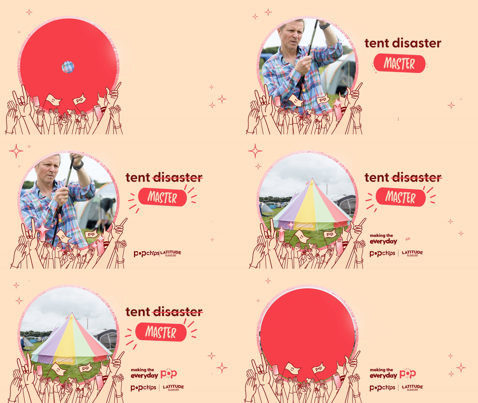
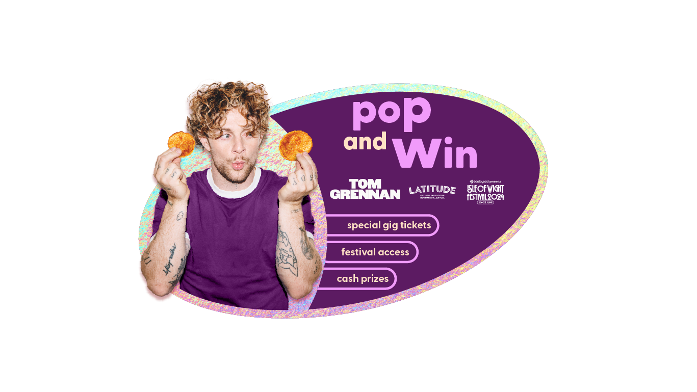
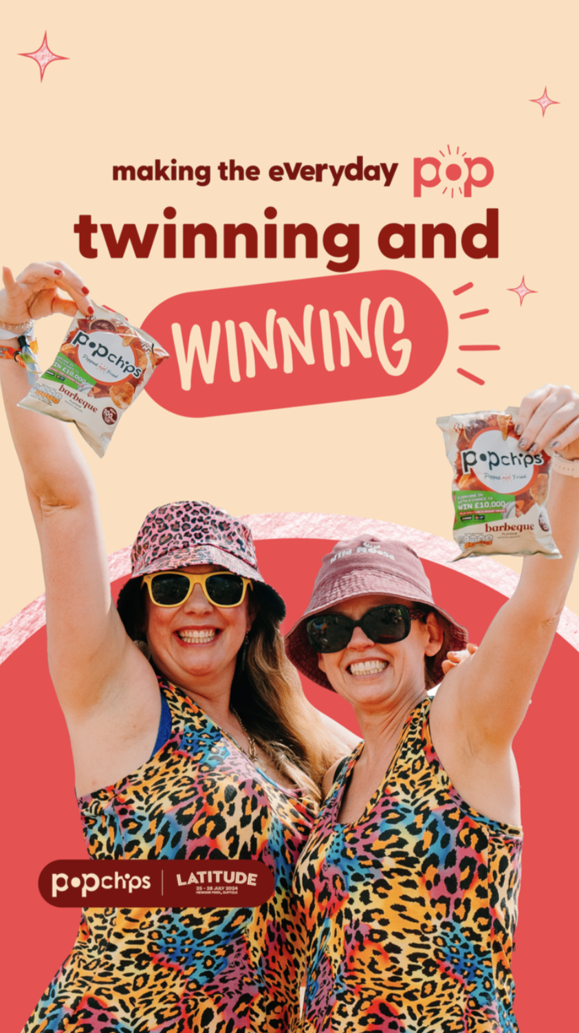
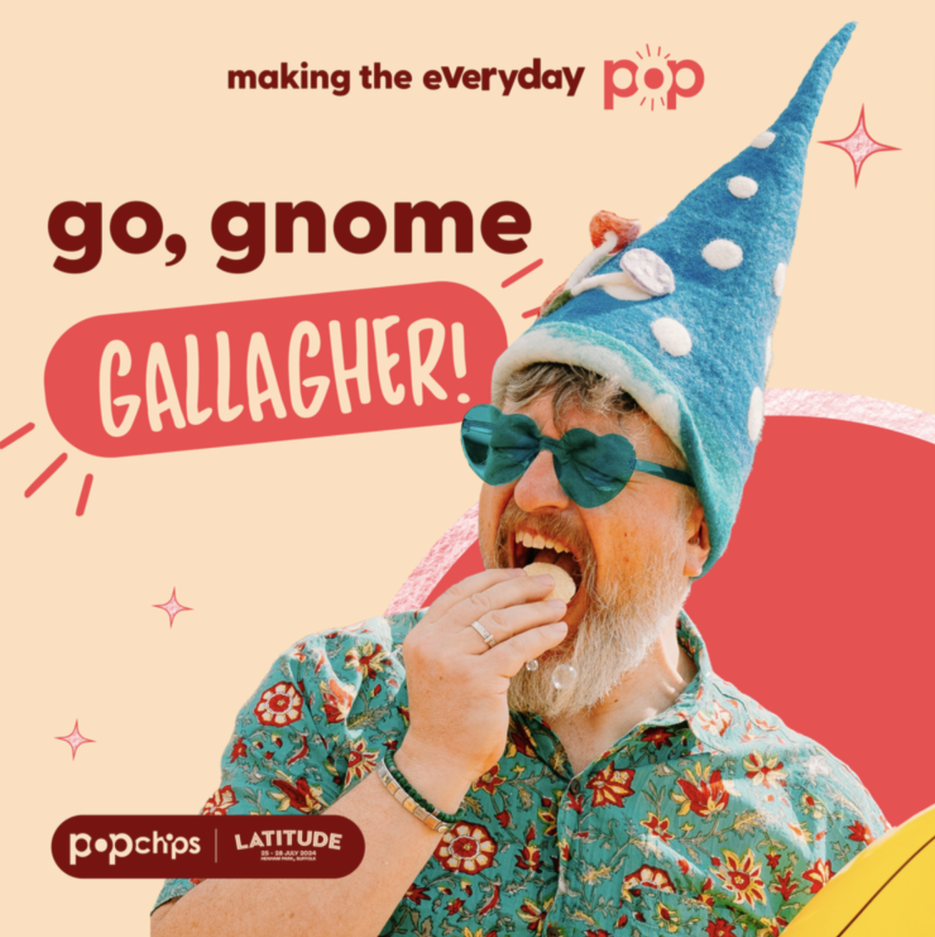
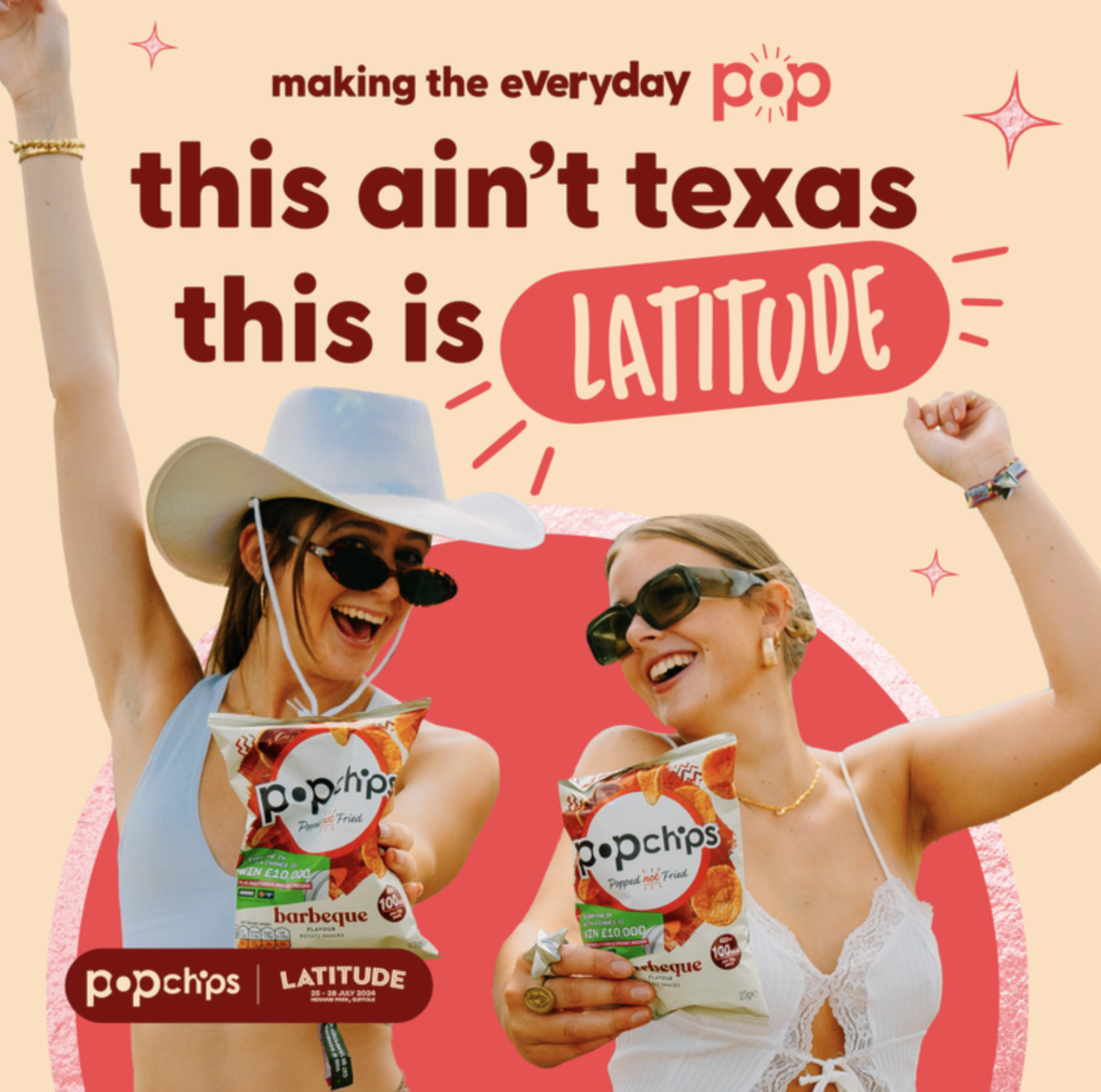
I helped the design direction from the pitch stage, then designed DOOH content, paid social assets, and packaging for the 2025 partnership. On-site at Latitude Festival and Gunnersbury Park, I ran the live content production: animation exports, press-ready deliverables, and real-time asset creation as festival-goers filmed their own Popchips ads.
Pack flash routes, out-of-home and festival social.
Nine-by-sixteen cutdowns, posted across the festival weekend.


dreamweapon
A voice-first journal that asks for a minute a day.
You talk, it writes. I designed the identity, the interface and the motion, then built the app end to end. One gesture to record, one place to read it back, and nothing else in the way.
Paper-calm neutrals, one leaf green, and a mark that softens as it warms.
A drifting mesh behind every screen, and a ring that breathes at the pace you are meant to.
Three tabs. Speak, read it back, and nothing to configure.
Been thinking about the studio brief all morning — the part that keeps nagging is